Visual Identity
Foundational styles for the new version of the Design System, including typography, color, grid, design tokens, and best practices.
Fonts
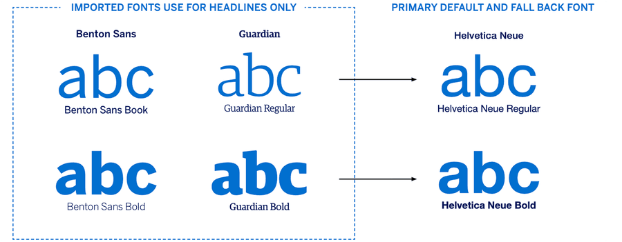
The primary font for all emails is Helvetica Neue which is ‘email safe’, meaning it will display across most customer devices. If this is not available on a customer’s device it will automatically swap to Helvetica, and if this isn’t loaded then it will revert to Arial or on Android, an equivalent default.
With M-EDS v.4.0, we introduced two custom fonts: Benton Sans and Guardian - for optional use in headlines only - via WOFF font imports. The HTML code for this can be found in the ‘Web Fonts’ folder with the other HTML files. While not every email client displays web fonts, our data shows that over 60% of US Card Members use devices or apps that will display the two new fonts.
Where Benton Sans and Guardian do not appear, one of the fall backs mentioned above will be used, resulting in no disruption to the customer experience.
Do not be tempted to use Benton Sans or Guardian in an email by saving the text as an image. If images are turned off by the email client (such as Outlook), or they don’t download, your text will not display. All copy and headlines must be live text as per email accessibility best practice.
Where supported, web fonts add a premium brand element to the Card Member’s email experience, but they also add more weight to the code download so can affect loading times. Use them in the most optimal way for high end emails that will benefit from the brand reinforcement that web font headlines bring as the reader scrolls through the email.
Icons
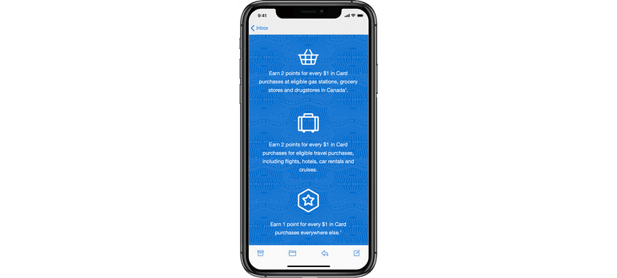
Icons enhance the visual experience of an email and enable Card Members to quickly locate a desired action. They can be simple, such as a circle with a number inside, or they can be visual metaphors, such as a hand with a thumbs-up, a pencil, or a lock. Icons are supplied in PNG and SVG format, the latter is for use if an icon needs to be added to an image aor adapted in some way, SVG format is not supported in email.
DO NOT create new icons - contact the Design System Team if there are additional icons your market needs.
Icon Sizing: For email, icons should be a minimum of 32px square and a maximum of 60px square. If resizing icons be sure to start with the larger format PNGs or SVG format to retain quality when resizing.
Icon Labels: Re-purpose the icons we already have and change their label to meet the needs of your communication, for example the telephone icon could be labeled ‘Contact Us’ or ‘Call to Book’. See the document on Alt Text in the Email Accessibility Pack for information on Alt Text use on icons.
These icons have been created by the DS team following rounds of research and screen testing. Use the recommended colors and weights to retain uniformity.
Illustrations
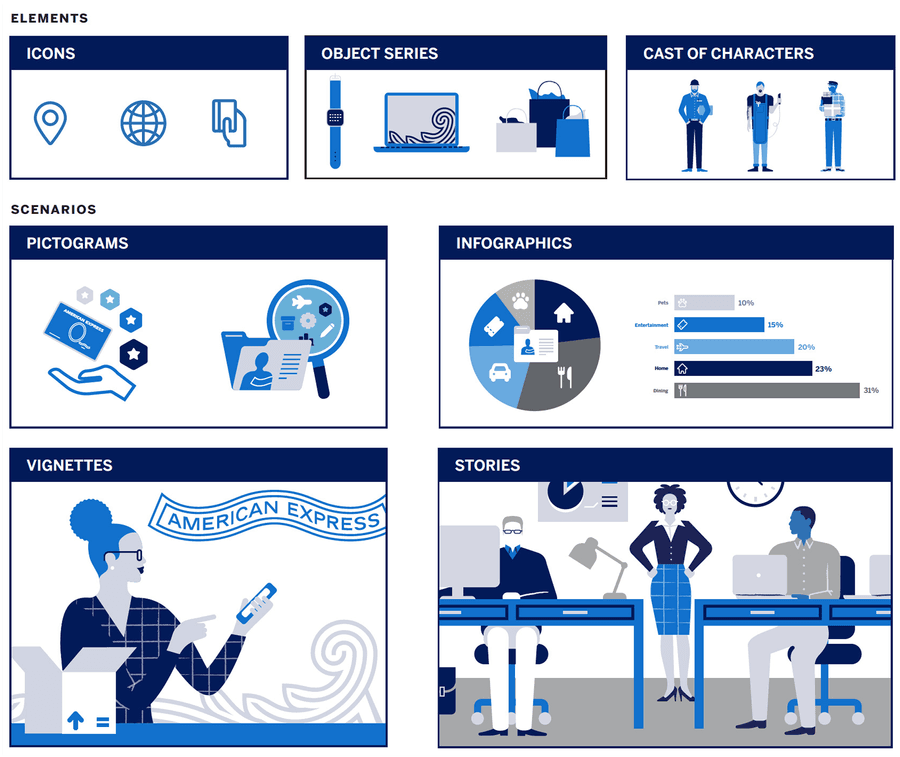
The illustration design system is designed from a group of simple elements: Icons, Object Series and Character set.
Each of these can be applied across a range of Pictograms, Infographics, Vignettes or Stories to show data, explain complex ideas, or as spot illustration. The illustration system has been designed to be flexible and can be adapted by agencies to ft local requirements.
Illustrations can be utilized within your email comms in the body of the mail – note that illustrations may not be used in the hero section as American Express is a relationship brand, using photography/images that our Card Members can relate to is important. Therefore only use illustration below the fold.
A maximum of six colors may be used within individual illustrations. To ensure consistency, illustrations should always use at least two colors from the brand palette, including one of the blues. The brand palette must make up at least 70% of the illustration. The sample illustrations on the next page demonstrate how various color combinations can be used.
World Service Pattern
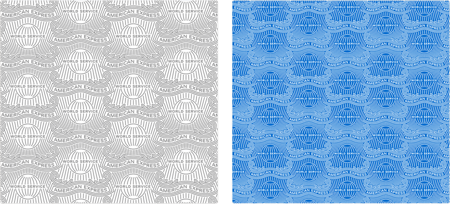
Since we have only a few colors in our palette other visual tools have been explored. The World Service Pattern, when applied subtly, can add interest and richness to an email.
There are three areas where the World Service Pattern can be utilized. Only use one treatment at a time to avoid the email getting cluttered:
Email Window Background: This is the area behind the email that ‘frames’ it on desktop. We recommend using this on all emails, except when the World Service Pattern is present in the Hero section.
Hero Text Box: Adding a WSP here is not mandatory, your agency can choose to apply it. If it is used the pattern is treated as a ‘background image’ so it will display for the majority of email clients, however a small few do not display background images - if this is the case the text box just reverts to the flat color with no pattern - nothing breaks or looks odd.
Section Header: The same principle applies here, a background image can be added to a text module using TM01a Section Header. The Pattern adds emphasis to a module or headline.
The pattern works by adding transparent PNG saved as the required opacity over a flat background color from the Brand color palette. Your agency needs to specify this background color as it is also what color TM01a will fall back to if the World Service Pattern cannot be displayed by the email client. They need to ensure the copy is still legible on the fallback color.
Ribbons
There are two American Express Ribbons that can feature on any Amex communications:
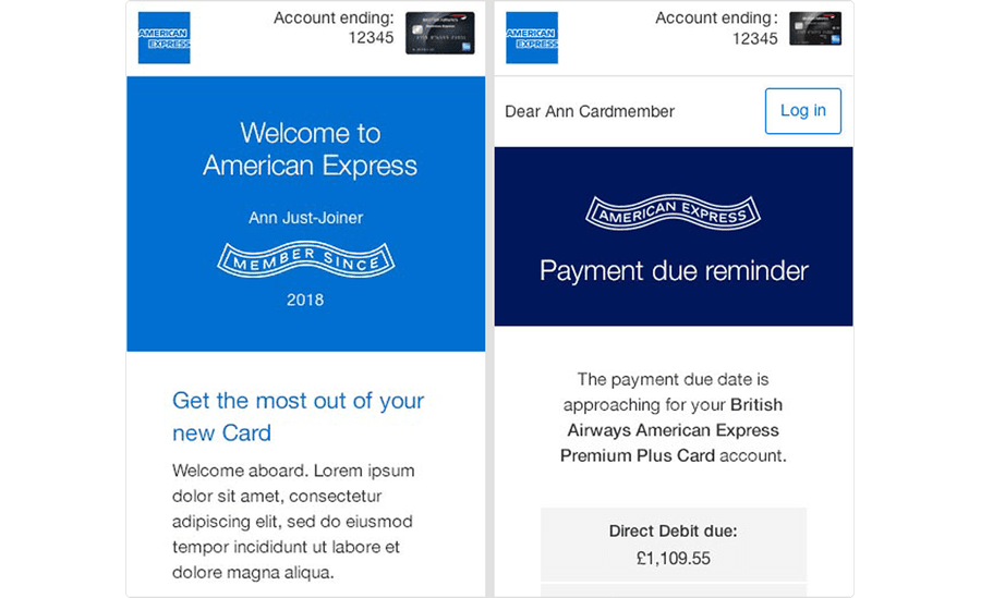
MEMBER SINCE
AMERICAN EXPRESS
They tend to lend themselves more naturally to Servicing emails than marketing, but are allowed in marketing communications if relevant.
Either Ribbon can be dropped into designs but use them sparingly, to enhance or support the message - they shouldn’t dominate or create extra clutter.
Graphic Use in Partner Emails
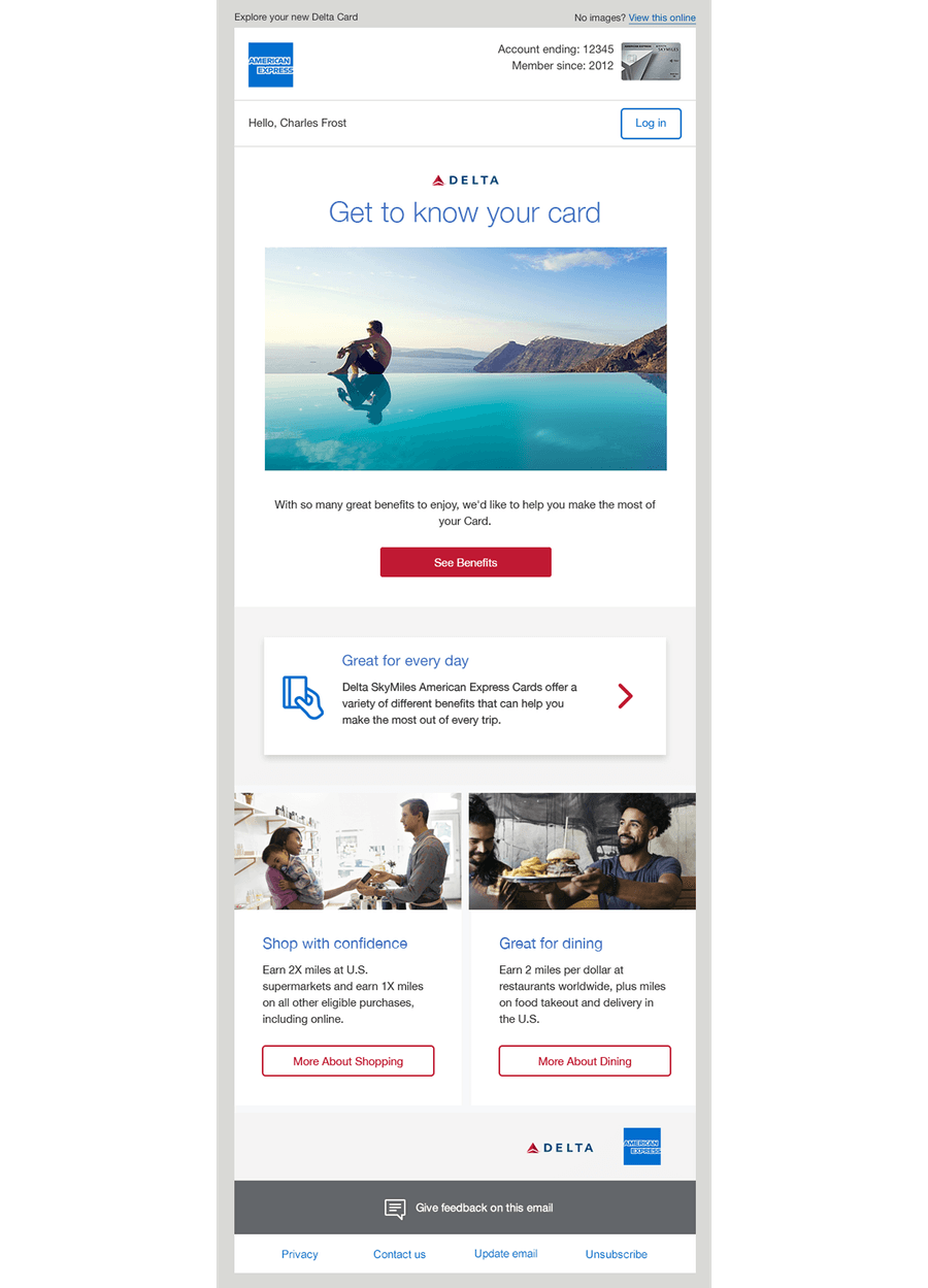
For Co-brand emails, we should only incorporate the Amex brand into the top and footer portions of marketing emails.
The Hero Banner and all body content modules should follow the partner’s color palette/branding.
There is a specific Co-brand Logo Bar (TM11) that can be used to house additional logos, e.g. Avios, Air Miles, Aeroplan etc., so that they do not clutter the communication (do not include the Blue Box here).
The World Service Pattern window background is optional for Co-brands, but our tagline (Don’t Live Life Without It) should not be displayed.
Questions?
Connect with the DLS Team on Slack or by email.
Resources
Check out additional resources.