Get Started
The American Express Design System provides a unified language for designing American Express websites and experiences. The design system provides design resources that match our coded components and are aligned with the American Express brand. Included are colors, components, icons and glyphs, type styles, and graphic assets to get you up and running quickly.
Mission Statement
The design system sets the standard foundations for inclusive, connected and consistent user experiences for teams and partners within the Amex ecosystem. By bringing together our design community through the design systems, we enable you to deliver the Amex brand promise to your consumers while developing a cohesive experience for our customers across digital platforms. As colleagues at Amex, we strive to deliver the brand promise to our customers and each other every day. The design system provides cohesive structure with an accessibility-forward mindset that allows our design community to win together as a team of design colleagues at Amex.
Why Should You Use a Design System?
The Design System (DS) is built to help you be efficient, allowing you to concentrate on solving real user problems. Although the system is not mandated we recommend using our components and foundations over using custom components.
Design systems follow atomic design best practices, and usually use a foundation of sub-atomic design choices documented as tokens, principles and concepts. Using the DS allows you to benefit from:
- A single source of truth that allow for consistent style across all devices, platforms, and features.
- Enables teams to create products faster by making design reusable and scalable.
- By providing libraries and code, and standardizing naming conventions, the system helps teams save time and prevent errors.
- Design System teams works with or within brand to make sure customers experiences have the right style and tone across all platforms, reinforcing their trust in the brand.
System Principles
Facilitate efficiency and scalability
Our guidance allows designers and developers to work together efficiently and effectively across journeys through our systems designs and code bases. Systems-first thinking facilitates efficient workflows and increases scalability while enhancing visual appeal for our consumers.
Harmonious visual cohesion across platforms
By giving teams the tools to create beautiful products that seamlessly work together, the system enables our users to build visual cohesion within their users journeys. By centralizing design guidance through design systems, we help create a harmonious, cohesive experience for our users.
Build strong core foundations
The design system is meant to provide foundational building blocks for designers and developers across the enterprise. The system acts as the core foundations that designers across American Express implement within context needs across journeys. As a design system, we put the system first to design with the maximum number of users in mind.
Loyalty and trust through recognition
Collaboration across American Express’s design systems (web, mobile, email) allow for connected cross-channel experiences that are optimal, compliant and advocate for the American Express brand. This builds trust and loyalty amongst our consumers, who can recognize any of our products through brand consistency.
Enable inclusive experiences
Our design system meets American Express’s WCAG (Web Content Accessibility Guidelines) AA standard of accessibility. When implementing the design system, our components are set up to help guide you toward building an accessible, inclusive product.
Provide support and guidance
The design system team is continuously maintaining and evolving the system. The teams provide support to designers and developers through giving guidance on best practices and encouraging contributions to the system when appropriate. Working closely with design and developer colleagues builds a systems-thinking mindset across teams and builds confidence to grow the system of systems.
Common Misconceptions About Design Systems
Design Systems Stifle Creativity
The Design System is changing your jobs for the better, elevating them to solve big picture problems for business and customers. Instead, spend time on research with customers, building empathy for our users, and help re-shape the roadmap. Leave the pixel pushing and cataloging to us so you can go out there and be great!
Design Systems are a Silver Bullet
Design Systems are not designed to solve every design problem. The aim is that the system is a tool that designers can use to maintain consistency across large teams, improve productivity, and allow designers the ability to focus on their product.
Design Systems are One-and-Done
The Design System needs to be constantly evolving to stay relevant, modernize to visual trends, and make the system most effective for our users.
Compatibility
The DLS works best in the latest version of desktop and mobile browsers. We support the current stable version of the browser and the version that preceded it.
| CHROME | FIREFOX | INTERNET EXPLORER | OPERA | SAFARI | MICROSOFT EDGE | |
|---|---|---|---|---|---|---|
| Android | Supported | Supported | N/A | Not Supported | N/A | N/A |
| iOS | Supported | Supported | N/A | Not Supported | Supported | N/A |
| Mac OS X | Supported | Supported | N/A | Supported | Supported | Supported |
| Windows | Supported | Supported | IE11+ | Supported | Not Supported | Supported |
Legal
While American Express has redrawn and shares these assets for the benefit of our organization and partners, American Express does not own any of the underlying product or user interface designs. By accessing these assets, you agree to obtain all necessary permissions from the underlying rights holders and/or adhere to any applicable brand use guidelines before using them. American Express disclaims all express or implied warranties with respect to these assets, including non-infringement of intellectual property rights.
Documentation
Guidance
Through out the documentation you will find ‘Do this’, ‘Don’t do this’, and ‘Why’ sections.
- This section gives guidance and best practice scenarios for how to use components
- This section gives examples of how not to use components
- ‘Why’, explains design and development decisions, calling out connected accessibility standards.
Components
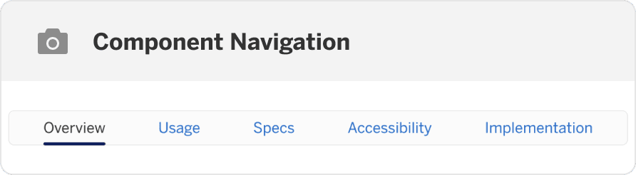
Each component page is split into overview, usage, specs, accessibility, and implementation. In each section you will find:
Overview
- Interactive Demo - This demo lets you preview the split button component, its variations, and configuration options.
- What’s New - latest updates to the component.
- Updates - Releases that have updated the component.
Usage
- Best Practices - When, and when not to use the component.
- Component Variations - Different versions of the component and when to use them.
- Recommendations - Guidance on how the component works and how to use it in your designs.
- Layout and Responsive - How the component reflows at different breakpoints and where to use it on the page.
Specs
- Anatomy - Breakdown of the component that names and describes each part, as well as calling out when a part is required or optional.
- States - Which states the component has and what to expect.
- Design Tokens - Component specific tokens.
Accessibility
- Use Cases - How the user is expected to use the component.
- Interaction and Style - Do and don’t guides and related accessibility standards.
- Keyboard Navigation - Guidance on what keys to use to navigate using keyboard, their interactions, and interaction order.
Implementation
- Import - Code snippet to easily copy to utilize the component.
- Props - The list of prop names & their description for the component and all variations.
Questions?
Connect with the DLS Team on Slack or by email.
Resources
Check out additional resources.