Brevity & White Space
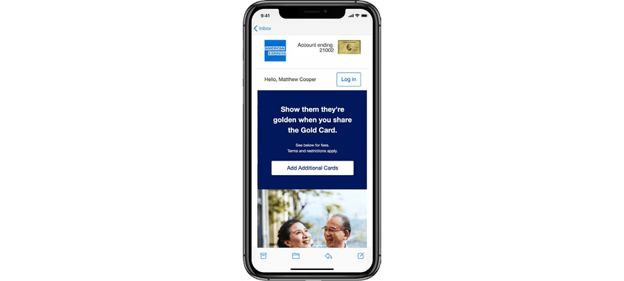
Air it out! Even if your email has lots of content, which ideally it shouldn’t, you can create space and a natural eye-friendly design low that Card Members will read.
Overview
Brevity and space work together to create emails that are easy to read, scannable, and visually inviting. In a crowded inbox and fast-paced digital environment, users don’t read—they scan. Clear, concise content and thoughtful whitespace help your message land quickly and effectively.
- Improves readability on all devices, especially mobile
- Increases engagement by focusing attention on key actions
- Reduces cognitive load, making content easier to process
- Supports accessibility, particularly for users with visual or cognitive impairments
The 3 C’s: Clear, Concise, Compelling
With users scanning rather than reading, every word and pixel counts. By embracing brevity and space, and applying the 3 C’s (Clear, Concise, and Compelling) you make your emails easier to read, more impactful, and more likely to convert.
Clear
- Use plain, straightforward language
- Eliminate jargon and ambiguity
- Structure your content logically: headline → supporting text → CTA
Concise
- Say more with less
- Trim every sentence to its essential message
- Use bullet points, short paragraphs, and scannable formats
Compelling
- Focus on the “why” for the reader—what’s the benefit?
- Use action-oriented language in CTAs
- Create urgency, relevance, or curiosity without being gimmicky
Guidelines
Content
- One message per email whenever possible
- Front-load value—lead with the most important information
- Use CTAs early and clearly—don’t bury the ask at the bottom
- Follow guidance in our 7 Top Tips for Email Copywriting 2025 PDF
Layout and Spacing
- Use ample padding between sections, text blocks, and buttons
- Avoid visual clutter—group related content, remove distractions
- Design for mobile-first, with vertically stacked, well-spaced elements
Best Practices
By designing with brevity and space, and applying the 3 C’s, your emails will be more effective, accessible, and user-friendly. Consider:
- Is the message clear and easy to understand at a glance?
- Is the language concise and free of filler or redundancy?
- Is the content compelling, with a reason to keep reading or take action?
- Is there enough whitespace for a clean and calm layout?
- Are important elements (headlines, CTAs) easy to find and/or tap?
Questions?
Connect with the DLS Team on Slack or by email.
Resources
Check out additional resources.