Above the Fold
Designing effectively for this area ensures recipients immediately understand the purpose of the email and are encouraged to keep reading or take action.
Overview
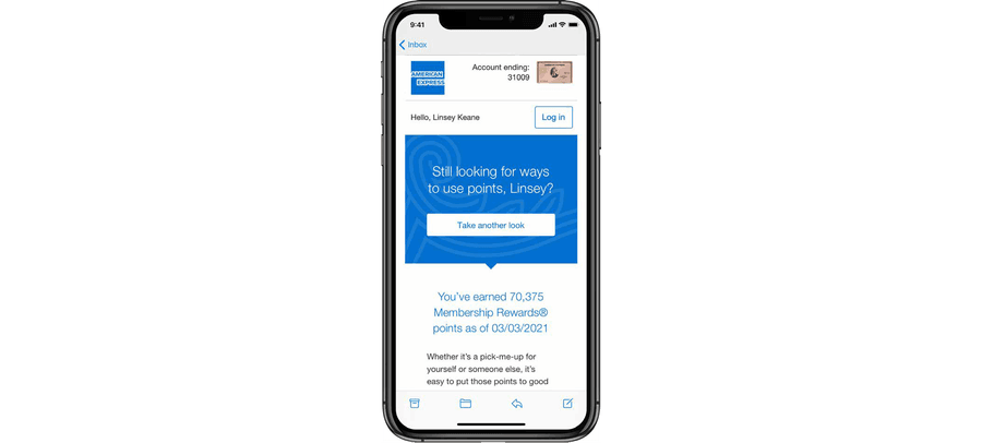
“Above the fold” refers to the portion of an email visible immediately upon opening, without scrolling—especially on mobile devices. This prime space is critical for capturing attention and communicating value quickly.
Key Goals for Above the Fold Design
- Grab attention with a compelling headline or image
- Communicate value within the first few seconds
- Provide a clear call-to-action or next step
- Ensure accessibility and readability, especially on small screens
Best Practices
Prioritize Key Content
- Lead with the most important message, offer, or update
- Avoid burying primary CTAs or value props below the scroll
Optimize for Mobile First
- Design for small screens (320-375px width) as the default
- Consider thumb-friendly placement for buttons and links
- Use responsive layouts to adapt text and images gracefully.
Use Clear Visual Hierarchy
- Headline > Supporting text > CTA
- Use spacing, size, and color contrast to guide the eye
- Avoid clutter—limit to one key message or goal
Keep It Lightweight
- Limit the number of images or media that could delay load time
- Ensure alt text is present in case images don’t render
Respect Brand and Tone
- The top of the email sets the tone—make it visually consistent with your brand
- Use brand-approved type, color, and logo positioning
What to Include Above the Fold
Do This
- Include a headline or greeting: Make it clear and engaging
- Write a primary message or offer: What’s in it for the reader?
- Consider using a CTA button or link: Should be clearly labeled and tappable
Don't Do This
- Place the CTA too far down
- Use too much padding that pushes content below the fold
- Rely on a hero image without accompanying text or alt text
- Use vague or overly general copy
Questions?
Connect with the DLS Team on Slack or by email.
Resources
Check out additional resources.