Color
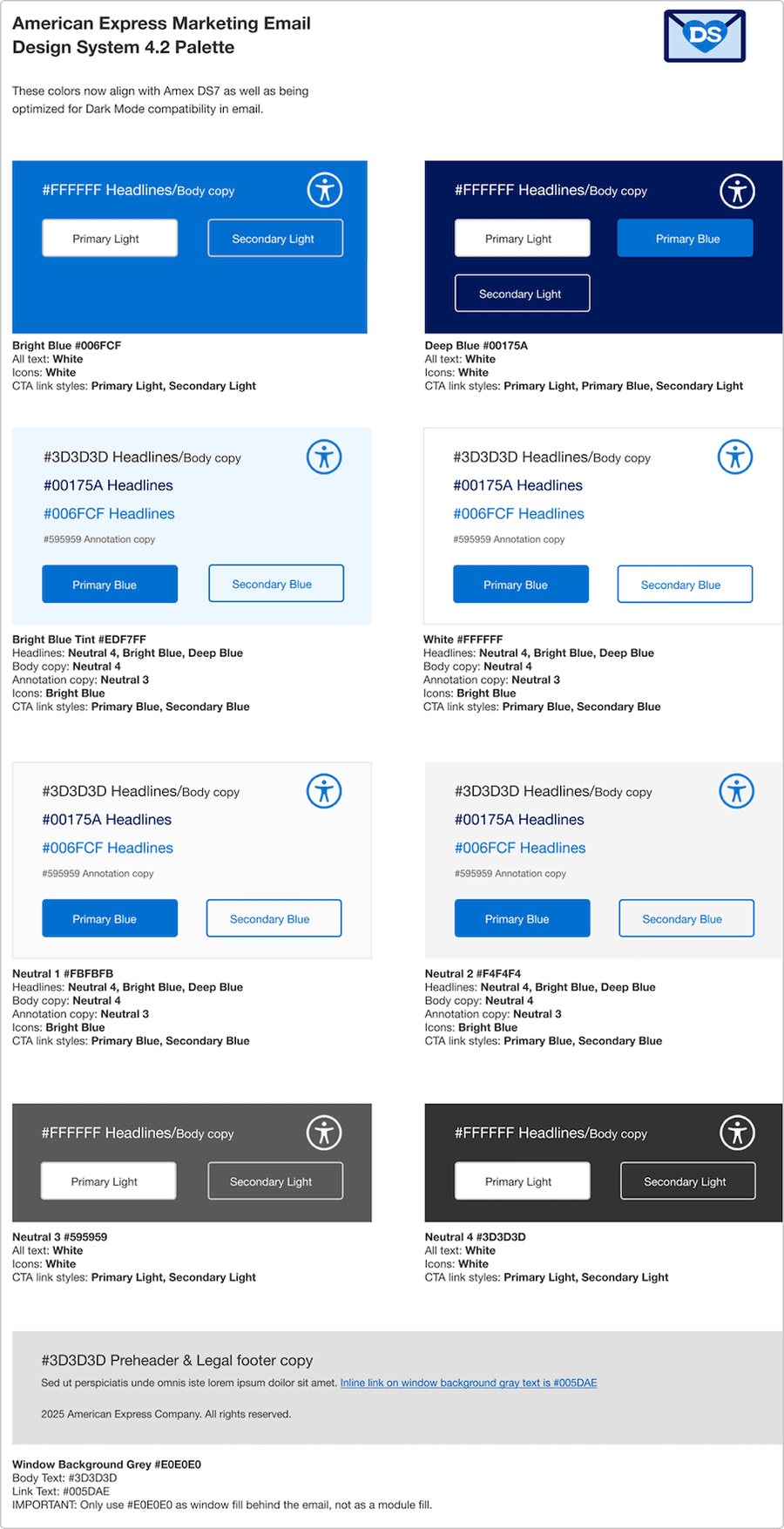
The color palette shows combinations that are optimized for email and will work in light and dark mode. Use these as the core foundations for your email colors.
Overview
Color in email design plays a vital role in brand recognition, readability, hierarchy, and emotional impact. Unlike web design, email color choices must account for limited rendering support across clients (such as Outlook) and varying user settings (such as dark mode). Our color system ensures consistency, accessibility, and performance across all email types.
- Reinforce brand identity with a consistent color palette
- Maintain high contrast for readability across devices
- Support accessibility for users with visual impairments
- Optimize for email client compatibility
Brand Palette
The brand pallet is the American Express colors you should know and recognize. The email design system palette now aligns with the web colors, and are also optimized for dark mode compatibility in email.
Blues and Neutrals
Use the Blues and Neutrals email palette. The only exceptions to this are for Co-Brand and Merchant Partner-funded emails where the partner’s palette can be used.
Due to different email rendering, especially in dark mode, we don’t use all the styles and colors that web and mobile might use, but if there is a scenario in which another product palette needs to be incorporated, agencies should test thoroughly to be sure nothing becomes inaccessible.
We can’t cover all global product variations and Brand Guidelines in the M-EDS so we supply a core set of styles, it’s them up to agencies to follow best practice with anything they need to use outside the M-EDS.
Hero Banners
The block of color onto which the headline is placed can be Bright Blue, Deep Blue or Gray. If your email is partner-funded or a Co- brand, their palette may be incorporated. Otherwise only Amex Brand colors should be used.
Content Modules
Differentiate content by adding a tinted Gray background or full color boxes if using the two Blues (tints of the Blues are not allowed except for the Bright Blue Tint in the palette), see the M-EDS in Action section for inspiration
Best Practices
- Use brand and status colors consistently
- Always check color contrast for text
- Consider color-blind users in your color choices
- Rely on color alone for critical meaning
- Use background images as color containers
- Assume colors will appear identical in every email client
- If the option selection affects the state of other checkboxes, instead use the radio button.
- If the user has an option to select only one option from the list, consider using radio button.
- If the selection options are binary I.e. on/off, consider using toggle switch.
- If there are more than five options, consider using the multi-select dropdown.
Guidelines
Use Color with Purpose
- Guide the user’s eye to important actions (for example, CTAs)
- Differentiate content sections subtly with background hues
- Avoid overusing bold or brand colors—balance is key
Prioritize Contrast and Accessibility
- Ensure minimum 4.5:1 contrast ratio for text against backgrounds
- Don’t use color as the only means of conveying information—pair with icons, labels, or patterns
Test Across Clients and Modes
- Dark mode is increasingly common—test how your color palette inverts or adapts
- Double check how background images render in Dark Mode
Email-Safe Color Use
- Stick to solid background colors. Gradients and overlays are unreliable in some clients
- Use inline styles or well-supported CSS for consistent rendering
Questions?
Connect with the DLS Team on Slack or by email.
Resources
Check out additional resources.