CTA Links
A good link hierarchy is essential to structuring how users can enage with the links that an email offers them.
Overview
CTA (Call to Action) links are the primary interaction drivers in emails. Whether they’re buttons or text links, CTAs guide the reader to act—shop, register, read more, or confirm. In email, CTAs must be clear, easy to find, and functional across all devices and email clients.
- Drive a specific user action
- Provide a clear next step
- Increase engagement and conversion
- Increase engagement by being accessible and mobile-friendly
Effective CTAs
Color
Color makes a CTA visually distinct and reinforces brand identity. It should attract attention without overwhelming the design.
- Use high-contrast colors to ensure visibility and accessibility (WCAG contrast ratio ≥ 4.5:1)
- Use hover or active states where supported
- Avoid relying solely on color to convey importance—pair with hierarchy and copy
Copy
Copy communicates the value of the action in a short, compelling way. Great CTA copy is clear, concise, and action-oriented.
- Use strong verbs: Shop Now, Get Started, Download the Guide
- Be specific: See Pricing Options, Track Your Order, Explore Paris Itinerary
- Avoid vague or passive terms: Click Here, Learn More (unless contextually appropriate)
- Align CTA language with the tone of the email and user intent
Placement
Where a CTA appears in your email affects its visibility and effectiveness.
- Place primary CTAs “above the fold” so they’re seen without scrolling
- Repeat primary CTAs toward the end in longer emails (but don’t overwhelm with too many)
- Use secondary CTAs sparingly to avoid distracting from the main action
- Allow enough white space around CTAs to avoid crowding and increase tap-ability on mobile
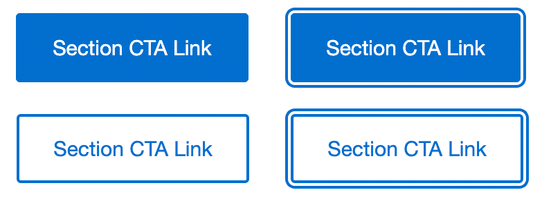
Types of CTA Links
Within the email system designs there is:
- Primary CTA Button for the main action you want a Card Member to take
- Secondary CTA Button should be used for less important messageso take
- Tertiary Button link to non-key informations important messages
Note: No arrows or other graphical elements should be included.
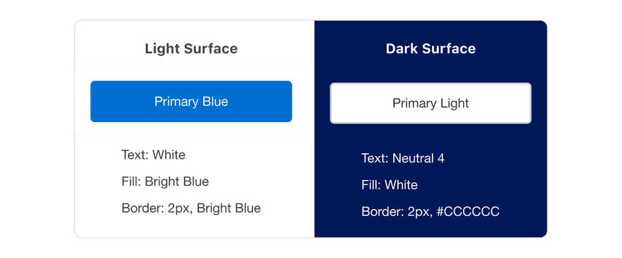
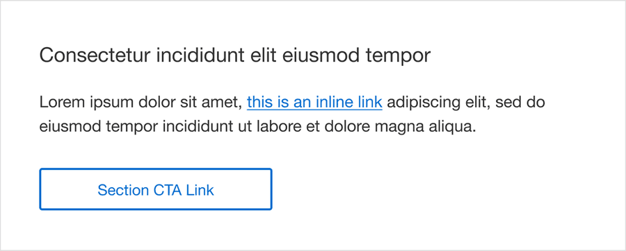
Primary CTA (Button Style)
Filled button. Used in Hero Banners and main feature content. Can be blue or reversed out.
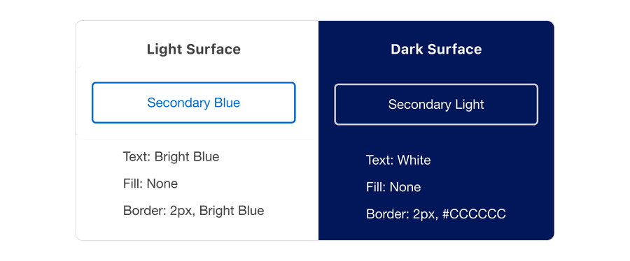
Secondary CTA (Button Style)
Outlined button. Used for lower priority content. Do not fill in, outline only.
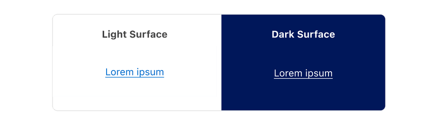
Tertiary Button Link (Inline Text Link)
Text with underline to be used in Body modules, Text only in Footer modules.
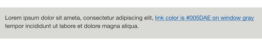
Link Color
For consistency, use the default link color of #006FCF. One exception is for links on the on the Window Background Gray (#E0E0E0) in the Preheader and Terms and Conditions sections which should be #005DAE for accessible contrast.
Underlining Links
Depending on the type of link being used, the link might need an underline. Through extensive research and our partnership with Deque, the Amex Design System Team recommends underlining inline links within blocks of text as color contrast is not sufficient alone to distinguish a link from adjacent text. This is also a very long-established visual affordance pattern used throughout the internet and one we have followed in the default module content in the M-EDS. Please note, links in areas such as the footer navigation bar do not need an underline as they are standalone elements, not in a block of body text.
CTAs Specs
Only the CTA designs used in the M-EDS are allowed and align with those in other Amex digital journeys. Do not amend with other design elements or styles.
| Description | Specification |
|---|---|
| Height | 44px (ensure this is minimum touch target size) |
| Default Width | 230px |
| Max Width | 260px |
| Font | Helvetica Neue Regular 15px |
| Case | Use Title Case in alignment with Amex cross-channel digital experiences. As a rule, capitalize all words except for conjunctions, prepositions, articles, or words three letters or less. |
| Graphics | Do not include graphics such as glyph arrows after the copy |
| Character Count | Approx 22 including spaces |
Accessibility Checklist
Color
- Ensure a minimum contrast ratio of 4.5:1
- Include meaningful link text (no “Read more” without context)
- Make the clickable area large enough for touch (min. 44px height)
Live Text
Some email clients automatically block images until the reader downloads them, therefore it is important that CTA Links are ‘Live Text’ as opposed to being images which will not be displayed when images are disabled. The good news is that the M-EDS has been coded with this in mind.
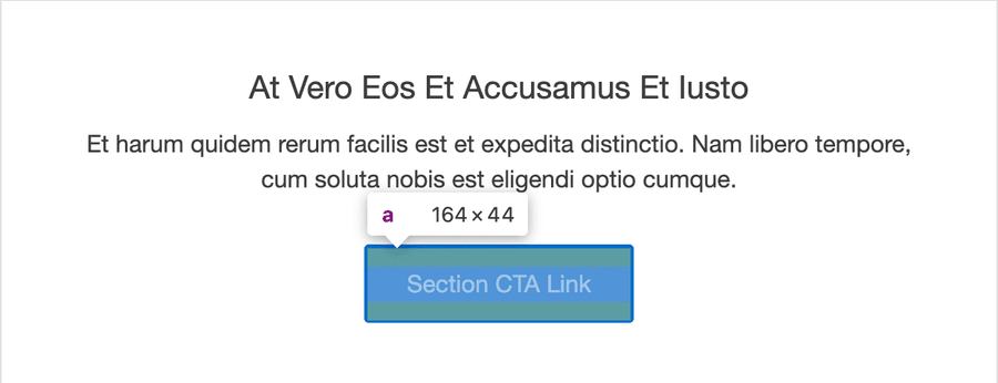
Touch Target
As designated by WCAG Success Criterion 2.5.5: Target Size (Level AAA), the touch target size of all CTA links and any clickable graphics (e.g. App store badges) must be a minimum of 44px in each dimension. All instances of this issue that were found in the audit of version 4.1 have been fixed in 4.2. Please note, touch target is the active area of an element, not just the button dimensions, as shown on the screenshot below where the CTA link size is viewed using the inspect element function.
Semantic Structures
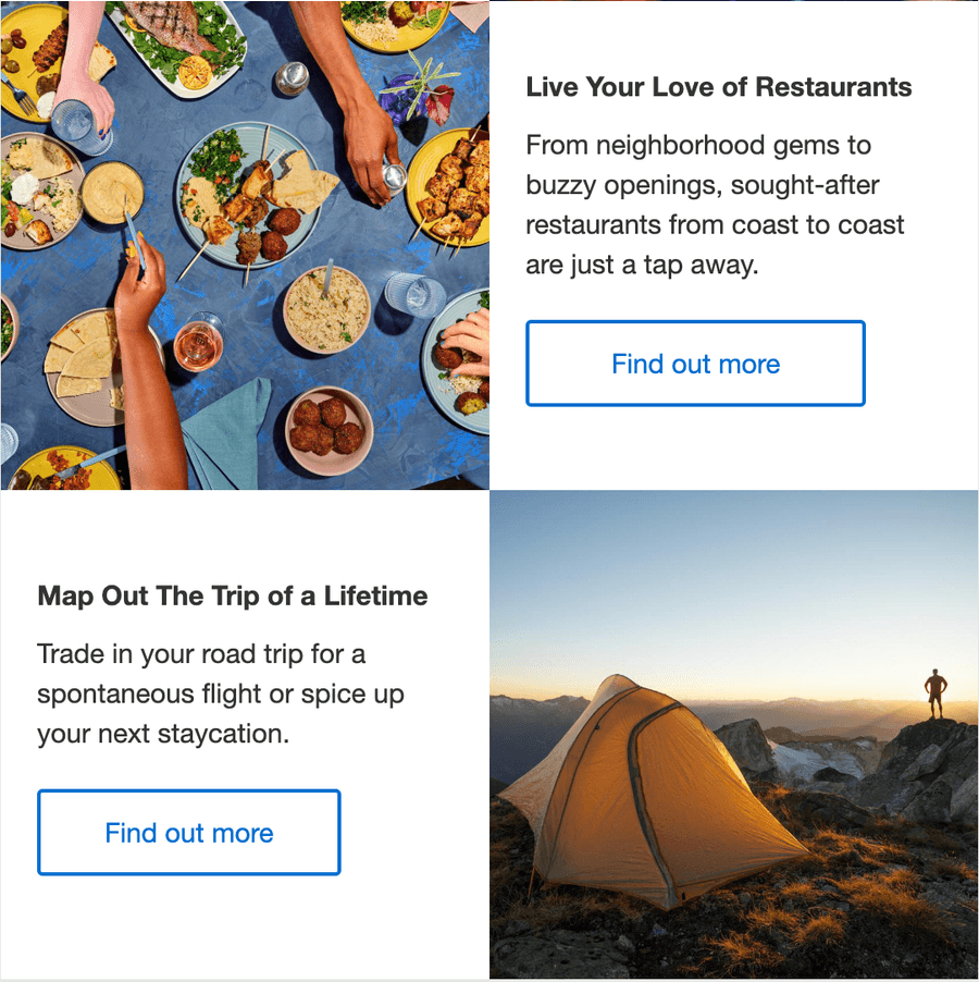
Ensure the mentioned link visually conveys that it belongs to a specific section or element. This information is conveyed through the relationship between the section heading and the CTA link to visual users, however it is not conveyed to screen reader users. This means we should not use CTA links with the same call to action text in the same content group and absolutely avoid generic text on CTA links such as ‘Find out more’.
Focus
Visual focus indicators
When navigating pages or content, visual focus indicators are required so the currently focused element can be identified. Focus has been amended in M-EDS 4.2 to match the Amex DS7 web style so it has the sufficient 3:1 contrast needed for WCAG SC 1.4.11 Non-text Contrast Success Criterion. Note that focus is not supported in all email clients, but advice for email developers is to ensure that the focus is working when using a keyboard or mouse to test the email in a browser.
Actions performed by keyboard alone
When navigating through the email when viewed in a web browser using the “Tab” or “Shift + Tab” keys, the specified elements must receive keyboard focus. If not, users who rely entirely on the keyboard, particularly those with motor disabilities and visual impairments, cannot interact with or operate the control.
The amends made to M-EDS 4.2 have addressed theses issues, as well as removing focus from some hidden elements in the kinetic elements that should not receive it.
The default exterior focus outline is shown when applied to Primary and Secondary CTA Links.
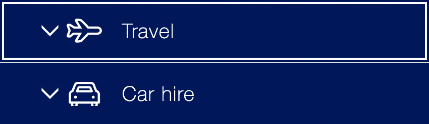
The default interior focus outline is shown when applied to the interactive header bars in the KT03 Accordion Module.
Interactive
As of v.4.0, M-EDS buttons were embedded with hover interactivity. This means on desktop (most web client and consumer email applications), the shade of the button will darken upon hover, bringing customer experience across web and email one step closer together.
Questions?
Connect with the DLS Team on Slack or by email.
Resources
Check out additional resources.