Dark Mode
Dark Mode is often promoted as an accessibility setting that promises to be easier on the eyes and save battery life, but for email it comes with a set of challenges due to variations in Dark Mode across different devices and email clients.
Overview
For email designers and developers, Dark Mode means new, countless ways that emails can render, as different applications and operating systems apply Dark Mode differently and Dark Mode should no longer be regarded as a niche feature.
While exact figures are nearly impossible to obtain, estimates currently range between 25% to 40%, with email testing specialists Litmus estimating that around 40% of all emails are viewed in Dark Mode.
Version 4.1 of the M-EDS introduced new guidelines for Dark Mode and how it affects email rendering. Extensive research was carried out and the learnings are included in the sections below which offer a full breakdown of how Dark Mode affects M-EDS email and a wide range of best practice guidance. Solving for Dark Mode is still very much a work in progress and needs regular monitoring to check for updates and changes.
Dark Text
Dark text on Gmail Android and on Windows webmail is lightened while lighter backgrounds are made darker.
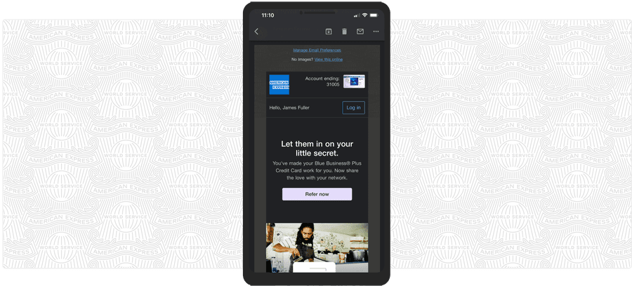
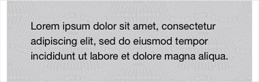
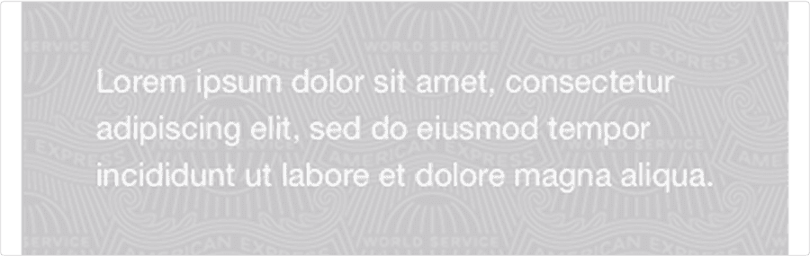
In the example below, the old Amex M-EDS palette Grey 03 #C8C9C7 (21% black) background does not change so lightened text is illegible.
Ensure no background tint darker than 20% gray is used behind text as it will not be darkened, making the lightened text illegible.
The recommended neutrals in the latest version of the Amex M-EDS palette are all tested for light and dark mode use. This rule also applies to the Amex DLS palette Accent Blue (#66A9E2) has been removed as it should never be used as a surface behind any color text.
Outlook Clients
Outlook clients darken lighter text and lighten dark backgrounds.
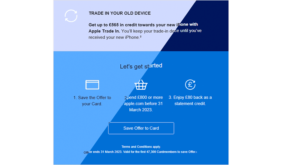
There are significant changes to brand colors in Outlook Office 365 Windows 10: Top block is Deep Blue and lower one is Bright Blue. The text has been inverted so it is still legible. Right side of diagonal shows original for reference.
No action needed. While some odd changes are imposed on background colors, Outlook does not cause legibility issues as a result of these.
Gmail on Android
Gmail on Android does not just lighten black and grey text it also lightens Bright Blue and Deep Blue, which become #5A9DFF and #FFFFFF respectively when used for text.

On Gmail Android, Bright Blue (left) becomes #5A9DFF (right) - about 12% lighter
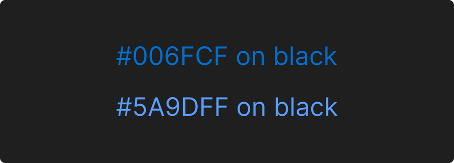
#5A9DFF is brighter on dark backgrounds than the original #006FCF value
None. The change to Bright Blue is helpful as the changed color is accessible on all the dark grey tones that our neutral surfaces become in Gmail.
#5A9DFF is brighter on dark backgrounds than the original #006FCF value.
CTA Links
Primary CTA
Some CTA and background combinations are rendering at sub-optimal legibility in dark mode.
A white Primary CTA will invert to black in Gmail and be hard to see on an unchanged Deep Blue Background.
A 2px #CCCCCC border can be added to improve the contrast with background in dark mode.
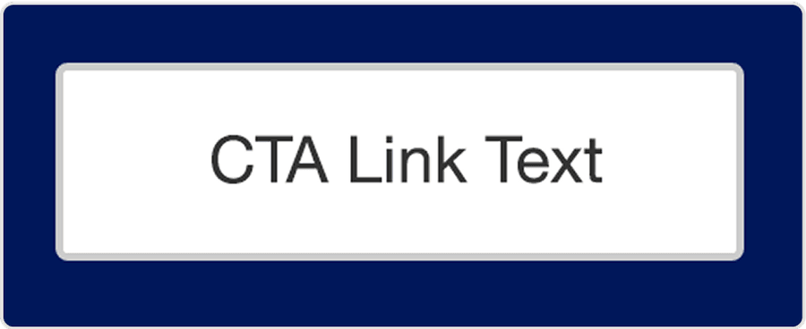
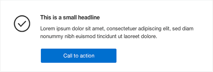
Light mode
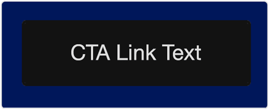
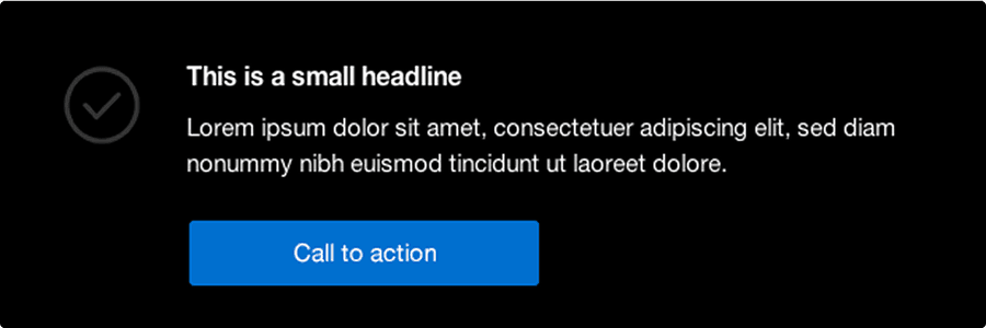
Dark mode without border
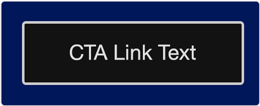
Dark mode with border
Secondary CTA
A Secondary CTA with a white border will become harder to read on a Deep Blue background as the Deep Blue will not be darkened in Gmail but the white border will be.
Amend white border to be 2px #CCCCCC (does not get changed) for improved legibility on backgrounds in both Light and Dark mode.
Light Mode with #CCCCCC border
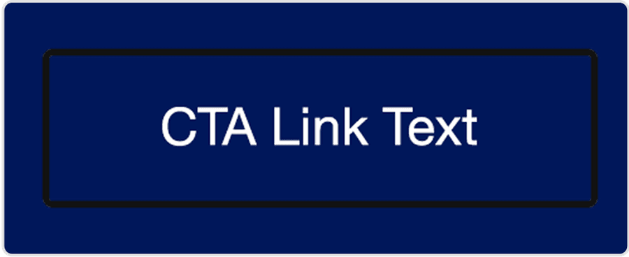
Dark mode with #000 border color
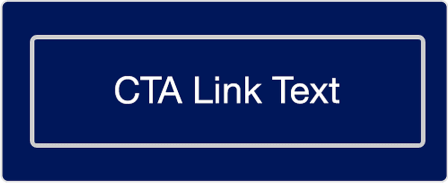
Dark mode with #CCCCCC border
CTA Borders
The 1px Bright Blue border of secondary CTAs on light backgrounds does not have good contrast when the background is darkened in Gmail.
The Bright Blue border should be thickened to 2px for improved legibility on dark backgrounds. Thicker border (right) aids legibility when background is darkened.
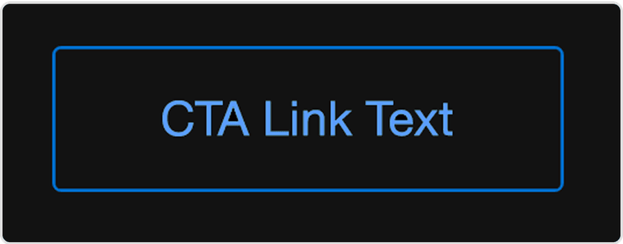
1px border is hard to see on dark background
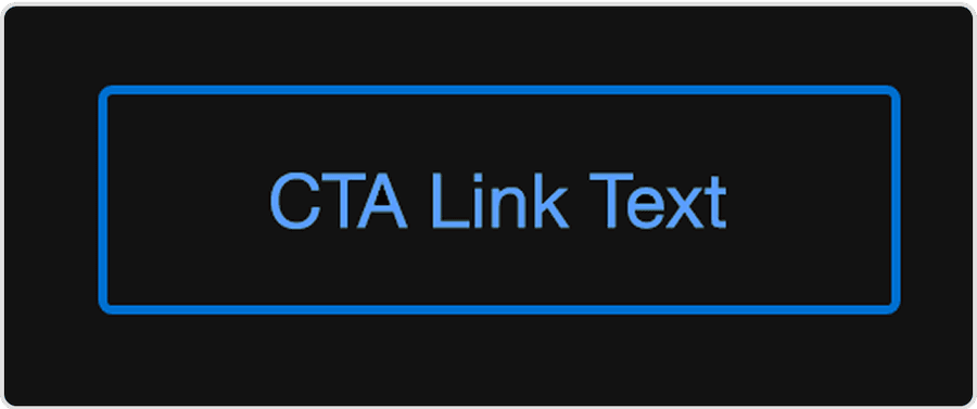
Thicker border aids legibility on dark background
Background Patterns & Graphics
An opaque background image will mask a ‘live’ background that dark mode has darkened, rendering the lightened text on top illegible.
Use transparent PNGs for backgrounds so the darkened background tint can show through and allow legibility of lightened text.
In Light Mode, an opaque background image works with dark text on top.
But in Dark Mode the opaque background image masks the darkened background so the lightened text is illegible.
Using a transparent PNG background fixes this.
Icons
Some icon colors such as Neutral 4 (#3D3D3D) for example, will look fine on a lighter background but be illegible when that background is darkened.
Use only Bright Blue icons on lighter backgrounds and White on darker ones.
A dark grey icon on white is fine in Light Mode.
But illegible in Dark Mode
Bright Blue will work better in both.
Logos & Wordmarks
Transparent PNG logos or Card art that feature dark gray or black elements can become illegible when the background is darkened.
If a version of the logo that works on both light and dark modes is not available, place it on an opaque background that matches the background tint of the surface it sits on (be mindful of good cropping and not infringing partner logo Brand Guidelines). This will result in the content sitting in a box in dark mode, but legibility of the content is more important. For elements such as Card art, an outline can be added to separate the image from the darkened background.
Logos
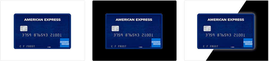
The example below shows an illegible transparent PNG on left, a tightly cropped opaque logo in centre and a slightly better cropped one on right. This is not ideal, but is the only solution for keeping dark logos legible in dark mode.

Card Art
A dark-colored Card is lost on black, but adding a white outer glow or outline will separate it from the dark background but will not be visible on a white background in Light Mode.
Working with Dark Mode
You Cannot Control All Dark Modes
Don’t think it terms of fixing dark mode, work with it. We are not trying to prevent dark mode from being applied, nor are we attempting to force any behaviors on it via code adaptations. This would lead to an overcomplicated and hard to manage workflow for M-EDS users. There are code hacks available that will stop dark mode being applied such as the one for Gmail that stops text from darkening by specifying a gradient fill. This hack it does not work in Outlook though so a better approach is to make sure the initial color combinations work everywhere in light and dark mode.
The plan in the Design System Team at Amex is to continue to work with dark mode by creating dark mode compatible content, check for updates to dark mode and to test all emails on inbox previewers.
Use Progressive Enhancement
Our emails focus primarily on simplicity, legibility and accessibility across all clients. Following from there, various enhancements such as hover states, animation and even interactive elements can be supported where possible.
Dark mode needs to be catered for at the basic end of the scale to ensure good rendering everywhere. Follow the recommendations in this document, especially the color combinations, to ensure your emails are all legible and accessible in dark mode and then add more features where possible.
Dark Mode & the Amex Email Design Systems
Following research we have defined set background and foreground color combinations as well as CTA styles and a checklist of element use so that the editable elements used to make Amex emails can be optimized for dark mode by M-EDS users.
Going forward, the next iteration of the American Express Email Design Systems will incorporate the dark mode styles that are used in web and mobile.
Dark Mode Checklist
We are working with M-EDS users to raise awareness of dark mode and define the rollout of a fully dark mode compatible system. The principles below, were integrated into M-EDS 4.1+:
| Description | Action |
|---|---|
| Text, background and icon colors | Use the recommended combinations in our updated M-EDS palette and style guide below |
| CTA links | Use CTA styles that follow the Dark Mode optimized ones in the updated M-EDS palette |
| Background patterns | Use transparent PNGs, never opaque |
| Text over images | Test thoroughly and remember an alternate version can be loaded for Outlook clients |
| Logos/wordmarks | Check if an image that works in both modes is available image as a transparent PNG - if not create an appropriately cropped image with a tinted background. |
Questions?
Connect with the DLS Team on Slack or by email.
Resources
Check out additional resources.