Interactive/Kinetic Emails
Interactive email modules (also known as kinetic modules) are a great way to enhance the Cardmember experience of Amex emails and add a premium quality that helps to drive engagement.
Overview
Kinetic emails are interactive HTML emails that allow users to engage with content directly within the inbox - letting user swipe, click or expand content without needing to click through to a browser. These modules create an app-like experience that increases engagement and reduces scroll fatigue.
- Increases click-through rates and dwell time
- Allows more information to be shown above the fold and decrease the overall length of the email
Clients That Support It
Always include fallback content for unsupported clients.
| Client | Support Level |
|---|---|
| Apple Mail (macOS/iOS) | Full support |
| Outlook (Windows) | No support |
| Gmail (Web/Mobile) | Limited |
| Yahoo Mail | Partial |
| Samsung Email (Android) | Partial |
Types of Modules
KT01 - Carousel
The KT01 Carousel let users browse through a rotating set of featured content (e.g., products, stories, images) horizontally within a single module.
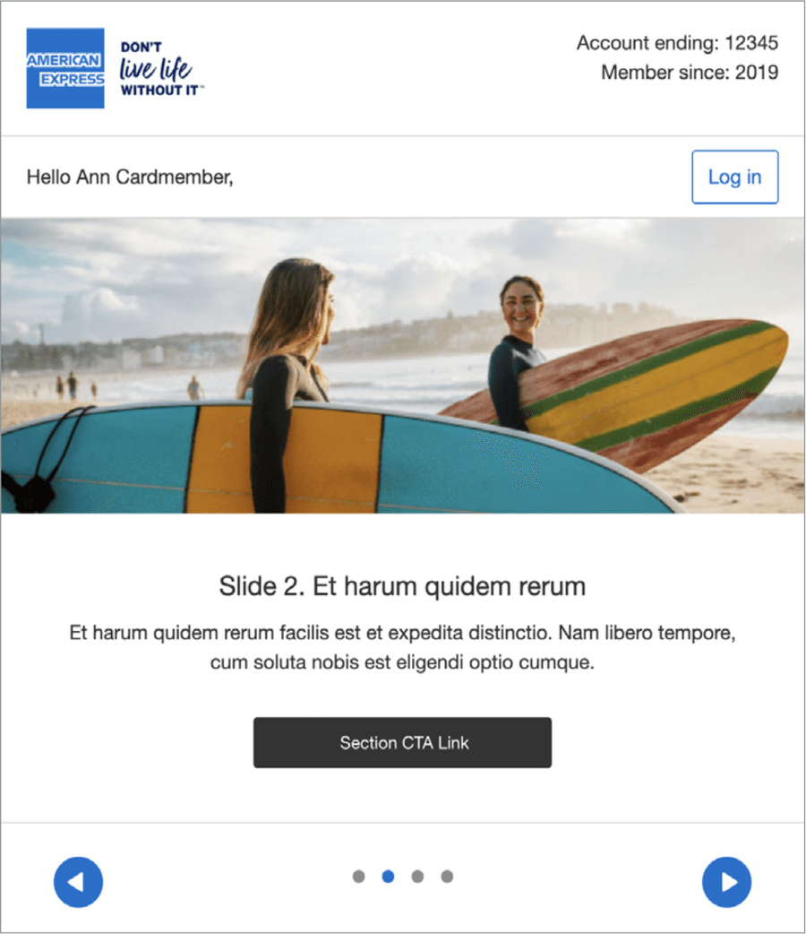
- Use a strong first frame
- Provide clear left/right navigation controls
- Device test for Apple Mail rendering and fallback states as inbox previewers such as Email on Acid will not preview kinetic thoroughly
- Optimize for mobile with large tap areas
- Depend on users interacting to see critical content
- Use large, uncompressed images
- Use more than one carousel in an email
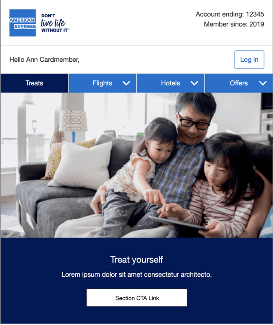
The KT01 Carousel displays all the slides stacked vertically in fallback mode.
As this module allows a different set of modules to be used for the fallback, it is possible to use modules that take up less space - for example the full width HB15 module shown in the above example could be replaced by an IM02 module which sit image and text side by side on desktop view.
Alternatively, only the top image could be used in the full width layout with the subsequent ones in a more concise format.
KT02 - Tabbed Carousel
The KT02-Tabbed Carousel enable users to switch between related content areas—like feature tiers, categories, or menu items—by clicking tabs.
The color of the tabs can be adapted and any of the M-EDS modules can be placed in the area that is changed by using the tabs – in the example on the right IM01 is shown below the Tabbed Carousel navigation.
The tabs change color, showing the user which slide they are on. The arrow glyph can be changed for another glyph such as a plus sign. On mobile, the tabs stack vertically.
- Use clear tab labels that match the content
- Design consistent layout across all tab states
- Test tab interaction on mobile devices
- Ensure the first tab reveals key information
- Use vague or icon-only labels without context
- Vary tab panel heights dramatically
- Rely on hover-only tab states (they fail on touch devices)
- Hide all important messaging inside a tab
The KT02 Tabbed Carousel displays all the slides stacked vertically. As with KT01, a different set of modules can be used in the fall back version, so modules that take up less vertical space can be used to save the user from excessive scrolling to view all the content.
KT03 - Accordion
Allow users to expand/collapse sections—ideal for FAQs, multi-topic newsletters, or progressive content reveals.
Of the three interactive modules available, this one works better as a body module lower down the email, rather than as Hero Banner content at the top of the email.
- Use accordions to reduce scroll in long-form content
- Use strong visual cues for expandable areas
- Keep content under each panel short and focused
- Use fallback view with all sections expanded
- Put essential CTAs inside collapsed sections only
- Hide the accordion without an alternate display option
- Stack more than 4-5 panels in one accordion
- Assume collapsing works on all clients
The KT03- Accordion version just shows all content areas expanded.The header bars are still visible but not selectable as in the interactive version.
Unlike the other two interactive modules, there is no separate fallback content specified in this module.
Questions?
Connect with the DLS Team on Slack or by email.
Resources
Check out additional resources.