Color
The American Express color palette showcases the strength of our brand and helps define communication. The design system’s colors and color design tokens make it easier to create consistent and accessible experiences across products.
Enterprise Colors
The brand palette is the American Express colors you know and recognize. They are used across both digital, print and our logo. The colors should be used sparingly and with purpose. For additional guidance, refer to the component specific guidelines.
We strive to make all our experiences accessible, follow the text and graphics color guidance using surfaces to ensure passing AA contrast. Please also refer to brand guidelines for more information regarding our use of color.
The Design System uses many more colors than the ones shown on this page. For a full list of how colors are used within the system including sematic colors, surfaces, and dark mode refer to the color tokens.
What’s New
- Introducing new naming convention of our color palette.
- All colors are now tokens.
- Updated gray color palette.
- Updated status color palette to meet accessibility standards.
Brand Palette
The brand palette is the American Express colors you should know and recognize. The brand colors are same used across both digital and print and our logo. The colors should be using sparingly and with purpose. For additional guidance, refer to the component specific guidelines.
Brand
| Color | Use Cases | Hex/Token |
|---|---|---|
Bright Blue | Primary Interaction. Bright blue is the main brand color used for primary actions, brand logo, taglines, and brand typography. It is one color that must be used in every communication to guide users in their journey. | #006FCF |
Deep Blue | Use deep blue to emphasize brand in headlines, graphics, and backgrounds. | #00175A |
Light Blue | Light blue should only be used as an accent color – as a guideline aim to use on no more than 20% of a communication. | #66A9E2 |
Brand Neutrals
| Color | Use Cases | Hex/Token |
|---|---|---|
White | Backgrounds and text color on darker background. | #FFFFFF |
Black | High contrast situations | #000000 |
Gray | Use for brand purposes only, not part of the design system colour palette | #A7A8AA |
System Colors
Understanding System Colors
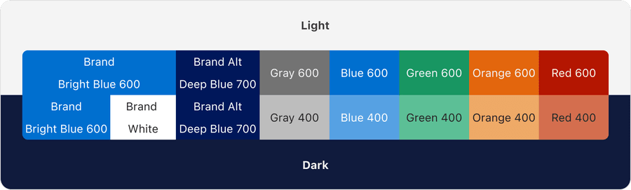
The system colors are based off our brand colors bright blue (brand) and deep blue (brand alt) and additional 5 colors, gray, blue, green, orange, and red. Although our brand color is blue, there is a separation between using brand and using blue in tokens to allow for theming.

Each color has it’s own palette that ranges from 100-900. Each color has been calculated by standardizing brightness across hues using the color model HSB. Each number is within the same brightness range, no matter the hue.
The full list colors and palettes can be found in our primitive tokens.


Standardizing colors allows us to be confident that our system is accessible. For example, there will aways been at least a 4.5:1 contrast between any 100 as a background and any 700 as a text color. Find out more about color accessibility.
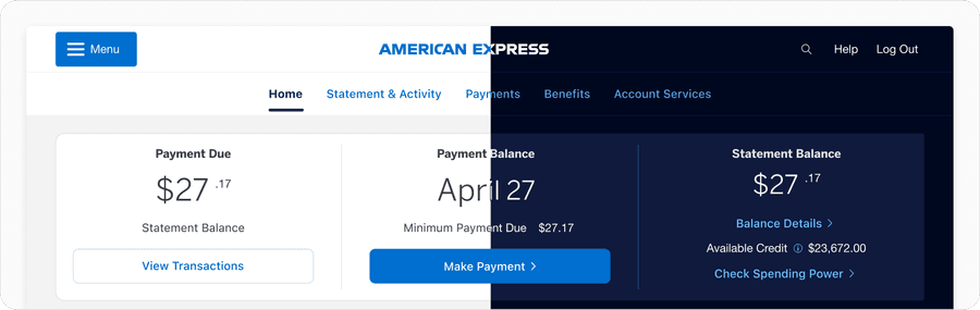
Dark Mode
The system carefully pairs colors from each palette for light and dark mode. The system respects brand colors but provides dark mode options for blue for use cases such as links where higher contrast is needed. Find out more in Dark Mode docs.
Solid Colors, Tints, and Shades
Solid colors have high saturation and are found in the primitive color palettes. Solid colors are used for the majority of default states and non-interactive components of a page.
Tints and shades mimic the layering of a white (tint) or black (shade) layer with a percentage opacity on top of a solid color. These colors are used to create elevation in dark mode and subtle state color changes for hover and pressed on our surface colors.
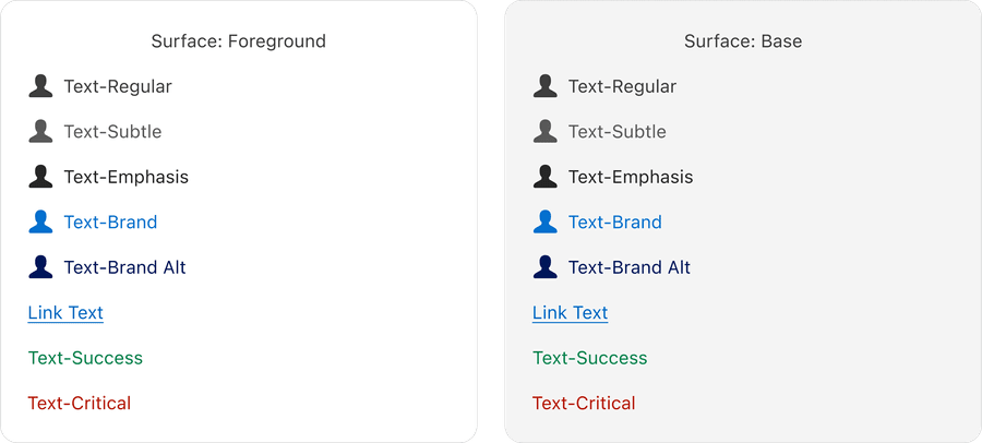
Surface and Color Accessibility
The system uses on surface tokens for text and graphics that change color based on their surface to ensure there is alway enough contrast between background and foreground elements. Find out more in Surface docs.
Updates
| Version | ChangeDate | Link |
|---|---|---|
| v7.0 | August 19th, 2024 | v7.0 Release notes |
Questions?
Connect with the DLS Team on Slack or by email.
Resources
Check out additional resources.