Color
The American Express color palette showcases the strength of our brand and helps define communication. The design system’s colors and color design tokens make it easier to create consistent and accessible experiences across products.
On this page
Best Practices
- To maintain the brand’s identity
- Tokens with the appropriate semantic name for example ‘text-regular’ for body text
- Sparingly within page to help users stay focused
- To apply emphasize information
- To create depth and visual hierarchy
- Combinations that meet or exceed accessibility standards
- If they are not offered in the Amex design system
- As the only way to show information
- Tokens from primitives, use the appropriate semantically name color token
- To introduce a new hex value
Using Colors
Semantic Colors
Colors are used along with text and symbols in a variety of ways to communicate meaning to our customers.
Use this table as a guide for when to use colors in products and system components. The names can also be found in Design Tokens.
| Color | Use Cases | Hex/Token |
|---|---|---|
Information | Used for notifications and icons. | #006FCF |
Neutral | Used for notifications and icons | #737373 |
Success | Used for notifications, status, validation and icons | #00804A |
Caution | Used for notifications, status, validation and icons | #B5530D |
Critical | Used for notifications, status, validation and icons | #B41601 |
- Reference this table when choosing color for:
- Actions in components such as brand buttons or menu
- Notifications
- Status in components such as badges
- Selection in components such as checkboxes
- Icons
- Validation in text inputs
- When using color for semantics, remember to provide additional ways to inform the user such as text or graphics Success Criterion 1.4.1: Use of Color | WAI | W3C
- Changing colors specified within the design system components, or using them for different use cases
- Use color as the only form of showing information
- When colors are representing a state, it’s an important visual indicator to our customers that is defined in a cohesive way across our system.
- For people with color vision deficiency, it can be hard to distinguish the difference between colors, usually, red, yellow, and green. Color should not be used as the only visual means of conveying information, indicating an action, prompting a response, or distinguishing a visual element. WCAG 2.1 Understanding 1.4.1
- Changing color may cause contrast issues. You need at 4.5:1 contrast for body text and 3:1 for graphics. Here’s our blog post on color accessibility which covers testing contrast.
Choosing Color Tokens
Tokens act as a single source of truth. Utilizing a token library within the design system allows color updates to propagate throughout the system, product, and enterprise. For example, we use component token ‘card-border’ in place of hex codes or the primitive tokens ‘Gray 300’. If any of our colors were to change, even slightly, updating the token HEX code would allow that change to be seen system-wide. This also allows us to handle light and dark mode without changing anything in the card component. This increases product scalability at a faster rate.
Find out more about tokens in our token documenation.
- Use the semantically correct token. For example, ‘card border’ for a card’s border or ‘Surface-background’ for page or section backgrounds
- In Figma use variable to set surface and light or dark mode
- Using primitive colors. Primitives do not have mode or surface, color pairings, and will not update when you change mode or surface
- Using hex codes, you will loose system updates to color and will not get modes or surface changes
- Change color tokens in components
Using Color Tokens in Figma
Tokens can be found in the foundations library or component library. Use variable to set surface and mode (light or dark).
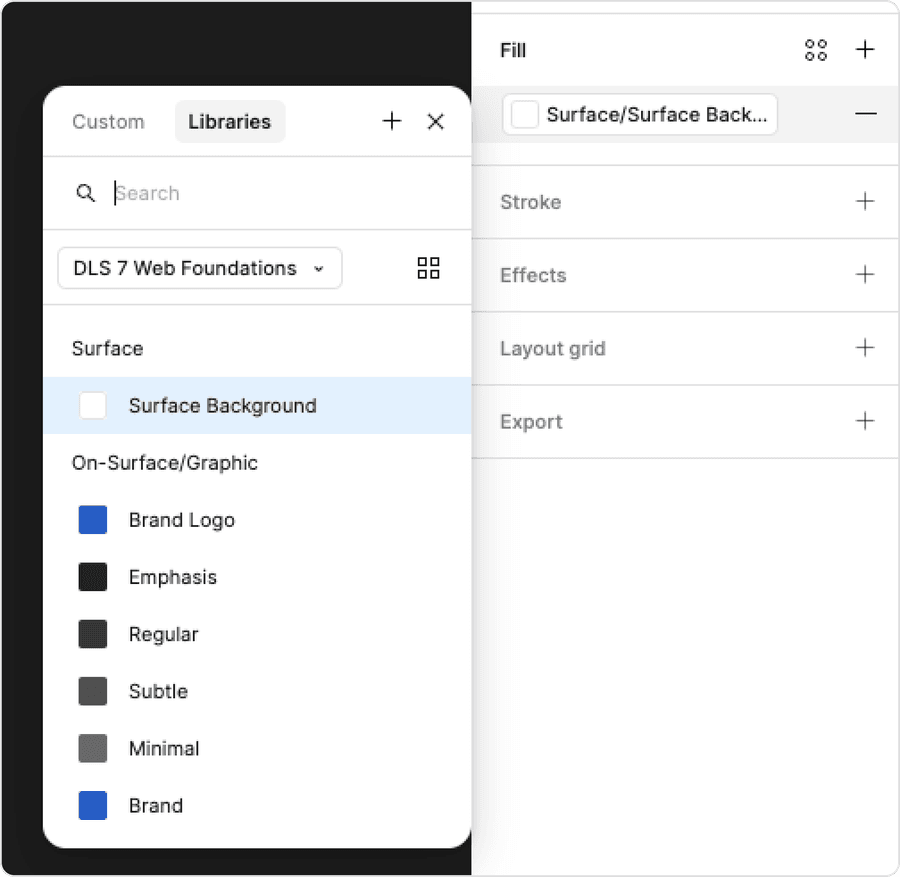
- Use Figma color variables to find out design tokens. Tokens can be found in the foundations library or component library
- Use the semantically correct token, for example ‘card border’ for a card’s border or ‘Surface-background’ for page or section backgrounds
- Use color styles if there are available variables
- Use primitive colors. Primitives do not have mode or surface, color pairings, and will not update when you change mode or surface variables
- Use hex codes or color styles, you will loose system updates to color and will not get modes or surface changes
Questions?
Connect with the DLS Team on Slack or by email.
Resources
Check out additional resources.