Color
The American Express color palette showcases the strength of our brand and helps define communication. The design system’s colors and color design tokens make it easier to create consistent and accessible experiences across products.
Make it Accessible
When the colors in the system are applied, it will be in compliance with color accessibility standards. We support Web Content Accessibility Guidelines 2.1
Tips:
- The visual presentation of text and images of text must have a contrast ratio of at least 4.5:1, with a 3:1 ratio for large-scale text.
- Interactive elements must have a 3:1 ratio with their background.
- Do not rely on color as the only way to communicate information.
To learn more about color accessibility read our blog.
Interaction and Style
Relevant WCAG Requirements:
Sensory Characteristics
Instructions provided for understanding and operating content do not rely solely on sensory characteristics of components such as shape, color, size, visual location, orientation, or sound.
Use of Color
Color is not used as the only visual means of conveying information, indicating an action, prompting a response, or distinguishing a visual element.
Contrast (Minimum)
The visual presentation of text and images of text has a contrast ratio of at least 4.5:1, except for the following:
- Large Text: Large-scale text and images of large-scale text have a contrast ratio of at least 3:1;
- Incidental: Text or images of text that are part of an inactive user interface component, that are pure decoration, that are not visible to anyone, or that are part of a picture that contains significant other visual content, have no contrast requirement.
- Logotypes: Text that is part of a logo or brand name has no contrast requirement.
Non-text Contrast
The visual presentation of the following have a contrast ratio of at least 3:1 against adjacent color(s):
- User Interface Components: Visual information required to identify user interface components and states, except for inactive components or where the appearance of the component is determined by the user agent and not modified by the author;
- Graphical Objects: Parts of graphics required to understand the content, except when a particular presentation of graphics is essential to the information being conveyed.
Focus Visible
Any keyboard operable user interface has a mode of operation where the keyboard focus indicator is visible.
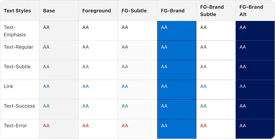
Accessibility Chart
The color accessibility chart follows the WCAG 2.1, which are a series of guidelines for making the web accessible. American Express requires products to follow the minimum contrast ratio of AA to be compliant with accessibility best practices. Level AA requires a contrast ratio of at least 4.5:1 for normal text and 3.1 for large text. Large text is 150% of the user’s default font size or 120% user’s default font size and bold.
Use a combination of icon, color and text to convey meaning, (not just one by itself) and be consistent. Provide multiple indicators so that customers who cannot easily distinguish colors can still understand and use our products.
Questions?
Connect with the DLS Team on Slack or by email.
Resources
Check out additional resources.