Light & Dark Mode
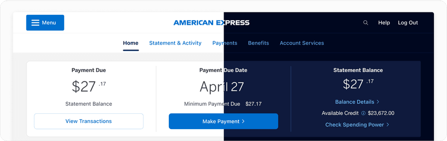
Dark mode is a theme that you can apply to our color palette that displays content on darker surfaces, creating a low-light UI environment.
Dark Mode Colors
The American Express color palette consists of a primary and neutrals palette. In designing for dark mode, we have modified our palette to adjust to being shown on darker surfaces. Our dark mode color palette allows for American Express’s primary color palette to remain accessible on dark backgrounds. As we strive to make all our experiences accessible, follow the text color guidance on palette swatches to ensure passing AA contrast.
Please also refer to brand guidelines for more information regarding our use of color.
Why Design For Dark Mode vs. Light Mode?
With increasing popularity, offering dark mode has become an industry standard. Many users prefer its lower light UI as it’s less harsh on the users’ eyes. Dark mode reduces light emitted from device screens, while still maintaining accessible contrast standards.
Using dark mode comes down to user preference, but it also increases inclusivity for users with light sensitivity or those who are visually impaired.
Designing For Modes
When designing for light and dark mode, several factors come into play.
Blue Light & Melatonin: Light mode emits blue light, which can disrupt melatonin secretion, affecting sleep patterns, making dark mode preferable for night-time usage.
Halation Effect: Additionally, light mode may contribute to glare, particularly in bright environments, while dark mode reduces the halation effect, offering a more comfortable viewing experience in dimly lit settings. The halation effect refers to the phenomenon where light scatters in the eye’s lens, creating a halo around bright objects on a dark background, potentially causing visual discomfort or strain.
Accessibility: From an accessibility standpoint, light mode provides better text contrast, aiding readability, whereas dark mode may benefit users sensitive to certain types of light, such as those with Irlen Syndrome.
Energy Saving: Energy efficiency varies, with light mode being more energy-efficient on LCD screens, while dark mode is favored on OLED screens, leading to battery savings.
User Preference: User preferences also play a significant role, with light mode often preferred for reading tasks and dark mode for video streaming in low-light conditions.
Business Impact: From a business perspective, the choice between light and dark mode can impact brand perception, with dark mode potentially increasing user engagement, as seen with platforms like Facebook and Instagram.
Design Considerations for Dark Mode: Design considerations for dark mode include ensuring adequate text contrast, using less saturated colors, optimizing for accessibility, and offering users the choice between light and dark mode to accommodate personal preferences and needs.
Overall, designers must carefully weigh the advantages and disadvantages of each mode to optimize the user experience effectively.
Setting Up Light and Dark Mode
Light and dark mode are calculated based on the surface that is set to the container, like a parent frame in Figma or a parent html element, like a div, in an application. All content within that container will also be self aware of the surface color that is applied. When you toggle between light and dark mode, all surfaces and content will update automatically within Figma. Each container can be set independently or inherit from its parent container.
Learn more about surfaces
Resources
NN/g (Nielsen Norman Group)
Dark Mode vs. Light Mode: Which is Better?
Fast Company
Dark Mode vs Light Mode: The UX debate settled
Updates
| Version | Change Date | Link |
|---|---|---|
| v7.0 | August 29th, 2024 | v7.0 Release notes |
Questions?
Connect with the DLS Team on Slack or by email.
Resources
Check out additional resources.