Surface
Our design system has been carefully crafted to maximize content communication though a harmonious relationship between content and surface.
What is a Surface?
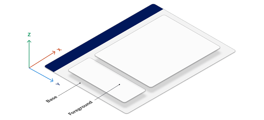
In our design system, a surface represents the visual layer or container where content is presented. Surfaces help create visual clarity and hierarchy by setting background properties, managing contrast, and framing content within a predictable structure. Each surface type carries unique properties—color, elevation, and borders—helping to guide the user’s focus and create a sense of depth across the interface.
Using standardized surfaces helps establish a coherent, predictable, and reliable experience for users, particularly when switching between light and dark modes or interacting with content.
Surface Tokens
Surface tokens are dynamic design tokens that enable consistent styling across components and support light/dark mode, accessibility, and responsiveness. Unlike static color tokens, surface tokens allow our design system to adapt to different themes and component states, providing a harmonious, accessible experience.
Surface tokens serve as references to mode tokens, which, in turn, reference primitive tokens (e.g., raw color values). This layered structure allows components to adjust automatically based on the surrounding context—whether it’s a light or dark mode environment or a brand-focused color theme.
Why Surface Tokens?
Consistency: Ensures uniform design across varying contexts.
Adaptability: Easily support dark/light modes and dynamic states.
Efficiency: Reduces need for custom styling, centralizing control via global tokens.
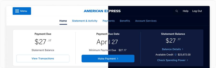
Surfaces and Dark Mode
Dark mode support has become an industry standard, offering users a choice between light and dark interfaces. Dark mode can reduce eye strain and is preferred by many users, especially those with light sensitivity. Our surfaces are carefully paired with colors that maintain accessible contrast in both light and dark themes, ensuring content remains readable and inclusive across modes. Learn more about light and dark mode.
Types of Surfaces
Our design system incorporates several primary surface types, each suited to specific UI contexts. By using these standardized surfaces, we maintain a cohesive visual language that adapts seamlessly across different themes and states.
Default Surfaces
Use default surfaces like base and foreground to establish clean, foundational layers for your UI:
-
Foreground: Apply to primary content that needs a strong contrast.
-
Foreground Subtle: Use for elements that require softer contrast.
-
Base: Use as a background layer to distinguish from interactive elements.
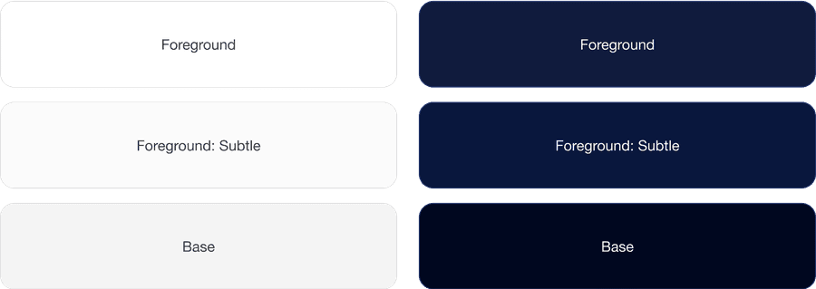
These surface layers play a vital role in establishing hierarchy and depth within your design. It’s crucial to prioritize the use of foreground: regular (white) for the majority of your surface treatments. Utilize alternative foreground colors sparingly and purposefully, employing them to highlight essential elements or de-emphasize others.
Brand Surfaces
For moments requiring additional emphasis, brand surfaces bring visual prominence to critical elements without overwhelming the design. Our brand surfaces retain consistent colors in both light and dark modes, allowing them to maintain the brand’s identity regardless of user settings.
- Brand and Brand Alt: These surfaces are used to highlight important elements while ensuring accessibility standards are met through pre-defined, accessible color combinations.
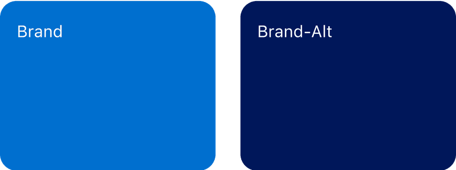
Use brand color background sparingly. To ensure proper color contrast, solid surface content has designated color combinations like “regular” text and “subtle” text styles. Each of these text styles have a predefined color combination that ensures accessibility. Not all colors change when in dark mode. For instance, Brand and Brand Alt maintain their color in light and dark mode.
Updates
| Version | Change Date | Link |
|---|---|---|
| v7.0 | September 6th, 2024 | v7.0 Release notes |
Questions?
Connect with the DLS Team on Slack or by email.
Resources
Check out additional resources.