Typography
Great typography is vital to our product experiences. It reinforces the American Express brand by providing a strong visual hierarchy and helps set the overall tone.
Best Practices
- To maintain consistency across American Express digital experiences
- To create hierarchy and vertical rhythm. Remember to reflect visual hierachy in code, for example using a H2 along with font.heading.sans.large.book.
- Keep it simple, avoid using more than two typefaces, and two to three font styles
Using Typography
Font Licenses
American Express colleagues have access to Benton Sans, Guardian and SF Pro via self service or software download service (SDS).
Agencies follow the guidance in the brand guidelines.
When building digital experiences (other than emails and native apps), please incorporate the typeface directly from our content delivery network (CDN).
Custom Fonts
Using fonts that are not part of the brand can lead to inconsistency in branding across different service channels. It is important to use brand fonts, colors, and logos to ensure a consistent and recognizable brand identity.
Additionally, using custom fonts can impact accessibility as some font weighting and size may be difficult to read for visually impaired users. It is recommended to use fonts as specified to maintain consistency and accessibility.
Icon Fonts
The Design System no longer offers an icon font, instead the system has a library of SVG icons. As a system, we don’t recommend using alternative icon fonts.
Icon fonts are used in combination with the CSS content attribute to map to the correct icon, but this only works when CSS is available on the page. Without this the connection between the elements and the fonts are lost. SVG icons remain as a semantically valid icons on the page, even without CSS styling being available. For this reason as a system we do not recommend the use of icon fonts.
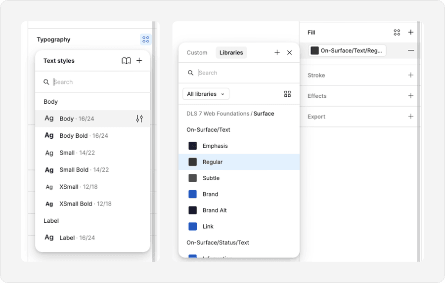
Typography in Figma
Typography can be found as separate font and colors styles in Figma. Unlike Sketch, Figma font colors are handled separately to font styles. Colors can be found as Figma variables.
Type Hierarchy
Visual Hierarchy and HTML Hierarchy
Visual hierarchy should mimic the content hierarchy. Content hierarchy is created in code by using HTML heading tags such as h1, h2, h3, h4. H1 tags are important for both the user experience and for search engine optimization. They help to organize the content of the page and make it easier for users and search engines to understand the main topic of the page.
Visual headings web page should be matched with the correct level HTML heading tag. An example of the hierarchy is example page title being h1 subtitle h2. Assistive technologies leverage these tags to help users with visual impairments easily navigate and traverse the page content. See our Creating a More Inclusive Experience at Amex through Page Hierarchy and Component Reflow.
Our new type hierarchy now aligns with the order of semantic HTML. Larger type styles mimic larger heading tags. However designers may assign a heading hierarchy that best matches their designs.
Weight and Color Value
Type hierarchy and prominence can be leveraged through scale, weight and color. This design system introduces the concept of surface and content color. These colors are carefully selected to meet the demands our design community while ensuring accessibility. Other forms of type hierarchy include semantic markup of the HTML (H1, H2, H3 …)
- Use weight and color to create visual hierarchy
- To create type hierarchy and vertical rhythm
- Include semantic hierarchy and visual hierarchy. For example H1=Desktop-Display-Benton-Medium and H2=Desktop-Heading-Benton-Small
- Don’t use all caps to create visual hierarchy
- Underline text, reserve for signifying inline links
All caps causes readability to be reduced because all words have a uniform rectangular shape, meaning readers can’t identify words by their shape.
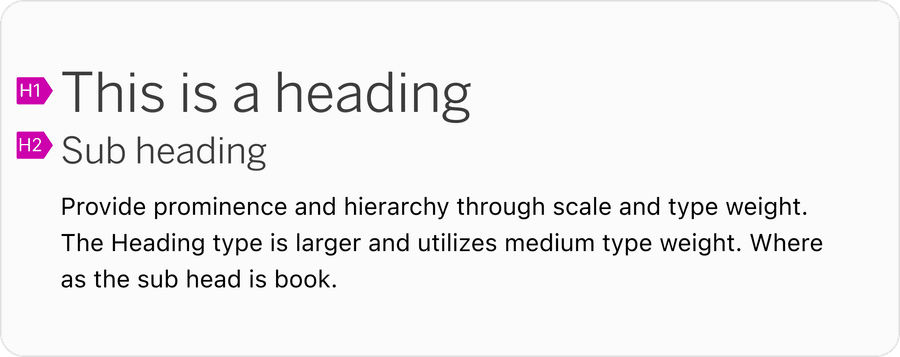
When to Use Display or Heading Text Styles
Display text styles should be used for marketing and headlines, for example, typography inside a hero. Use heading text styles to create visual structure and hierarchy on the page.
- Use headings to add hierarchy and break up content on a page
- Aim for no more than one to two uses of display fonts per page
- Keep display text short, aim for less than one sentence
- Use display text styles for anything lower than a H2
- Use display or headings for large blocks of text
Font Pairing
Use scale to create headings and sub headings on a page. Here are examples of pairs that work well with body text style.
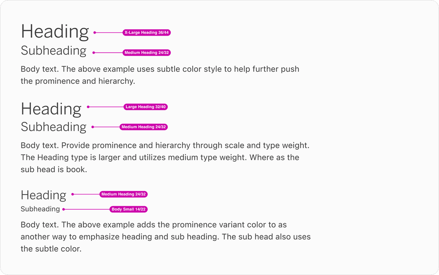
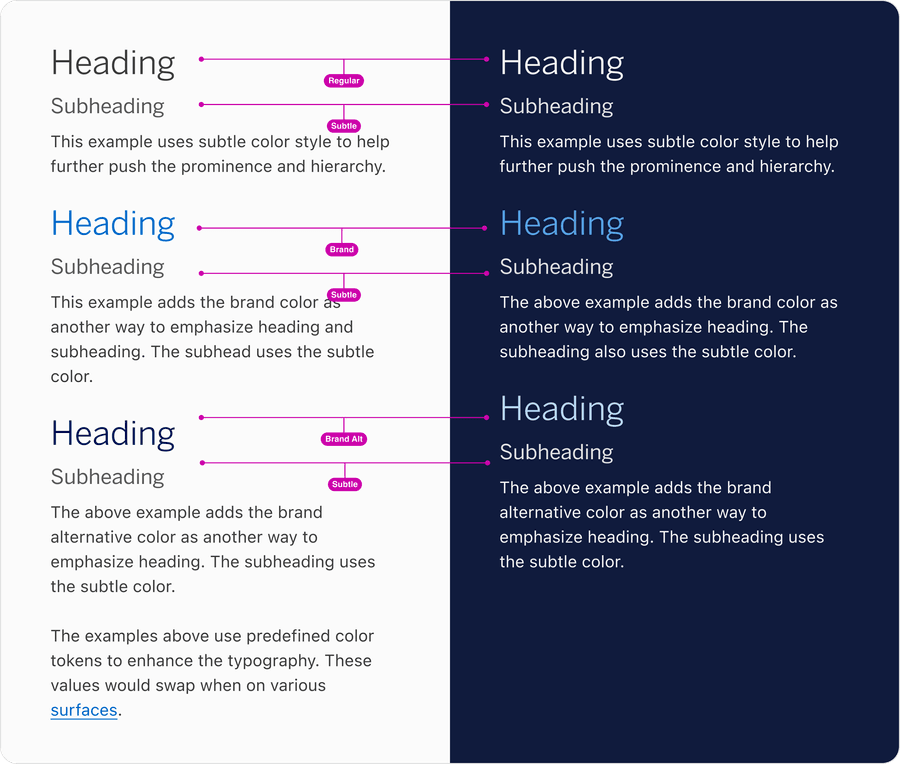
Font and Color Pairing
Along with using heading styles color can be used to create visual hierarchy. Here are examples of headings and body pairings using scale, weight and color to create hierarchy.
Layout
Line Height
When line height is too tight or too loose, the customer’s ability to understand the message will be compromised. The proper line height allows the typeface to breathe, ensuring legibility. Line heights were determined based on each styles individual size and weight, for example the design systems body line height is 150% the font size.
Users customize text settings with assistive technology to improve readability. Changes include font size, line height, letter spacing, and word spacing.
Text styles should allow changes for:
- Line height (line spacing) of 1.5 times the font size
- Spacing following paragraphs of at least 2 times the font size
- Letter spacing (tracking) at least 0.12 times the font size
- Word spacing at least 0.16 times the font size
These guidelines help ensure that users with reading disabilities, such as dyslexia, can read the text more easily. Understanding Success Criterion 1.4.12: Text Spacing | WAI | W3C
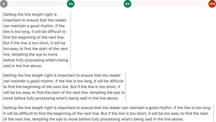
Optimal Line Length
Similar to line height, line length is also determined based on the individual style and weight. It is measured in characters, not pixels. A comfortable measure is 45 to 75 characters (including punctuation and spaces) per line.
Responsive Text
Text and text boxes should automatically adjust its size and layout based on the screen size and resolution of the device it is being viewed on. This is important for responsive web design, which aims to provide an optimal viewing experience across a wide range of devices, from desktop computers to mobile phones. The Design System accounts for screen size in its grid and layout to allow for smaller and larger spacing to help maximize layout for text.
By using responsive text, the content of a website or application can remain legible and easy to read, regardless of the device it is being viewed on. This can improve the user experience and make the content more accessible to a wider audience.
This is an example of text wrapping to a new line so that content is not lost or hidden behind other page elements.
This is an example of text not wrapping to a new line so that content is not lost or hidden behind other page elements.
Text resizing is an important aspect of web accessibility. It allows users with visual impairments to increase the size of the text on a webpage, making it easier for them to read and understand the content.
Text should be able to be resized up to 200% without the use of assistive technology and without loss of content or functionality.
This means that the layout and design of the page should be flexible enough to accommodate larger text sizes without causing issues such as overlapping or truncated text. Understanding Success Criterion 1.4.4: Resize Text | WAI | W3C
Images of text should be avoided when possible, and replaced with actual text. This is because images of text cannot be resized or customized by the user in the same way that actual text can, making it difficult for some users to read.
Additionally, images of text may not be recognized by screen readers, making the content inaccessible to users who rely on these assistive technologies.
If images of text must be used, it is important to provide alternative text that describes the content of the image, so that it can be understood by all users. Understanding Success Criterion 1.4.5: Images of Text | WAI | W3C
Questions?
Connect with the DLS Team on Slack or by email.
Resources
Check out additional resources.