Grid
Grids are the foundation to design web page experiences. Thanks to a twelve column system they aid visual balance and make the user interface easier to scan. Having a defined grid creates a consistent layout that works across other platforms and different breakpoints.
What is Grid?
A grid is a set of horizontal and vertical lines that form a pattern. This pattern helps us align our design elements, making sure they stay in place and don’t change size as we move from one page to another. This consistency makes our websites look more organized and predictable.
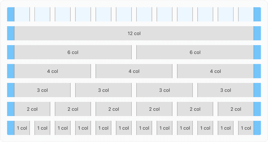
We use a 12-column grid to optimize flexibility and to allow for a variety of layouts. The grid consists of containers, rows, and columns. Find out more about component layout using the systems spacing in spacing documentation.
Best Practices
- To maintain consistency across American Express digital experiences
- When the gutters and margins are easily divisible by 8.
- 8x (8, 16, 24, 32, etc.) is used to space content from navigation, between page elements. Gutters and margins are also based on 8x across breakpoints. Gutters and marging sizes are defined by breakpoints.
- Without gutters as they provide spacing between elements
- Other than the 12 column grid system
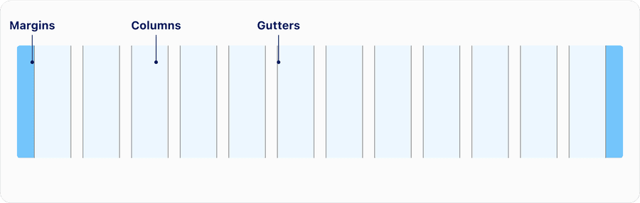
Grid Anatomy
Our design kit contains a set of pre-defined artboard frames at various screen sizes. These frames can be accessed directly in Figma and brought into your project to maintain consistency.
| Name | Description | Required |
|---|---|---|
| Margins | Margins are the space to the right and left of the 12 columns. They are a fixed value as the grid changes size. They can either be the same size as the gutters or greater when working with a larger screen resolution, such as the case with the Desktop breakpoint. In general wider margins are more suited for larger screens. See below for details on breakpoint. | Yes |
| Columns | There are 12 columns in our responsive grid which is the area where content is applied. Column widths change based on the size of the screen size. A grid changes its column width value for each breakpoint. Note that the column widths are defined by percentages rather than fixed values. | Yes |
| Gutters | Gutters are the spaces between columns that separate content. Gutters are a fixed value based on the breakpoint. Do not extend your content into the gutters. | Yes |
Breakpoints
Our grid supports six breakpoints. The breakpoints are ranges, meaning the values are true from the minimum width up until the next breakpoint. To maximize space (especially for min and x-small), it’s important to identify the gutter per breakpoint. This will also help you maintain consistent spacing and provide customers with an optimal user experience.
Column widths are a percentage, fluid and not a fixed size. While margins and gutters are fixed sized until the x-large breakpoint. At that point the grid is centered on the screen.
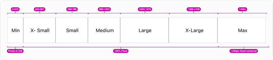
| Breakpoint | Min-Width | Max-Width | Margin | Gutter | Grid Width (Container) |
|---|---|---|---|---|---|
| Min | 0 | 319 | #Size/16 | #Size/12 | 319px minimum |
| X-Small | 320 | 567 | #Size/16 | #Size/12 | 100% |
| Small | 568 | 799 | #Size/16 | #Size/16 | 100% |
| Medium | 800 | 1023 | #Size/24 | #Size/16 | 100% |
| Large | 1024 | 1279 | #Size/32 | #Size/24 | 100% |
| X-Large | 1280 | 1439 | #Size/40 | #Size/24 | 100% |
| Max | 1440+ | - | #Size/40 | #Size/32 | 1440px fixed centered |
Fixed vs Fluid
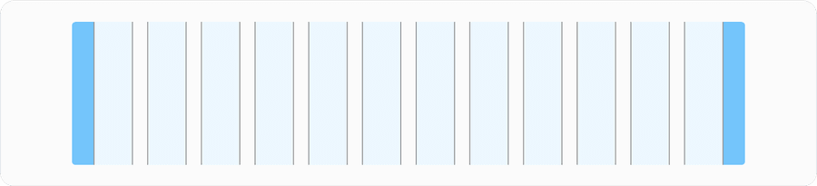
Fixed Grid
The fixed grid has a maximum size that content is contained within, know as the container. The width allows for maximum readability of page content in large and high-definition screens. While the screen can be resized larger, content will stop filling the left and right space, causing the content to remain unchanged. Fixed has a minimum of 319px at min breakpoint) and maximum of 1440px at max breakpoint.
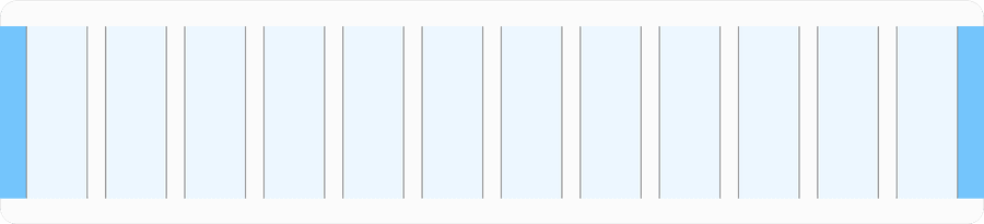
Fluid Grid
The fluid or responsive grid uses 100% screen real estate making it useful for complex screens and applications. Fluid will be supporting between minimum 320px and maximum of 1440px.
320 CSS pixels is equivalent to a starting viewport width of 1280 CSS pixels wide at 400% zoom. For web content which are designed to scroll horizontally (e.g. with vertical text), the 256 CSS pixels is equivalent to a starting viewport height of 1024px at 400% zoom.
Containers
Containers are part of the layout that is placed on columns to hold the content of the page. It wraps components and elements to keep the site content within max width of 1440px. Containers should always be paired with breakpoints and layout columns. Make sure the content spans all of the columns in the layout (whether it is 2, 6, or 12 columns), rather than using columns as margins or padding. This method will keep layouts uniform and prevent unreliable responsive behavior.
Equal
Each column of our 12-column grid is an equal percentage of the full width. The content is adaptable to the container size which is fluid. Content is within columns but effects like shadows and hovers can expand into the margins and gutters.
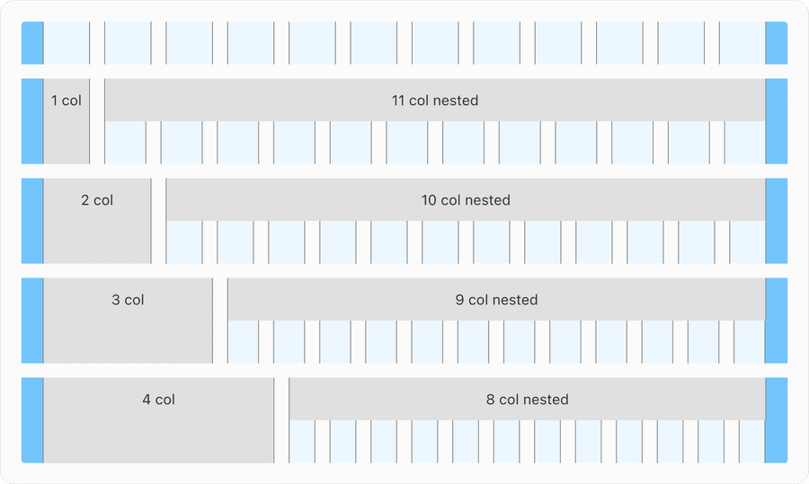
Push and Pull
Some experiences require to push or pull containers for the use of side navigation or other fixed element that are placed outside the main content. You can push columns to right which requires nesting columns, it is simple and can add more flexibility in your designs. In a column, you can add a nested grid by creating a container. Note to maintain gutters same as the breakpoint not the width of the container.
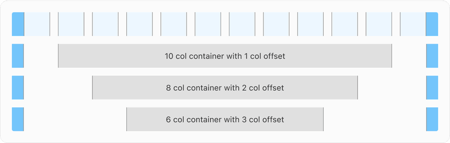
Offset
Within the 12 column grid it is not necessary to use all for content. Offset allows user to move columns right. This middle example shows a 12 column layout region with an offset of 2 columns on both sides, resulting in 8 column container.
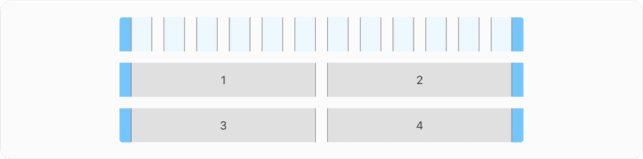
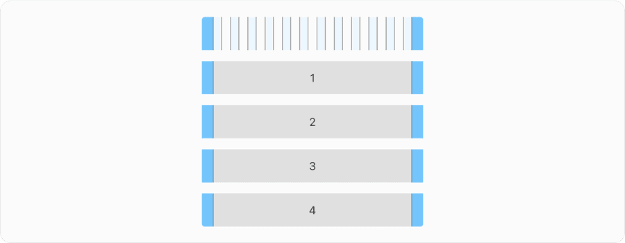
Reflow
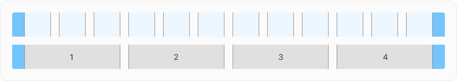
By default, a grid flows left to right and the containers arranged horizontally will reflow vertically when breakpoints gets smaller. As you can see below how the 4 containers align and stack vertically as screen gets smaller. Note in smaller screen size of 320px content can be presented without loss of information or functionality. Avoid scaling things smaller to fit into the screen.
This requires responsive design for most websites.
No loss of content or functionality occurs and horizontal scrolling is avoided when content is presented at a width of 320 pixels. This can be tested by setting the browser window to 1280 pixels wide and then zooming the page content to 400%. Content that requires horizontal scrolling, such as data tables, complex images (such as maps and charts), toolbars, etc. are exempt. Learn more about understanding reflow and success criteria.
Updates
| Version | Change Date | Link |
|---|---|---|
| v7.0 | August 26th, 2024 | v7.0 Release notes |
Questions?
Connect with the DLS Team on Slack or by email.
Resources
Check out additional resources.