Typography
Great typography is vital to our product experiences. It reinforces the American Express brand by providing a strong visual hierarchy and helps set the overall tone.
Typography Overview
The American Express Design System includes a carefully crafted type system that works harmoniously with the 8x grid. Each type size and weight was intentionally chosen to establish trust and credibility. Typography enhances the usability and navigation through clear headings, subheadings, and labels.
Simplicity: Simplicity should be employed with fonts. Limit type styles to 2-3 per page in order to maintain legibility and coherence. See example pairings.
Hierarchy: The combination of type size, weight, and color luminosity help to provide type hierarchy.
Brand: Typography is core to our brand, to find out more about using typography and brand read the brand guidelines.
The Design System uses many more font styles than the ones shown on this page. For a full list of typography styles that are used within the system including typography in components, use of text color on surfaces, and dark mode refer to the design tokens.
What’s New
- Introduced new naming conventions for typography
- Introduced bold variants of headings and display
- Typography is now part for design tokens
- Font sizes and line heights have moved to the 8px grid
Font Styles
Primary & System Fonts
Consistent typography is an important element of a brand’s visual identity. American Express brand typography consists of two primary typefaces: Benton Sans and Guardian.
Use Benton Sans in most cases. Save Guardian for use in marketing messages such as new product announcements, special offers, and promotions. Don’t use it for servicing messages. To learn more about when to use Benton Sans and Guardian, visit the brand site.
Use the System font and either Benton Sans or Guardian. Don’t combine the two primary typefaces on one page.
Brand Typography
We inherited 2 fonts from our enterprise brand guidelines Benton Sans and Guardian which are commonly used in headings or marketing content.
Benton Sans
Use Benton Sans in most cases. It is typically used for headings and display within web pages. Benton is also leveraged within marketing messages.
Guardian
Guardian is primary used for marketing headings and display.
System Typography
We leverage system fonts for body copy, UI elements and data.
System Fonts
System fonts are the default fonts that come with a device. The design system uses system fonts for moments when device is important for example UI elements to ensure a familiar and accessible experience.
Using system fonts also allows us to be confident that the UI will be optimized to be legible, perform well and have a consistent experience across products and the American Express design system.
While this may result in subtle differences between platforms, it will be consistent to the user’s experience within their system. To see these differrences, test on multiple types of devices or change the channel variables in figma.
Here are the common device system fonts:
- SF Pro - the default system font available on Apple devices.
- Segoe UI - the default system font for Microsoft appications and devices.
- Roboto - the default system font for Android.
Font Stack
Font-system: -apple-system, BlinkMacSystemFont, Segoe ui, Roboto, Oxygen-Sans, Ubuntu, Cantarell, helvetica neue, sans-serif;
Monospaced Font
For code applications, the system mono font should be used.
Font Stack
Font-code: ui-monospace, Menlo, Monaco, Cascadia Mono, Segoe UI Mono, Roboto Mono, Oxygen Mono, Ubuntu Monospace, Source Code Pro, Courier New, monospace;
Type Scale
Our type system provide a clear delineation between each size to help designers communicate hierarchy within their solutions. All sizes and line heights are derivatives of 8x system which allows them to fit harmoniously within the overall layout.
Measurement Guide
Font Weight
Font weight refers to the thickness of the font. It is a numerical value that ranges from 100 to 900, with 100 being the thinnest and 900 being the thickest. Common font weights include regular (400 Benton Sans) and bold (700 Benton Sans). The font weight can be used to create contrast and hierarchy in text, making it easier to read and understand.
Font Size
Height from ascenders’ top (l,t, caps) to descenders’ (g,p,q) bottom in pixels and rems (16px = 1rem)
Line Height
Space between baselines of type measured in pixels and rems (16px = 1rem)

Display Type Scale & Type Weight
Benton Sans
Display text styles should be used for marketing and headlines, for example typography inside a hero. Benton Sans is our default typeface for display headings.
| Preview | Token | Font/Line Height |
|---|---|---|
Aa | font.display.sans.large.book | 56/64 |
Aa | font.display.sans.large.bold | 56/64 |
Aa | font.display.sans.medium.book | 48/56 |
Aa | font.display.sans.medium.bold | 48/56 |
Aa | font.display.sans.small.book | 40/48 |
Aa | font.display.sans.small.bold | 40/48 |
Guardian
Guardian is primary used for marketing headings and display.
| Preview | Token | Font/Line Height |
|---|---|---|
Aa | font.display.serif.large.regular | 56/64 |
Aa | font.display.serif.large.bold | 56/64 |
Aa | font.display.serif.medium.regular | 48/56 |
Aa | font.display.serif.medium.bold | 48/56 |
Aa | font.display.serif.small.regular | 40/48 |
Aa | font.display.serif.small.bold | 40/48 |
Headings Type Scale and Type Weight
Benton Sans
Benton Sans is our default typeface for headings. Use heading text styles for headings to create visual structure and hierarchy on the page. Headings help to organize content into sections and make it easier for the reader to navigate and understand the information. Make sure to match your visual hierarchy with semantic HTML.
| Preview | Token | Font/Line Height |
|---|---|---|
Aa | font.heading.sans.xlarge.book | 36/44 |
Aa | font.heading.sans.xlarge.bold | 36/44 |
Aa | font.heading.sans.large.book | 32/40 |
Aa | font.heading.sans.large.bold | 32/40 |
Aa | font.heading.sans.medium.regular | 24/32 |
Aa | font.heading.sans.medium.bold | 24/32 |
Aa | font.heading.sans.small.Regular | 20/28 |
Aa | font.heading.sans.small.Medium | 20/28 |
Aa | font.heading.sans.small.bold | 20/28 |
Aa | font.heading.sans.xsmall.Regular | 16/24 |
Aa | font.heading.sans.xsmall.Bold | 16/24 |
Guardian
Guardian is primary used for marketing headings and display.
| Preview | Token | Font/Line Height |
|---|---|---|
Aa | font.heading.serif.xlarge.regular | 36/44 |
Aa | font.heading.serif.xlarge.bold | 36/44 |
Aa | font.heading.serif.large.regular | 32/40 |
Aa | font.heading.serif.large.bold | 32/40 |
Aa | font.heading.serif.medium.regular | 24/32 |
Aa | font.heading.serif.medium.bold | 24/32 |
Aa | font.heading.serif.small.Regular | 20/28 |
Aa | font.heading.serif.small.bold | 20/28 |
Aa | font.heading.serif.xsmall.Regular | 16/24 |
Aa | font.heading.serif.xsmall.Bold | 16/24 |
Please note: heading-2 and heading-1 have been deprecated, please do not use. *Use the small heading, medium weight sparingly for slight emphasis.
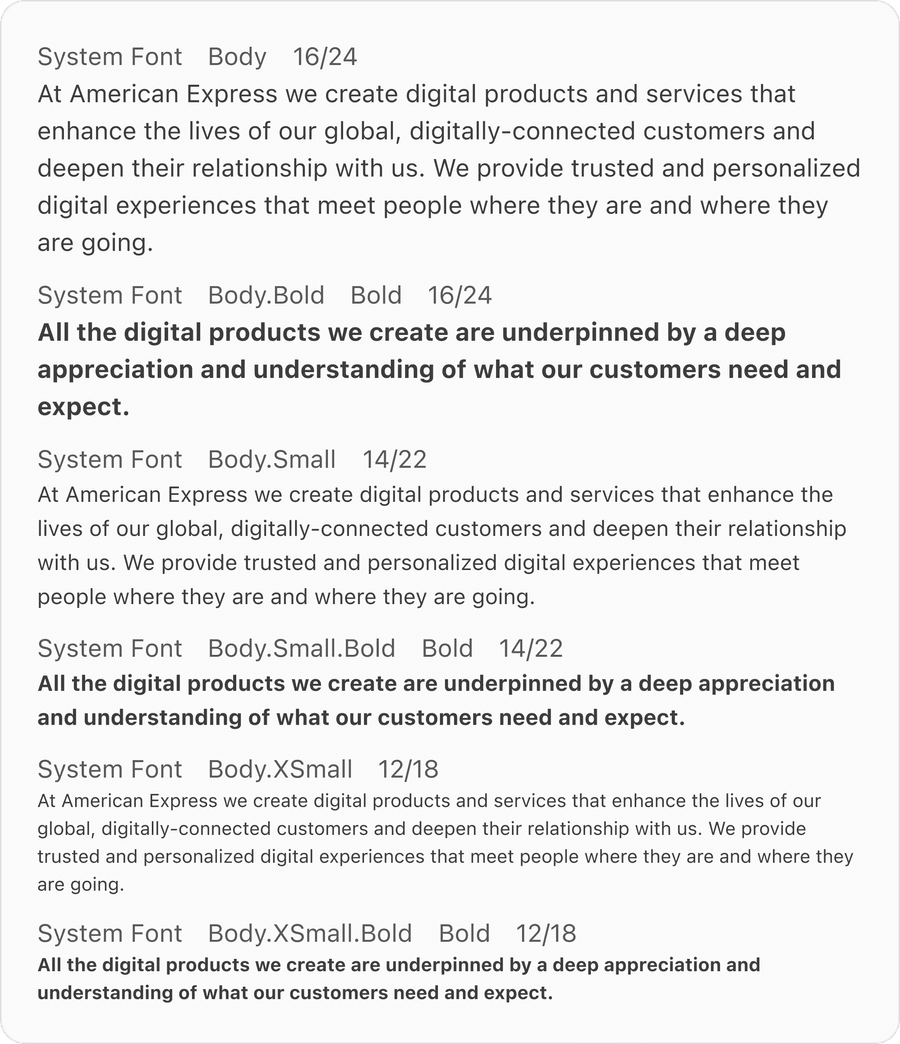
Body
Body text is the main text of a document, email, or webpage, use it along with headings, subheadings, captions, or other text elements, to create hierarchy.
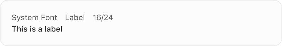
Label
Related Links
Updates
| Version | Change Date | Link |
|---|---|---|
| v7.0 | September 9th, 2024 | v7.0 Release notes |
Questions?
Connect with the DLS Team on Slack or by email.
Resources
Check out additional resources.