Filters
Filters allow users to dynamically filter data and/or content. Through filtering, users can reduce the amount of information being displayed.
Anatomy
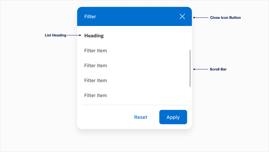
| Name | Description | Required |
|---|---|---|
| Container | Card container allows users to display media, content and actions. | Yes |
| Filter Heading | Displays the title of the filter. Label best practice. | Yes |
| Close Icon Button | Allows users to dismiss the filter. | Yes |
| List Heading | A descriptive label for the category of the list. | Optional |
| Filter Items | The filter item options presented to the user. | Yes |
| CTA Footer | Footer is pinned to the bottom of the card often used to display a link or button depending on the use case. | Optional |
| Scroll Bar | Allows users to navigate through overflow content. | Optional |
States
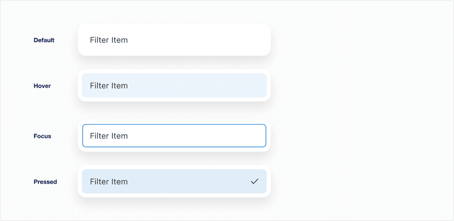
| State | Description |
|---|---|
| Default | When the filter is enabled and the user is not directly interacting with it. |
| Hover | When a user’s cursor is over the filter’s field. |
| Focus | A focus outline appears around the handle to help users identify current selected component. This is used when a user navigates using keyboard controls or uses a cursor. |
| Pressed | The pressed state activates when an item in the filter list is selected. |
Questions?
Connect with the DLS Team on Slack or by email.
Resources
Check out additional resources.