Filters
Filters allow users to dynamically filter data and/or content. Through filtering, users can reduce the amount of information being displayed.
Best Practices
- To allow users to narrow down content based on common characteristics
- To allow users to refine or narrow down large sets of data or content
- To allow users to tailor the view to their specific preferences, enhancing the overall user experience
- When data frequently changes and users need updated views
- When the dataset is small and users can easily scan the entire content without additional filtering
- If options are too complex or require extensive user input
- When context doesn’t call for refinement or when all data is already visible and manageable
Recommendations
- Ensure filter options are relevant to the displayed data or content
- Arrange values logically for the user, such as alphabetically, numerically, or by frequency of use
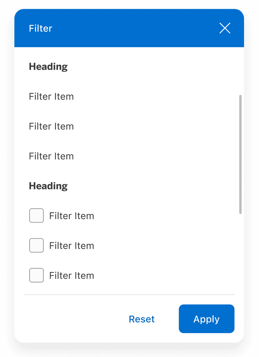
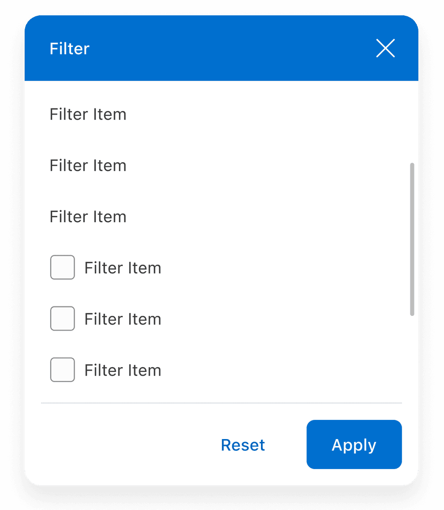
- Use scrollbars for long lists
- Overwhelm users with excessive or unrelated options
- Use confusing headings or value labels
Filter Items
Use copy that is clear on its own and only include values that are directly relevant to the current dataset or view. Not everything should be stuffed in filters. Important top level choices which are being made by almost all users are best being displayed upfront. It also declutters and simplifies the user experience.
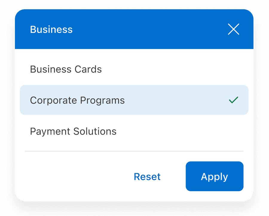

Use headers or separators when there are multiple related value groups
Filter Types
Filter types determine how options are displayed and interacted with, allowing for flexibility based on the dataset and user needs.
| Variation | Description |
|---|---|
| Default | Use for simple text-based options that do not require additional context. Example: filtering by alphabetical names or straightforward attributes like color or size. |
| Icon | Use when visual recognition can enhance understanding or speed up decision-making. Example: filtering by file types, such as PDF, Word or social media platforms. |
| Multi-Select | Use when users need to select multiple options simultaneously. Example: filtering multiple product categories. |
| Radio | Use when only one option can be selected at a time. Example: filtering by price range. |
| Flag | Use for region- or language-specific filters where flags provide clear identification. Example: filtering by country or language preferences. |
Using Call to Action Footer
Call to action can be applied if several items require to be actionable. Remember to avoid using confusing call to actions.

Using Icons
Icons used within filters should be simple, with well known visual metaphors. Guidelines for Icons.
- Use simple well known icons for example account for ‘Account Home’
- Take real world examples for example rewards for Membership Rewards® points
- Be consistent with layout and usage
- Think customer consistency. Follow the icon names available in our icon library for the actions when possible.
- Consider icon meaning and localization
- Don’t use the same icon for different values within the related content
- Don’t use complex icons where its hard for user to understand the meaning of icon used
- Icons need to be simple and easy to understand.
- For accessibility, we need to make sure we use icons for the same meaning throughout our website. Consistent identification accessibility standards
- Remember: the more complex the icon, the longer a user spends understanding them.
Localization
For RTL (right-to-left) markets, the layout of the filter is mirrored. The order of the min and max values are in reverse, placing the largest value on the left, and the smallest value on the right.
Here are some reference tables, for those formats, if you would like to read more about localization read the internationalization documentation.
Responsive
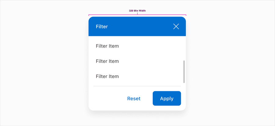
All pages must be responsive and reflow to a minimum of 320px. Filter will reflow to a minimum of 300px, to allow for margins and grid gutters. Reflow accessibility standard
Questions?
Connect with the DLS Team on Slack or by email.
Resources
Check out additional resources.