Buttons
Buttons are used as triggers for actions. Buttons can contain a label and/or an icon and come in a variety of styles and sizes.
Best practices
- To complete an action
- To submit a form
- To trigger a new UI element to appear on the page, such as a Modal
- If the button navigates you to a new page, use one of our link components
- Avoid multiple primary buttons on one page
Variations
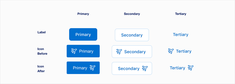
| Variation | Description |
|---|---|
| Label | This is the default variant, and can be used to save space. Always have a short, clear and descriptive label that explains the buttons purpose. |
| Icon Before | Use icon thats meaning is easily recognizable. Ideally, it should have same meaning across all our markets. To make sure your icons align, use icon before. For more information about icons in general, check out our Icons. |
| Icon After | Use icon if the icon meaning is easily recognizable. Ideally, it should have same meaning across all our markets. For more information about icons in general, check out our Icons.. |
Recommendations
Button Labels
Button labels should be clear, brief and invite the customer to take action.
- Use a verb and noun construction, like “View Account Details”
- Be specific in the action a user is taking, like “Submit”
- Use consistent verbiage for common actions, like “View” to take a user to a new view
- Keep it short, target a length of one to three words with no more than five
- Use title case, like “Almost Every Word is Capitalized”
- Don’t use personal pronouns, such as “View my Account Details”
- Button labels need to be simple and easy to understand.
- For accessibility generic text, like “Learn More”, is not recommended, as it does not inform a user of the content behind the action. Headings and labels accessibility standards
- Remember that action should be brief. The longer a button text, the longer a user spends reading them.
Long Button Labels
- Work with the business to refine the text to make it shorter
- Aim for less than five words
- If character length is too long, use responsive type
- Don’t use an ellipsis on longer labels
- Cut off label text
Disabled Buttons
Try to avoid using disabled buttons when possible, opting for enabled buttons or no button and an informative alternative, such as ‘out of stock’.
If you do choose to use a disable a button, our buttons use aria-disabled=true instead of disabled, so it’s announced to screen reader users.
- Avoid disabled buttons when possible
- Instead of a button try using an informative plain text alternative, like “out of stock”
- Use form validation
- Always provide a way out
- Use a disabled button to prevent information from being submitted twice e.g. double bookings
- Use
aria-disabled=true
- Don’t use disabled button labels to communicate information
- Disable the form submit until the form is complete
Disabledbuttons are visible, but not always focusable. They are not announced to screen readers using tab, and can only be found if your users go looking for them.- Disabling submit buttons in forms stops users from seeing error messages. Error messages save users time by helping users know where they have incorrectly filled in a form.
Choosing Icons
Icons used in buttons should be simple, with well known visual metaphors a hand with a thumbs-up for feedback, pencil for edit, or a lock for security. For more information about icons in general, check out our icons.
- Use simple well known icons
- Take real world examples for example lock for security
- Be consistent. Always use the same icon for action.
- Think customer consistency. Follow the icon names available in our icon library for the actions when possible.
- Consider icon meaning and localization
- Use different icons for the same action
- Use the same icon for different actions
- Use complex icons
- Icons need to be simple and easy to understand.
- For accessibility, we need to make sure we use icons for the same meaning throughout our website. Consistent identification accessibility standards
- Remember: the more complex the icon, the longer a user spends understanding them.
Backgrounds
Buttons can go on different colored backgrounds, aim for a 3:1 contrast with button focus and their surrounding colors. More on color contrast.
Light Backgrounds
- Use default Primary and Secondary on white, gray 100, gray 200
Inverse
- Use Primary and Secondary on bright blue, dark blue, and gray 800
- Use buttons on backgrounds when their background to button focus contrast is lower than 3:1
Layout
Horizontal: When laying out buttons horizontally, try to group relevant actions together putting the primary last.
- Buttons can be grouped together when presenting multiple action options to a customer
- When possible keep buttons the same length
- Avoid using more than one primary button in a group
- For horizontal buttons, primary buttons should always be after secondary
- Multiple primary buttons on a page
- Hide buttons in dropdowns or expandable panels
Vertical: Buttons can be stacked by default or reflow to stack at smaller breakpoints.
- Stacked buttons should have equal widths
- Primary actions will always be above a secondary
- Buttons should always center horizontally within the component
Responsive
- Fluid Buttons
Instead of hugging the label, a fluid button’s width is defined by the width of its container.

- Multiple Buttons
At our x-small breakpoint stack buttons with the primary on top.
Questions?
Connect with the DLS Team on Slack or by email.
Resources
Check out additional resources.