Link
Use the link components for when your link is outside a paragraph. Links may be isolated, stacked vertically in a list. Links should navigate you to a new page, internally or externally, back or to further information.
Best Practices
Be blue and have a visual signifier. This acts as a strong visual cue that the text is a link. Color and signifier (Chevron and underline on hover) together are needed to be inclusive, we cannot rely on color as the only way to communicate information.
Dedicated active and hover styles. Differentiating the link style on hover or on click provides visual feedback that enhances usability.
Start with keywords. Keep link text short and concise. Inform users of where they will go, like the page title or heading of the destination.
- To navigate to a different page
- To jump to an element on the same page
- To direct user to emails or phone numbers, like DLS@aexp.com
- Navigate to a different site
- Use links for standalone links outside of a paragraph or sentence
- Use links that are distinct, descriptive and consistent to help customers navigate the site
- Use links to take an action, like “delete”
- To style a button
- To back link to an unknown page, for example using back link variant with the label ‘back’
Variations
| Name | Description |
|---|---|
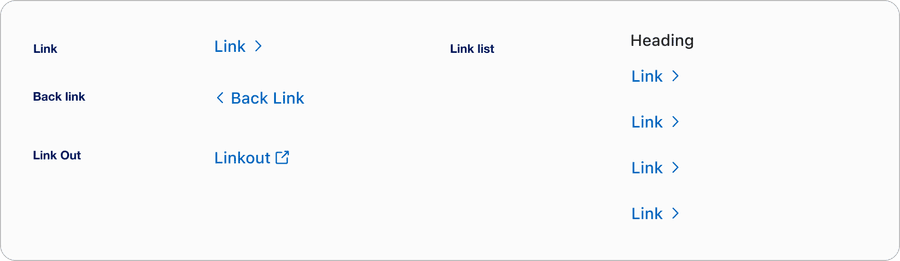
| Link | A link is a standalone link that is used in isolation and not as part of surrounding body text. Standalone links should clearly describe the target destination and meet accessibility requirements, such as having a 44x44px target size. |
| Back link | A back link is a standalone link that is used in isolation and not as part of surrounding body text. Use back link for moments where users need to navigate backwards to a previous page in a multi-page journey. Standalone links should clearly describe the target destination and meet accessibility requirements, such as having a 44x44px target size. |
| Link Out | A link out component indicates navigation to a destination outside of the current product or domain, for example external websites, partner platforms, or PDFs. This ensures users are aware they’re leaving the current experience and can make an informed choice. |
| Links list | A links list is a collection of hyperlinks grouped together, used for navigation to provide quick access to related resources. Links lists should clearly describe the target destinations and meet accessibility requirements, such as having a 44x44px target size. |
Recommendations
Link Text
To make links more accessible, avoid these common wording pitfalls.
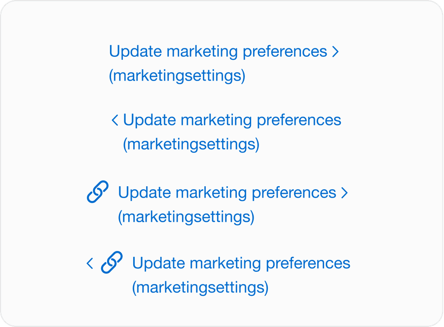
- Put the most important part of the link first, such as Update Marketing Preferences (Marketing Settings)
- When navigating to a new site use the domain name in brackets or separated by a ”|” at the end of a link e.g. Log In to My Account | American Express US or Log In to My Account (American Express US)
- Don’t use verbiage that doesn’t provide enough context, such as “link to,” “click here,” or “learn more”
- Don’t use a URL as a link
- Don’t use ALL CAPS except for the purposes stated in the Guidelines section
- Give different labels to links that serve the same purpose
Links should make sense out of context and be clear in their purpose/destination from just the text. Links are semantically different to buttons and should always be identified as a link regardless of how users consume them. Take a look at link accessibility for more details.
Link Text Checklist
Not sure what to write? Use this checklist to help refine your link text.
| Question | Do this | Don’t do this |
|---|---|---|
| Does your link navigate? | Terms and conditions (goes to a new page or location within the page) | Terms and conditions (opens a modal) |
| Does your link give context? | Edit email address | Edit |
| Does your link give context and purpose? | Update marketing preferences (marketingsettings) | wwww.marketingsettings.com/update |
| Have you put important information first? | Products (opens in new tab) | Link opens in new window: Products |
| Is the link readable? | Readable link | WWW.READABLE.COM |
| Does your link look like a link? | Edit email address |
Link Out
Link out component uses link styling, consistent with the design system and the link out icon as a visual cue that you are leaving the product environment. Place the link out icon always on the right of the link text and open external links in a new tab/window to preserve user context.
- Use link out when directing to an external website or application
- Linking to documents, for example PDF, Word, external hosted content
- Be clear on where the link goes, for example “Read more on the American Express website”
- Use when linking to internal pages within the same product or domain
- Triggering actions, use a button instead
- Linking within text where the external content is not meaningful
- Avoid stacking multiple link outs together
Responsive
When the link text is too long for horizontal space, link text wraps to another line below the text.
Questions?
Connect with the DLS Team on Slack or by email.
Resources
Check out additional resources.