Spacing
Spacing allows users to have consistency and visual hierarchy among elements on the page. A spacing system supports the creation of a predictable layout and an understandable interface.
Best Practices
- To maintain consistency across American Express digital experiences
- To create hierarchy and vertical rhythm
- If it is not divisible by 4 or 8
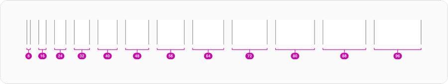
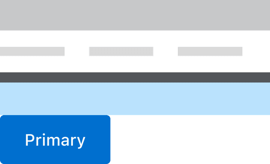
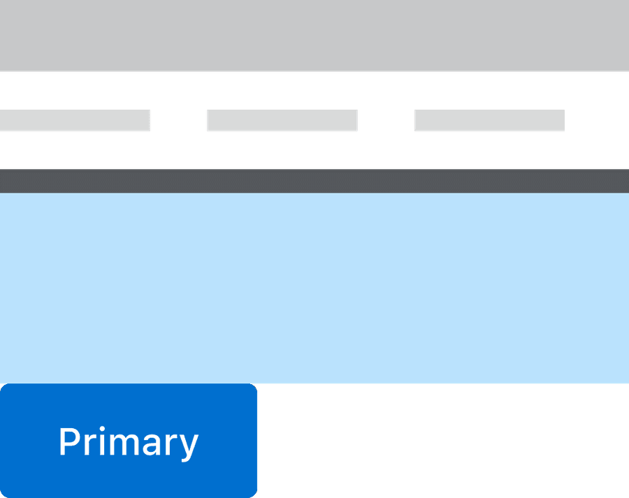
8x System
As the variety and diversity of devices, screen sizes, and pixel densities grows we need to be more responsive and device agnostic. Throughout our guidelines, you will notice we reference 8x many times. The number 8 is an even number that easily divides and multiplies to scale up and down to space components on a page. Smaller components, such as icons and type spacing, can align to a 4x grid.
Spacing
The spacing system is built around multiples of 8. The number 8 determines the spacing scale we use in our system and ensures visual consistency, hierarchy, alignment, and accessibility across products with vertical and horizontal layout. Keep this in mind while deciding the spaces between elements, type, and components.
Typography
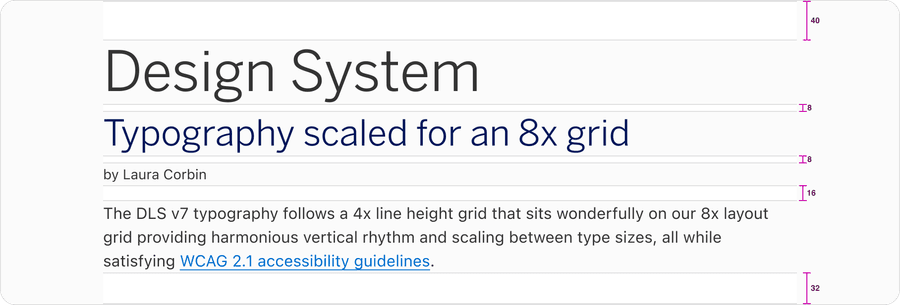
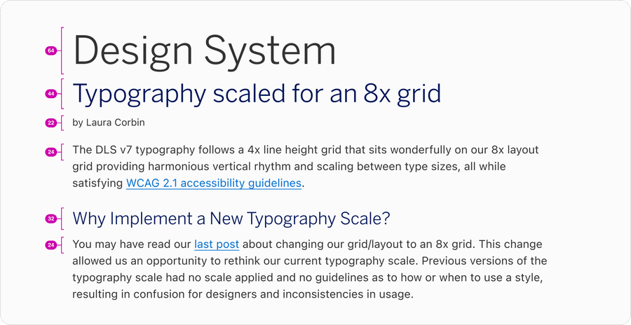
Our system has a carefully crafted type system that works harmoniously with the 8x grid. We started with a base font of size 16px=1rem because its a recommended size that is accessible and legible, particularly when it comes to reading long paragraphs. We chose to measure our typography by line height, as opposed to the baseline, as this is the web browser’s natural state. To learn more about how our typography scales with the 8x grid, read Typography guideline.
Component
Spacing of the elements within our components is also built with 8x system. Each element is a multiple of 8 which includes spacing, radius, and height of that component.To learn more about how our Shape and radius scales with the 8x grid, read Shape and Radius guidelines.
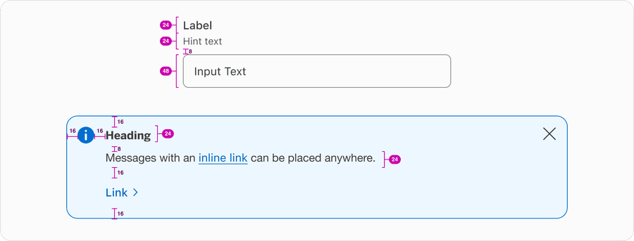
The distance between elements create semantic meaning, elements that are placed close to one another are assumed to be related.
Group related items close together so that users can scan the content more easily.
Group related items far apart.
Icons
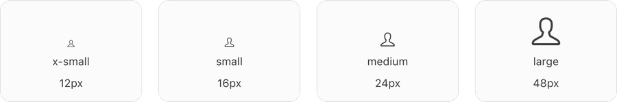
American Express icons are designed to fit our 8x system. The sizes available are in increments of 8x, with 4x size exceptions only made where necessary. Icon sizes were chosen to align with common typography line heights.
In Figma, use the icon component to change sizes, or preset size components. The components have properties for size: (X-Small/Small/Medium/Large), Icon Variant: swap default icon, filled/unfilled and alt text/decorative.
Units of Measurement
Rems
We use the relative units of rems when measuring attributes like margin, padding, and font size. This allows us to think in terms of relations and inheritance rather than singular element stylings, resulting in a stronger design system.
Rems base their measurement on the root element of the doc (rather than an em, which is based on the parent element). We define the relationship with the root to determine the element’s size.
The systems root element is based on the user’s preferred browser font size setting. The default is 16px. Header text is defined as 1.5rem, assuming the default font size is used then the header text will render at 24px. Which is base rem (16px) multiplied by 1.5 which equals 24px.
Having a system that is built on rems makes it possible to create an interface that grows and shrinks based on the root element font size.
| Rem | Pixel |
|---|---|
| 0.25rem | 4px |
| 0.5rem | 8px |
| 0.75rem | 12px |
| 1rem (base) | 16px |
| 1.25rem | 20px |
| 1.5rem | 24px |
| 2rem | 32px |
Scale
With consistency of spacing our base of 1rem (16 px) our tokens for scale provide spacers that can be used vertically or horizontally. The smaller scale sizes should be used on more detailed spacing of elements within components. The larger scale sizes should be used on layout spacing for larger element. Each value is a multiple of the base unit and ranges from 0px to 80px to allow for flexibility while still maintaining consistency across different layouts. For elements that require extra space, scale up by 8x only.
Sizing
While scale is the relative size of an element, size is the physical dimensions of an element. We have improved our naming of the component sizes based on the usability. Small, medium, and large may be useful for spacing and icons, but for components such as multi-step tracker we have used compact and default. This provides the user the ability to select a compact size component within a larger viewport. All of the components are responsive and reflow to accommodate the minimum size of 320px.
Accessibility standards require responsive design for most websites. This means no loss of content or functionality occurs and horizontal scrolling is avoided when content is presented at a width of 320 pixels. This can be tested by setting the browser window to 1280 pixels wide and then zooming the page content to 400%. Content that requires horizontal scrolling, such as data tables, complex images (such as maps and charts), toolbars, etc. are exempt. Learn more about understanding reflow and success criteria.
Updates
| Version | Change Date | Link |
|---|---|---|
| v7.0 | September 6th, 2024 | v7.0 Release notes |
Questions?
Connect with the DLS Team on Slack or by email.
Resources
Check out additional resources.