Shape and Radius
Shape can define the visual feel of a layout by utilizing different amounts of border radius to create a cohesive UI across the page.
Scale Overview
Within our system, the scale helps to define the visual style of our components. We have calculated our shape scale using the below formula to ensure that visual hierarchy will feel cohesive between the different radiuses. While our system follows an 8px grid, our shape scale goes as small as 4px to account for nesting radiuses.
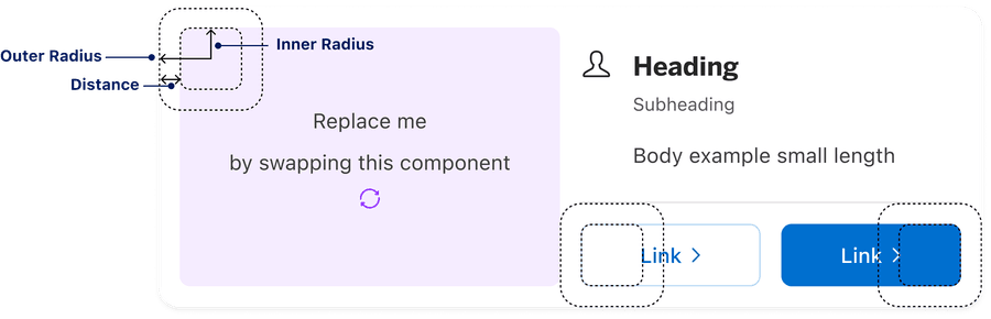
Inner border radius = outer border radius - distance
There are two categories of shape scale within our system:
General Radius None and Round
Elements: Element, Component, and Wrapper
Containers: Small, Regular, and Large
For additional guidelines on using shape, visit our spacing and grid documentation.
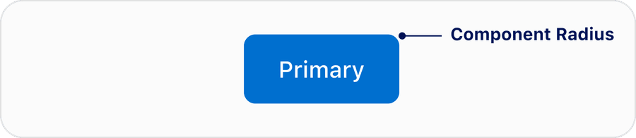
Component Scale
Components follow a shape scale based on ensuring proper nesting and visual hierarchy.
| Token Name | Radius Value |
|---|---|
| Element | 4px/0.25rems |
| Component | 8px/0.5rems |
| Wrapper | 10px/0.625rems |
In the below examples, you can see a smaller element like a checkbox utilizing a 4px radius while a medium/large element like button uses a radius size of 8px.
1. Checkbox
Smaller elements such as a checkbox have a radius size of 4px.

2. Buttons
Medium elements such as buttons and inputs have a radius size of 8px.
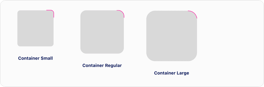
Container Scale
Containers used to layout components on the page follow a scale that nests radiuses, visually wrapping larger radiuses around smaller radiuses. This enhances the visual structure.
| Token Name | Value | Usage |
|---|---|---|
| Small | 8px/0.5rems | Nested containers |
| Regular | 16px/1rems | Default page level containers |
| Large | 24px/1.5rems | Special use cases for additional nesting hierarchy |
Scale or nesting can dictate shape choice. Hierarchy on the page can also determine shape choice to start with, dependent on what will be nested inside the container. A large container of 24px is uncommon and typically used for special use cases where there is a need for additional hierarchy on the page.
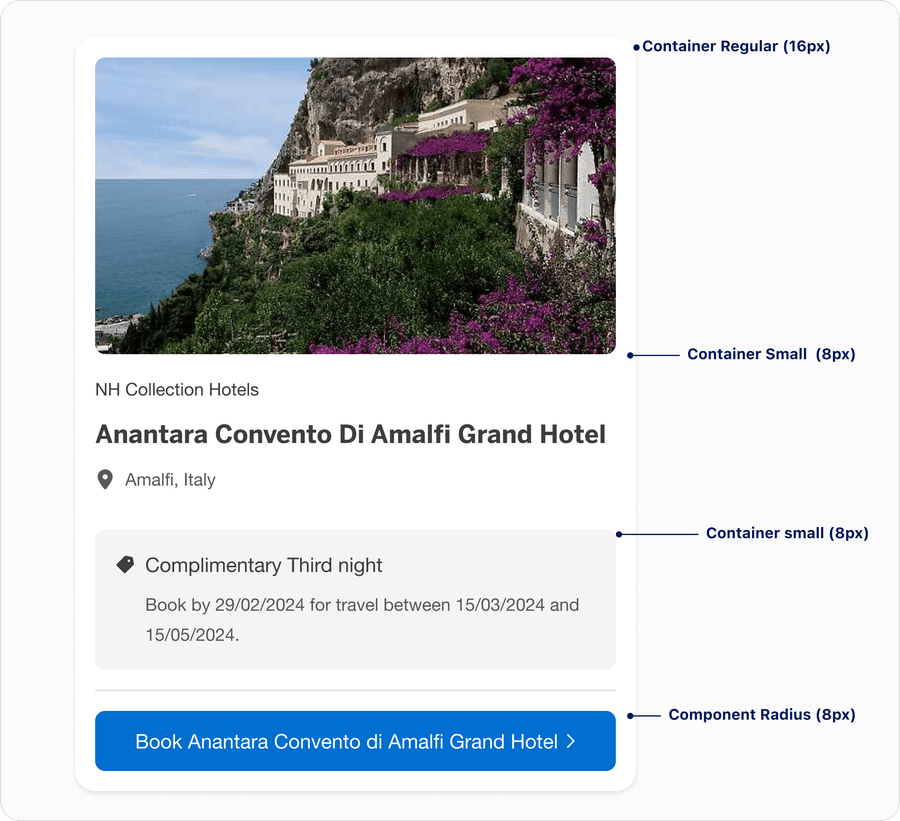
For example, depending on your layout, components could have an 16px container and the inside radius would decrease according to scale. If you have a component, like card, inside a container, you may want increase to use Container large to maintain scale and create visual hierarchy.
How to Nest Radius
Nesting components with the radius inherited from the parent component can help to elevate and soften the look and feel of the layout.
- Use radius to create an elevated look
- Use radius to make the layout feel intentional
- Use radius to create visual hierarchy on the page
- Increase the border radius of nested surfaces
- Make border radius of nested components match the parent component border radius
- Change the border radius of buttons or badges when nesting them
In the below example, you can see multiple elements nested in a card. The radius from the components parent container should expand proportionally. It creates a harmonious component and softens the system.
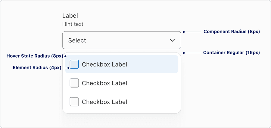
Another example below showcases a smaller element, like checkbox, nested inside a multiple select. As you can see, the radiuses get progressively larger as you move toward the outer edge of the layout. In this case, the container for the checkboxes (elements) is set to our regular container radius as the smallest variant (8px).
Updates
| Version | Change Date | Link |
|---|---|---|
| v7.0 | August 29th, 2024 | v7.0 Release notes |
Questions?
Connect with the DLS Team on Slack or by email.
Resources
Check out additional resources.