Data Visualization
Data visualization is a powerful tool for communicating complex information in a clear and intuitive way. When integrated into digital products, well-designed data visualizations enhance decision-making and improve user engagement.
Best Practices
Using Color in Data Visualization
Color helps differentiate data points, highlight trends, and guide user attention. However, improper use of color can create confusion or accessibility barriers.
- Use consistent color assignments, for example, green = positive/up, red = negative/down
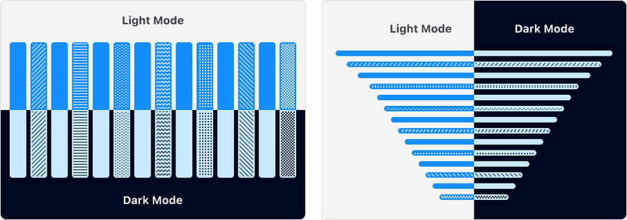
- Use patterns, text labels or icons alongside colors to reinforce meaning
- Test color combinations in both light and dark modes
- Test visualizations in grayscale to ensure clarity for users with color blindness
- Use different shades of the same color for categories, as it can imply ranking
- Rely solely on color to convey meaning; always include labels or patterns
- Overuse bright or saturated colors - they can overwhelm users
- Rely on red and green alone—consider adding textures or different hues
Default Surfaces
The data visualization color palette has been carefully designed to work on specific background surfaces to ensure accessibility. Learn more about surfaces and dark mode.
Use default surfaces like foreground, subtle and base only. Avoid using data visualization colors on brand or brand-alt surfaces, as these colors will not pass accessibility checks.


Color Palettes
Understanding Color Palettes
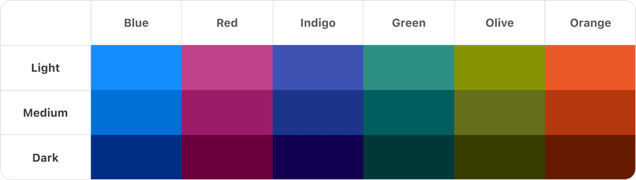
The data visualization color palette is based off 6 main colors: blue, red, indigo, green, olive and orange. Each color has a light, medium and dark range.
Standardizing colors allows us to be confident that our system is accessible. Find out more about color accessibility.
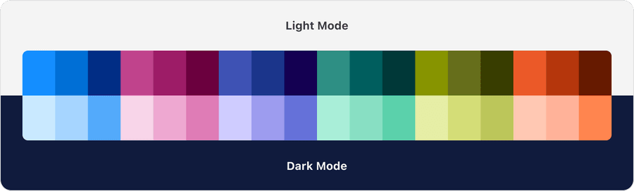
Light and Dark Mode
The system carefully pairs colors from each palette for light and dark mode. Find out more in Dark Mode docs.
Patterns
While color is a powerful visual tool, it should never be the sole means of communicating information—especially in data visualization. Provide alternative cues such as patterns, icons, and text labels.

Patterns should be used in order from left to right to maximize accessibility and contrast between them. All patterns can be tiled to any size.
Questions?
Connect with the DLS Team on Slack or by email.
Resources
Check out additional resources.