Data Visualization
Data visualization is a powerful tool for communicating complex information in a clear and intuitive way. When integrated into digital products, well-designed data visualizations enhance decision-making and improve user engagement.
Highcharts
Configuration
Highcharts is a powerful JavaScript charting library used to create interactive, accessible, and responsive data visualizations.
When using the Highcharts API, developers should set their own global and accessibility configs. For the most visually accessible chart we recommend adding patterns to your highcharts.
Refer to Highcharts lang.accessibility and chart.accessibility for configs options and our v6 working demo for implementation examples—v7 to come.
Chart Type Selection
Choose the simplest chart type that fits your use case:
- Line, Area – for trends over time
- Bar, Column – for comparing categories
- Pie, Donut – for part-to-whole comparisons
- Scatter, Bubble – for relationships between values
- Heatmaps, Treemaps – for complex hierarchical or dense data
Avoid 3D or overly decorative charts that reduce clarity.
- Use design tokens for colors and fonts
- Enable Highcharts accessibility features
- Choose simple, readable chart types
- Label axes, series, and tooltips clearly
- Provide data tables or summaries
- Hard-code brand colors or unapproved fonts
- Skip description or rely solely on color for meaning
- Use complex or unnecessary 3D visualizations
- Leave chart elements unlabeled or use cryptic terms
- Present only a visual without context or alternatives
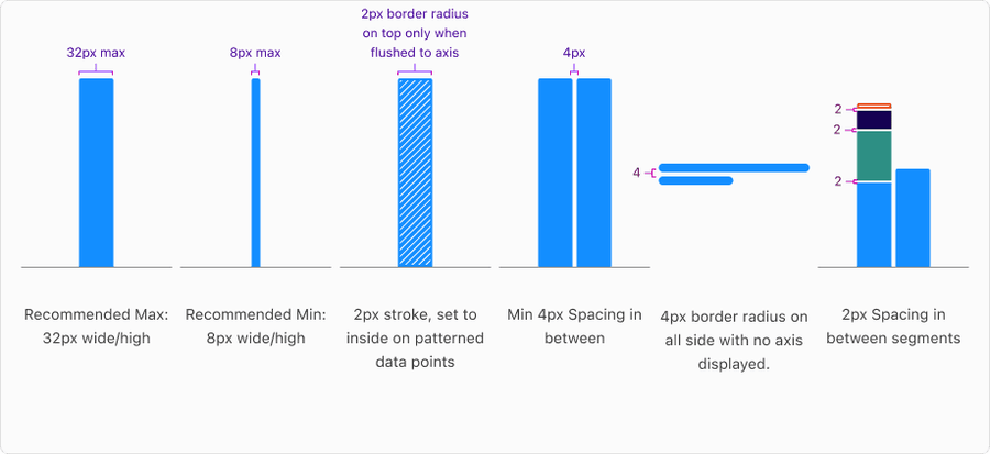
Bar Anatomy
A bar in a graph represents a single data point or value, visually encoding its magnitude through length or height. Each bar is made up of key components that work together to communicate information clearly, including the bar shape, color, label, and axis alignment. Understanding these parts ensures bars are styled, labeled, and positioned consistently across charts for clarity, accessibility, and comparability.
Basic Data Visualization
One Type of Data
Example: Spending over months
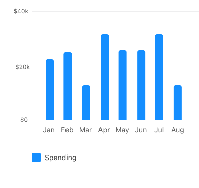 Only use one color to show data
 Don’t use different colors for each bar
Same Data Comparison
Example: Card spend this month vs last month
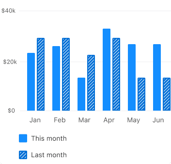
- Use the same base color at different intensities, such as light for current and medium for comparison
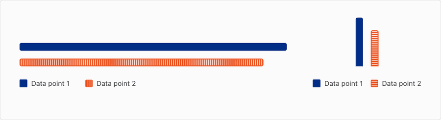
- Adding a pattern to the comparison value helps visually reinforce the relationship and ensures compliance with accessibility guidelines
- If you use patterns to show comparisons, apply them consistently across the entire visualization to support pattern recognition
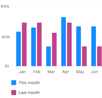
- Avoid using two different colors for the same data type—it can mislead users into thinking the chart is comparing two different kinds of data
- Without a supporting pattern or label, relying on color alone fails accessibility standards, making it harder for users with color vision deficiencies to interpret the information correctly
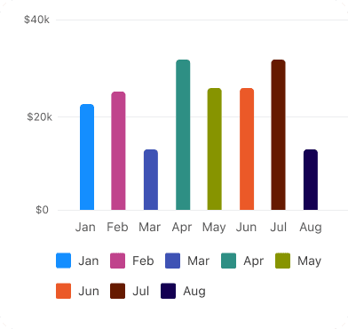
Simple Data Comparisons
If you don’t have a color mapped to a specific data type, use these default colors (for example, blue-light and indigo-dark).
Example: Card spend vs Checking spend
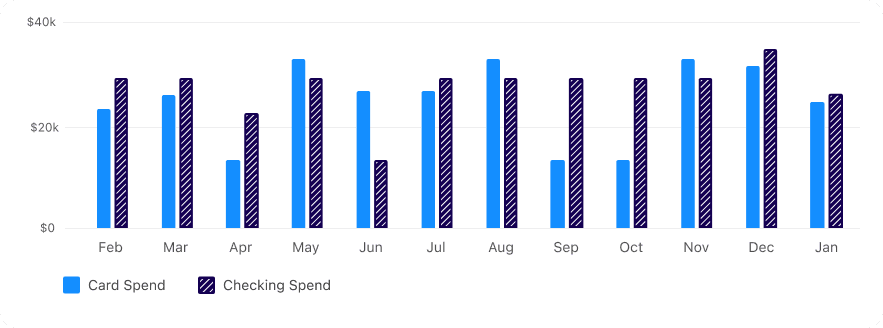
If you are mapping any data viz colors to a specific type of data (for example, Indigo-Medium is Spending, Orange is Income) use those colors consistently. Aim for a greater than 2:1 contrast ratio for between the colors and ensure 3:1 on the background.
Diverging Data
Use diverging data to display a meaningful midpoint between two opposing values, such as positive versus negative changes. It typically employs two contrasting colors that transition through a neutral midpoint. This approach is ideal for visualizing financial performance, sentiment analysis, and temperature variations.

Choose a palette that reflects the context, for example, red = loss, green = gain

Don’t use unexpected color associations, for example, red for increase unless contextually appropriate

Use two contrasting hues, for example, red-green, indigo-orange, that are perceptually balanced

Don’t use hues that are too close together - differences may be hard to see
Ensure hues at each end of the spectrum are equally visible and legible

Don’t use unbalanced color contrast, for example, one side brighter, the other darker
Questions?
Connect with the DLS Team on Slack or by email.
Resources
Check out additional resources.