Data Visualization
Data visualization is a powerful tool for communicating complex information in a clear and intuitive way. When integrated into digital products, well-designed data visualizations enhance decision-making and improve user engagement.
Make it Accessible
When the colors in the system are applied, it will be in compliance with color accessibility standards. We support Web Content Accessibility Guidelines 2.1 level AA which requires 4.5:1 contrast for text. We never rely on color for communication and we ensures that our product works for people with visual impairments and improves legibility for all users. To learn more about color accessibility read our blog written by our team.
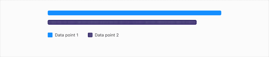
Don’t Rely on Color Alone
Always pair color with another visual cue (e.g., text labels, patterns, shapes, position) to communicate information.
Ensure Sufficient Color Contrast
- Text contrast should have at least 4.5:1 agains the background color
- Object contrast or bars and in bar graphs or sections should be 3:1
- Use approved chart tokens that are designed to meet these requirements across both light and dark modes
- Avoid pastel shades or low-contrast tones on light or dark backgrounds
Use Accessible Color Palettes
Choose palettes designed for accessibility:
- Categorical palettes with clearly distinguishable hues
- Diverging palettes that emphasize the midpoint with contrasting directions
- Stick to 5–6 colors max to maintain clarity
- Ensure the visualization is responsive to different screen sizes and zoom levels
Labels: Direct and Informative
- Prefer direct labeling over relying solely on a legend, especially in line or bar charts
- Label axes clearly, with units and context, for example “Revenue (USD)”, “Time (weeks)”
- Use human-readable formats, such as 1M instead of 1000000
- Use abbreviations and truncations carefully; always prioritize legibility
- Ensure text doesn’t overlap or get cut off at different screen sizes
- Maintain sufficient contrast against backgrounds for readability
- Avoid rotating labels unless necessary
Legends: Mapping Visuals to Meaning
- Place the legend close to the chart, ideally above or beside it
- Keep the order of legend items consistent with the chart’s data order
- Use descriptive, concise labels, for example “2023 Revenue”, not just “Blue”
- Include color swatches, patterns, or icons that match chart elements exactly
- Make legends keyboard navigable and screen reader accessible when interactive
Interactivity and Keyboard Navigation
Interactive Charts
- All controls (filters, toggles, sliders) must be keyboard navigable
- Include ARIA labels, focus states, and semantic grouping
- Provide a data table alternative for screen readers
- Make the data available in an accessible table format
Tooltips should be
- Accessible by keyboard
- Readable by screenreaders
Tab order example
- Chart Title
- Legend
- Filters
- Data points (navigable)
- Tooltip (when focused)
Screen Reader Support
- Use aria-label on chart containers to describe the chart purpose
- Use role=“img” with aria-describedby pointing to a summary
- Include a text summary of the visualization, making sure to describe trends or patterns in the visualization
Animation and Motion
- Avoid excessive animation, keep it purposeful, for example loading states
- Respect user preferences by detecting and honoring prefers-reduced-motion
- Should be short, non-looping, and minimal unless critical for understanding the data, for example, loading animations
- Allow the user to turn off animation
Interaction and Style
Relevant WCAG Requirements
Sensory Characteristics
Instructions provided for understanding and operating content do not rely solely on sensory characteristics of components such as shape, color, size, visual location, orientation, or sound.
WCAG 2.1 Understanding 1.3.3Use of Color
Color is not used as the only visual means of conveying information, indicating an action, prompting a response, or distinguishing a visual element.
WCAG 2.1 Understanding 1.4.1Contrast (Minimum)
The visual presentation of text and images of text has a contrast ratio of at least 4.5:1, except for the following:
- Large Text: Large-scale text and images of large-scale text have a contrast ratio of at least 3:1;
- Incidental: Text or images of text that are part of an inactive user interface component, that are pure decoration, that are not visible to anyone, or that are part of a picture that contains significant other visual content, have no contrast requirement.
- Logotypes: Text that is part of a logo or brand name has no contrast requirement.
Non-text Contrast
- The visual presentation of the following have a contrast ratio of at least 3:1 against adjacent color(s):
- User Interface Components: Visual information required to identify user interface components and states, except for inactive components or where the appearance of the component is determined by the user agent and not modified by the author;
- Graphical Objects: Parts of graphics required to understand the content, except when a particular presentation of graphics is essential to the information being conveyed.
Focus Visible
Any keyboard operable user interface has a mode of operation where the keyboard focus indicator is visible.
WCAG 2.1 Understanding 2.4.7Updates
| Version | Change Date | Link |
|---|---|---|
| v7.0 | August 26th, 2024 | v7.0 Release notes |
Questions?
Connect with the DLS Team on Slack or by email.
Resources
Check out additional resources.