Developer Onboarding
The American Express Design System provides a unified language for designing American Express websites and experiences. The design system provides design resources that match our coded components and are aligned with the American Express brand. Included are colors, components, icons and glyphs, type styles, and graphic assets to get you up and running quickly.
For the majority of applications, it is recommended to only use the dls-core stylesheet. However, there are additional stylesheets detailed below for more specific use cases.
Primary Stylesheets
There are two primary stylesheets available. There should only be one primary stylesheet included on the page.
DLS Core Recommended
dls-core is the primary DLS v7 stylesheet. It contains:
- CSS reset
- CSS variables needed to support modes and surfaces
- Utility classes for grid, spacing, color, and more
DLS Max
The dls-max stylesheet contains both dls-core and dls-extra-utils (see explanation of dls-extra-utils below). It should only be included if your application needs access to dls-core and dls-extra-utils, but only wants to have one DLS stylesheet on the page.
Extra Stylesheets
In addition to the primary stylesheets, these are extra stylesheets which provide additional functionality. These should be included in addition to a primary stylesheet.
DLS Extra Utilities
The dls-extra-utils stylesheet contains the utility classes with all possible breakpoint modifiers. For example, dls-core contains the text-align-left utility class, whereas dls-extra-utils contains text-align-left-sm-up and all other variations. This stylesheet should only be included if application teams need access to many breakpoint-sensitive utility classes. There is no overlap betweeen the dls-core and dls-extra-utils stylesheets.
DLS Components
The dls-components stylesheet contains component classnames, which can be used with the component HTML to get DLS components working in a non-React setting. Applications using One App or React should not need this stylesheet.
DLS Data Visualization
There is not yet a v7 data visualization stylesheet. Reach out to the DLS team for guidance on how to handle this use case.
Usage Tips
Stylesheet URLs are https://www.aexp-static.com/cdaas/dls/packages/@americanexpress/dls/<version>/stylesheets/<name>.min.css, where <version> is the DLS v7 version and <name> is the stylesheet name listed above (note that min indicates that the CSS file is minified).
Removing the min from the URL will retrieve the un-minified version, which is helpful for seeing the complete contents of the stylesheet. While the utility classes page documents the majority of classes, seeing the stylesheet in its entirety is useful for things such as seeing media queries and understanding style precedence.
Below is the complete suite of stylesheets offered:
- dls-core.css
- dls-core.min.css
- dls-max.css
- dls-max.min.css
- dls-extra-utils.css
- dls-extra-utils.min.css
- dls-components.css
- dls-components.min.css
DLS CSS Plugin
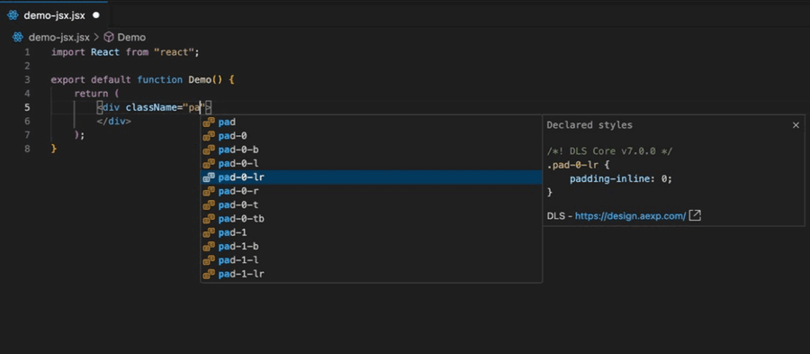
We recommend using the DLS CSS Plugin (community contribution from Ayush Sur) which provides DLS classname autocomplete and documentation (see below screenshot). Follow the installation instructions below based on your IDE:
Questions?
Connect with the DLS Team on Slack or by email.
Resources
Check out additional resources.