Data Table
Tables make it easier for users to compare and analyse data. Data tables organize information with logical relationships and two-dimensional data structures from a data set into a grid with two axis. An example of two-dimensional data is a table of flight costs, each row represents an airline, and each column represents a destination.
Best Practices
- To make it easy for users to compare data points between rows or columns, for example comparing features between card products
- A way to show relationships and patterns in data for example spending trends, allowing users to arrive at their own insights
- When the content of the cells share clear and simple column headings
- If the data is easy to understand when all data points are displayed in a flat hierarchy
- For short format data for example dates, numbers, prices and names
- When columns have no headings
- When rows and columns are only a means of layout, use CSS grid or flex box instead
- If the data is easier to understand with grouping and hierarchy for example sections or subheadings
- For data with long form content such as paragraphs or long lists
- When a more complex display of the data or interactions are required
- As a replacement for a spreadsheet application
- When there are columns where the cells will usually be empty for example a spacing column for layout
Variations
Default
Planet | Distance from Sun (million km) |
|---|---|
Mercury | 57 |
Venus | 108 |
Earth | 149 |
Mars | 228 |
Saturn | 780 |
Jupiter | 1437 |
Uranus | 2871 |
Neptune | 4530 |
Sortable
| Jan 05, 2020 | SAINSBURY’S ONLINE-GOL LON | $8.76 |
| Mar 16, 2020 | Online Payment | $300.00 |
| Apr 14, 2020 | SWISS Intl Air LinesBasel CH | $5,000.00 |
| Oct 01, 2020 | Music Enterprise In | $10.67 |
| Mar 15, 2020 | Martin’s News Shops Wellington | $32.99 |
| Variation | Description |
|---|---|
| Default | Default data table displays static data without interactive elements. |
| Sortable | Sortable data tables allow users to sort data. |
When to use data table functionality
Not sure what table to use? Use this list of scenarios to help refine your table.
| Table Function | Scenario | Do | Don’t |
|---|---|---|---|
| Default | Use for simple data display where users don’t need to interact beyond viewing. |
|
|
| Sortable | Use when users need to compare data or reorder by a specific column value (for example, dates, names, prices). |
|
|
| Actionable | Use when each row has associated actions (for example, edit, delete, download). |
|
|
| Checkbox | Use when users need to select multiple rows to take bulk actions (for example, delete, export, assign). |
|
|
| Expandable | Use when each row contains additional information that doesn’t need to be visible by default (for example, nested data, details view) |
|
|
| Checkbox + Expandable | Use when users need to both take bulk actions and view more details per row (for example, select orders and see shipment info). |
|
|
Recommendations
Interactive Elements
There are three types of interactive elements available for data tables that include checkboxes, expandable and additional actions. Any interactive component in a table needs a minimum line height of 44px for accessibility.
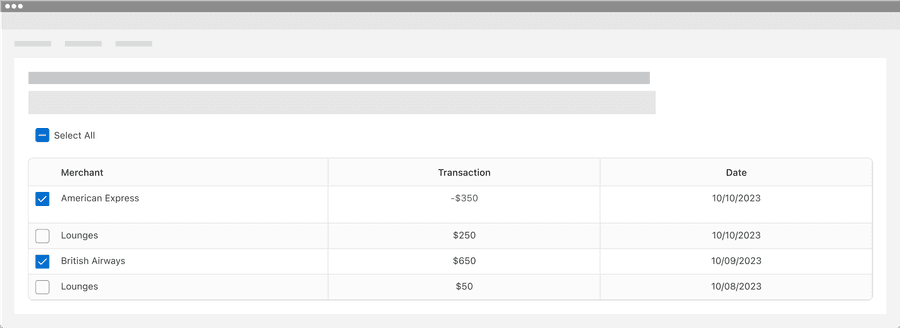
Selectable Rows
Selectable rows allows users to select one or more rows in a table. Selectable rows can be used in the batch actions pattern with selection controls and menu. Here’s an example of batch actions with options for select all, print, and export.
Batch Actions
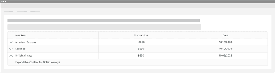
Expandable Rows
Expandable rows allow data table users to display supplementary information within an expandable row.
Additional Actions
Additional actions allows data table users to have apply actions for each row, for example copy row content or delete row. Additional actions uses menu.

Interactive components generally must be a minimum of 44 by 44px to pass the minimum target size accessibility standard. Any row with an interactive element will also need to be at least 44 by 44px to fit the target. Target size accessibility standard
Data Table Headings
Use short and descriptive headings to identify columns.
| Merchant | Transaction | Date |
|---|---|---|
| American Express | -$350 | 10/10/2023 |
| Lounges | $250 | 10/10/2023 |
- Give each column a heading
- Use short and descriptive headings
- Keep it short, target a length of one to three words with no more than five
- Use title case, like “Almost Every Word is Capitalized”
- Avoid merging headings when possible
- Give separate pieces of data their own cells
| American Express | -$350 | 10/10/2023 |
| Lounges | $250 | 10/10/2023 |
- Remove headings
- Leave headings empty
Data tables need headings to define the data relationship. Accessible tables need visual headings along with HTML markup that indicates header cells and data cells and defines their relationship. ‘-$350’ and ‘Transaction amount -$350’ can have very different meanings, adding headings gives context. Read the data table accessibility section for more details.
Ordering Content
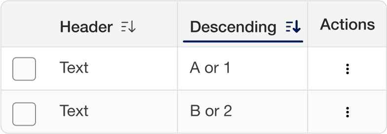
Selecting a column sorts the table by that column’s content, with an arrow indicating the order. Select again to reverse the order.
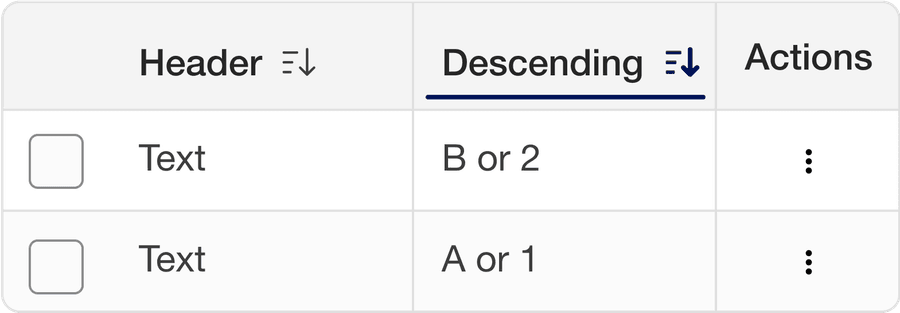
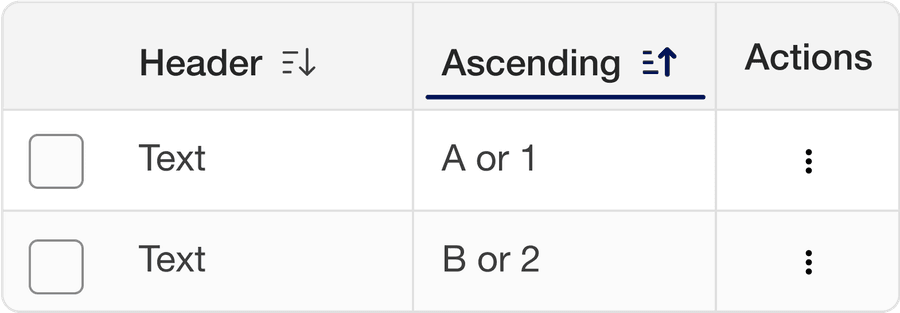
Order content using content relevant orders such as alphabetical (a-z), numerical (Ascending or descending), date, or distance. Consider Internationalization.

Borders
Table borders are optional and can be used to emphasize horizontal or linear relationships. Borders help the user’s eyes to scan long horizontal or vertical data.
Border options:
All Borders
Rows
Columns
No Borders
Zebra Stripes
Data table zebra stripes are optional and usually used to emphasize horizontal rows or linear columns for comparison tables. Zebra stripes can be used in addition or instead of borders. Zebra stripe options:
Horizontal
| Merchant | Transaction | Date |
|---|---|---|
| American Express | -$350 | 10/10/2023 |
| Lounges | $250 | 10/20/2023 |
| British Airways | $650 | 10/09/2023 |
| Lounges | $50 | 10/08/2023 |
Columns
| Header | British Airways American Express® Credit Card | Platinum Card® | American Express® Preferred Rewards Gold Credit Card |
|---|---|---|---|
| Card Type | Credit Card | Credit Card | Credit Card |
| What you earn | Avios | Membership Rewards® | Membership Rewards® |
| New Cardmember Offer | Collect 5,000 bonus Avios when you spend £1,000 in your first three months of Cardmembership | Earn 30,000 Membership Rewards® points when you spend £4,000 in your first three months of Cardmembership. Terms apply | 20,000 Membership Rewards® points when you spend £3,000 in your first three months of Cardmembership |
Because of the volume of data filling up the screens, data tables can cause cognitive overload. It can be complicated to understand what each cell stands for and row or column it belongs to. Borders and zebra striping support visual scanning behaviors, they help users to keep their place as they look around and compare data.
Compact Padding
Tables have default and compact padding. Use compact when it’s important to have as much data as possible on the screen to understand the data. Compact mode is also used by small breakpoint (800px) or smaller.
Default
| Header | Header |
|---|---|
| Text Cell with more data | Text |
| Text | Text |
Compact
| Header | Header |
|---|---|
| Text Cell with more data | Text |
| Text | Text |
Responsive
Data tables that don’t fit the screen have two options: Reflow cells or have a horizontal scroll bar. Data tables do not need to reflow to pass accessibility but it is a better experience to see all the data needed for the user. To help more content fit on smaller screens data table moves to compact at small breakpoint (800px) or smaller. Alternatively you could use data grid or cards that reflows at different breakpoints.
Wrap Content
Scroll
All pages must be responsive and reflow to a minimum of 320px, except for parts of content that require two-dimensional layout for usage or meaning. Data table’s do not need to reflow as they require two-dimensional layout for meaning.
Two dimensional data is data that uses two axis on a graph where each axis is a primary data point, an example of two-dimensional data is a table of flight costs, each row represents an airline, and each column represents a destination.
“This relationship is essential to convey the content. This criterion exempts data tables from needing to display without scrolling (e.g., horizontally in a vertically scrolling page).“- Reflow accessibility standard
There is the ability to add max and min widths with data tables. Alternatively you could use data grid or cards that reflows at different breakpoints.
Using Data Tables Figma component
The data tables Figma component is made up of column sub-components, you can choose to use the pre-made component or build your own using sub-components.
Using Data Table Component
Data tables uses a mix of properties and variables.
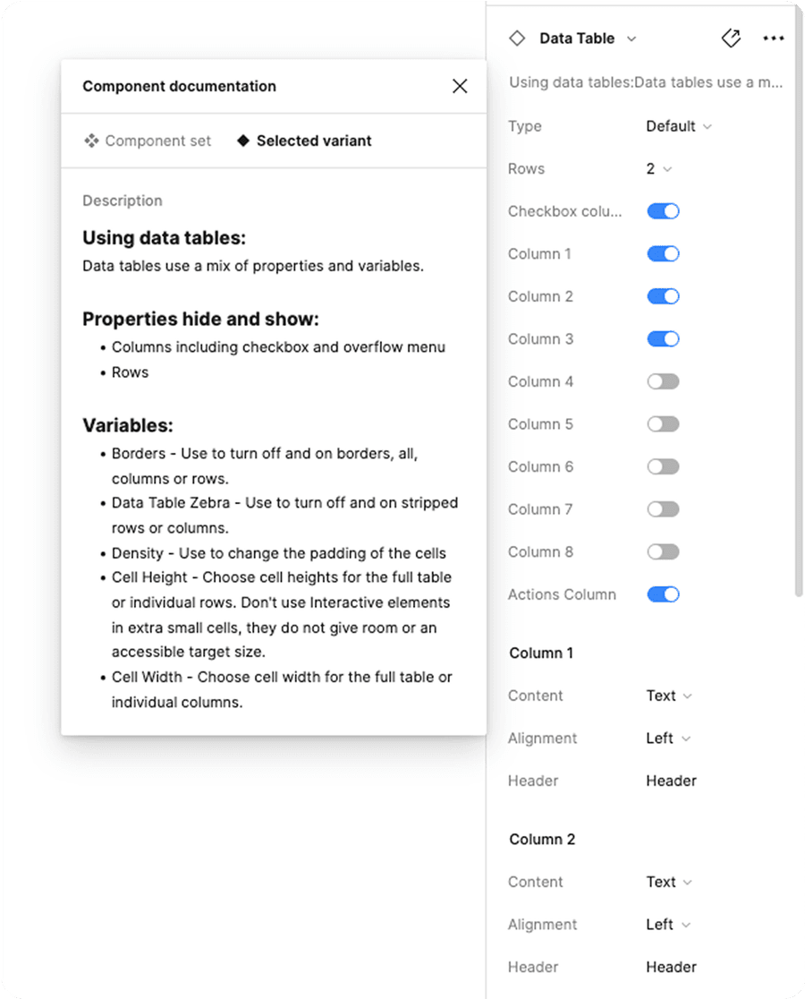
Properties:
- Hide and show: columns including checkbox and menu
- Select: Number of rows
Variables:
- Theme: Choose from neutral, subtle brand and brand.
- Borders - Use to turn off and on borders, all, columns or rows.
- Table Zebra - Use to turn off and on stripped rows or columns.
- Density - Use to change the padding of the cells
- Height - Choose cell heights for the full table or individual cells. Don’t use Interactive elements in extra small cells, they do not give room or an accessible target size.
- Width - Choose cell width for the full table or individual columns.
Using Column Sub-Components
There are four column sub-components, default, sortable, selectable, and actionable.
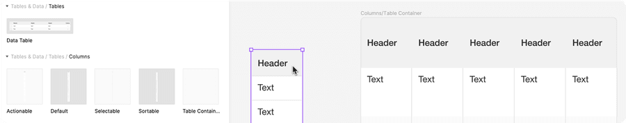
Make your own table: Columns should be used with data table container to build your own data table.
Detach the data table container then add columns of your choice. Note: Table container will clip content to create the table corner radius on the outside columns.
Using Selectable Columns: Selectable column should be used combined with default or sortable columns to create the checkbox label.
Questions?
Connect with the DLS Team on Slack or by email.
Resources
Check out additional resources.