Data Table
Tables make it easier for users to compare and analyse data. Data tables organize information with logical relationships and two-dimensional data structures from a data set into a grid with two axis. An example of two-dimensional data is a table of flight costs, each row represents an airline, and each column represents a destination.
On this page
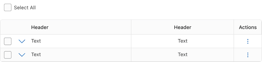
Default Table
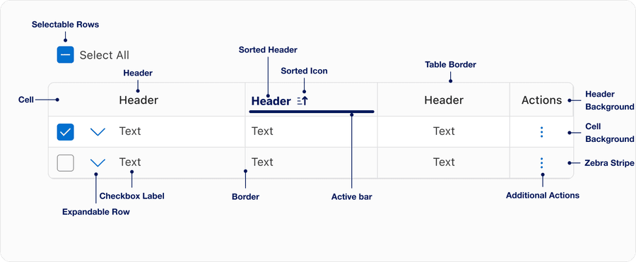
Anatomy
| Name | Description | Required |
|---|---|---|
| Header | Headings define the data’s relationship. Use short and descriptive headings. | Yes |
| Cell | A singular piece of data | Yes |
| Header Background | Used to emphasize header row. Background color conveys states default, selected, or hover. | Yes |
| Cell Background | Solid color thats used to contrast header row. | Yes |
| Table Border | Contains table content. | Yes |
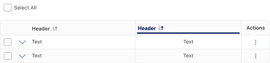
| Sorted header | Selected state for sorted header column, uses the filled sorted icons and active bar. | Optional |
| Sorted icon | Selecting a column sorts the table by that column’s content, with an arrow indicating the order. Select again to reverse the order. | Required when column is sorted |
| Active bar | Signifies the current sorted column. | Required when column is sorted |
| Border | Use to segment data or emphasize horizontal, linear relationships within the data. | Optional |
| Zebra Stripe | Use to emphasize horizontal rows or linear columns for comparison tables. Zebra stripes can be used in addition or instead of borders. | Optional |
| Additional actions | Apply actions for each row, for example copy row content or delete row. Additional actions uses menu. | Optional |
| Selectable Row | Select one or more rows in a table. Selectable rows can be used in the batch actions pattern with selection controls and menu. Here’s an example of batch actions with options for select all, print, and export. | Optional |
| Checkbox Label | Visual label for the selectable row check box. Each row must have a unique label this is made up of the data. This could be made up of one column or multiple columns. | Required when using Selectable row |
| Expandable Row | Use to display supplementary information within an expandable row. | Optional |
States
Default
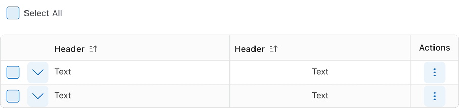
Hover
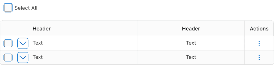
Focus
Selected
Unselected
| State | Description |
|---|---|
| Default | Users can select the sort button to activate. |
| Hover | When a cursor hovers over the sort button, the background color changes to indicate that the button is clickable. |
| Focus | A focus outline appears around visual element to help users identify current selected component. This is used when a user navigates using keyboard controls or uses a cursor. |
| Selected | Selecting a column sorts the table by that column’s content, with an arrow indicating the order. Select again to reverse the order. You may only select one column at a time. The selected state is signified using the active bar and filled sort icons. |
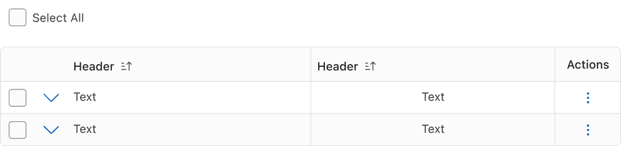
| Unselected | Unfilled icon and no active bar indicates that the content is not sorted by this column. |
Questions?
Connect with the DLS Team on Slack or by email.
Resources
Check out additional resources.