Tabs
Tabs consist of two parts- a tab and a tab panel. A tab is a label that represents the content of a tab panel. A tab panel is a region that contains the content associated with a tab. Use tabs to allow users to navigate easily between related views (content in tab panels) within the same context.
On this page
Best Practices
- To chunk content in sections so that user will be able to predict tab panel content
- For related content, if content is significantly different tabs could be missinterpreted as navigation
- To alternate between alternative views (content in tab panels) within the same context
- Aim for three to five tabs with no less than three tabs and no more than nine tabs
- Have important functions in tabs, for example forms
- If user needs to compare content and view it at the same time.
- As primary navigation or to navigate to a new page, use navigation or link
- To indicate progress, instead use the progress indicators or multi-step tracker
- Do not nest a tab group within another tab group
Recommendations
Tabs vs Navigation
While tabs and a navigation bar may seem to have a similar purpose, they have a strong cognitive difference. The content of each tab is considered to be related to that of the others and selecting between them keeps the customer on the same page. In a navigation bar, however, the content of each section isn’t necessarily related to the others and making a selection will open up that content in a separate view.
Writing Tab Labels
Tabs are used to group related information into different categories, this helps to reduce cognitive load. Category labels should be short and clear.
- Use short labels that are clear and specific. Aim for one to two words, as this is easier to scan
- Labels should clearly communicate the tab panel users will see
- Use title case, like “Capitalize Words”
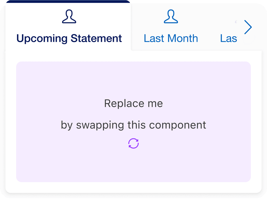
- Relate to the section of the page they’re on. Imagine the page section title is an invisible noun after the tab. For example, the tabs for transactions history:
- Upcoming statement
- Last year
- All
- Use sentences for example and FAQ “What are tabs?” use accordion instead
- Do not use punctuation in tab labels
- Do not truncate tab labels
Tab Panels
Tabs can be a helpful way of letting users quickly switch between related information in tab panels.
- Use tab panels to chunk content in sections so that user will be able to predict tab panel content
- The first panel should be more relevant than the others for most users
- Make sure users will not need to view all tab panels at once
- Have important functions in tabs for example a form.
- Nest a tab group within another tab group.
- Do not use tabs if the total amount of content the tabs contain will make the page slow to load. Use navigation
If content is nested by using tabs or accordions, the page may appear more organized and structured. However, the complexity of the page and how to use it increases. This is doubled if you nest tabs in a tab panel.
Nesting may cause:
- Users overlooking content
- Nesting important functions, reduces the usability for all users
- Causes more issues for designing responsive pages design are increasing
- The site becomes more complicated to use with screen reader and keyboard navigation
Layout
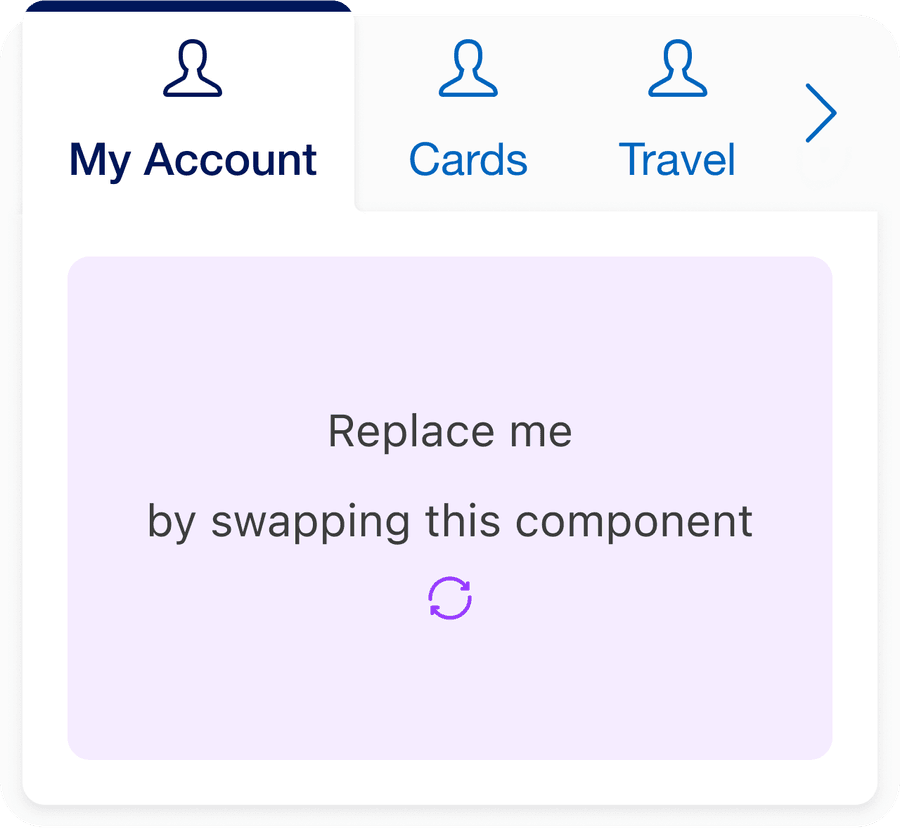
Tabs can be use on their own or inside a card with a heading.
Reflow
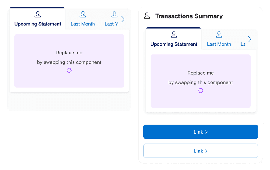
Tabs will work at all breakpoints. When the tab labels are too big for the tab list, the left and right overflow buttons show to help user navigate when tab list is too big for the container. Buttons change the active tab left and right. The overflow buttons will appear at different break points depending on the number of tabs.
Questions?
Connect with the DLS Team on Slack or by email.
Resources
Check out additional resources.