Tabs
Tabs consist of two parts- a tab and a tab panel. A tab is a label that represents the content of a tab panel. A tab panel is a region that contains the content associated with a tab. Use tabs to allow users to navigate easily between related views (content in tab panels) within the same context.
On this page
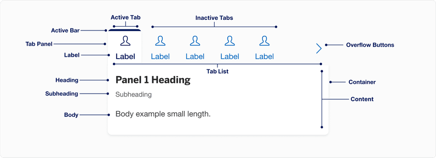
Anatomy
| Name | Description | Required / When Shown |
|---|---|---|
| Tab List | Tab list lets users switch between related tab panels within the same context. Each tab has a unique tab label. Tab lists should group related information split into different categories. | Yes |
| Tab | Inactive state for tab. Tabs are buttons contained in the tab list; they can be activated to display the tab panel. | Yes |
| Tab Label | Tab labels clearly communicate the content contained in the tab panel. | Yes |
| Active Tab | Active state for tab, uses the active bar and a bold font styling. The first tab will be active by default. Only one tab may be active at once. | Yes |
| Active bar | Signifies the current active tab. | Yes |
| Tab Panel | Contains the content associated with a tab. | Yes |
| Container | Tabs container, containing tab list and tab panels. | Yes |
| Content | Content related to each tab. In the Figma component, we provide a content block that allows users to utilize heading, subheading, and body with left or center alignment. One must be used at all times. | Yes |
| Overflow buttons | Left and right overflow buttons help users navigate when the tab list has too many tabs to fit the container at the breakpoint. Buttons change the active tab left and right. | Show when tab list overflows the container |
States
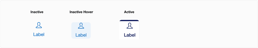
| State | Description |
|---|---|
| Inactive | Users can tap or click the tab to select an option. Once active, the user is not able to unselect. |
| Inactive Hover | A change in color indicates to a user it is clickable when the cursor hovers over a selection. |
| Active | Active state for tab, uses the active bar and a bold font styling. The first tab will be active by default. Only one tab may be active at once. |
Interaction
The tabs list supports keyboard shortcuts to easily navigate through the tabs. Using the left ← and right → arrow keys to move focus to the next and previous tab respectively. Use the Home key to focus the first tab and the End key to focus the last tab. Users can then press Space or Enter to activate that tab. Specifying data-activation-type="automatic" on the tabs container will automatically select the tab when it receives focus as well.
By default data-activation-type="manual" is specified. If the individual tab panels can be displayed without noticeable latency, then the automatic activation type is recommended, allowing users to quickly navigate through the tabs. For more details on making this decision, check the WAI-ARIA Authoring Practices.
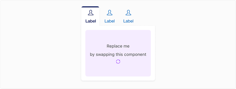
Example - Three Tabs With Default Data-Activation-type (Manual)
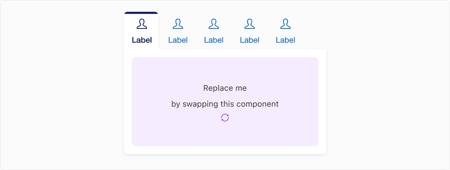
Example - Six Tabs with Data-Activation-Type Automatic
Questions?
Connect with the DLS Team on Slack or by email.
Resources
Check out additional resources.