Accordion
Accordion
Best Practices
- If there is a lot of information to be shown on a page
- If users have a small space to display a lot of content
- To group related information to ensure predictability
- For short content such as a paragraph or FAQs within the page
- If the information hidden is critical information to move forward to next step
- For content that all users need to see and read by assisted technology
- To nest an accordion within another accordion, as it will make content hard to find
- If its filled with heavy items like images, videos, and lots of scripts as it may slow down page load speed
Variations
| Variation | Description |
|---|---|
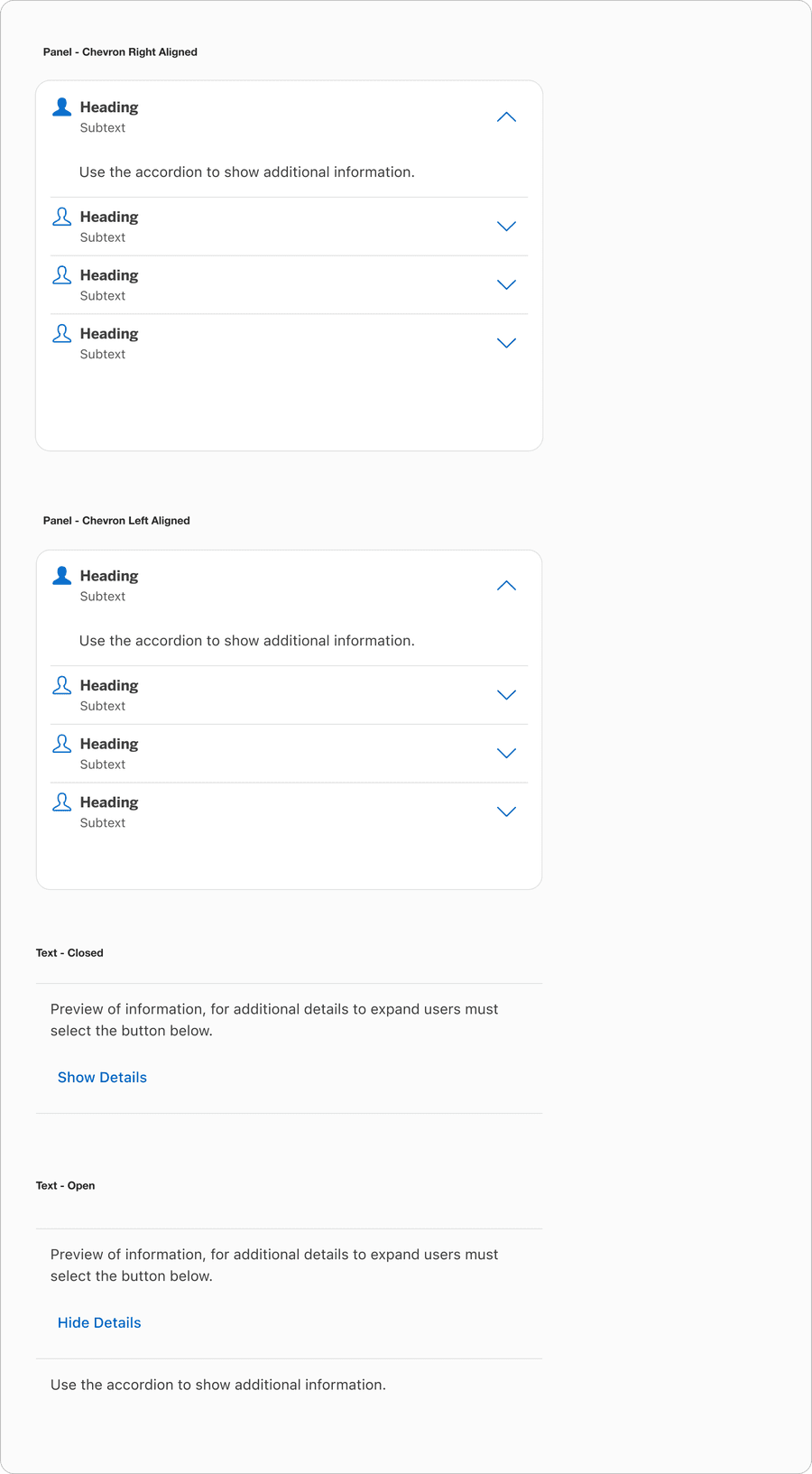
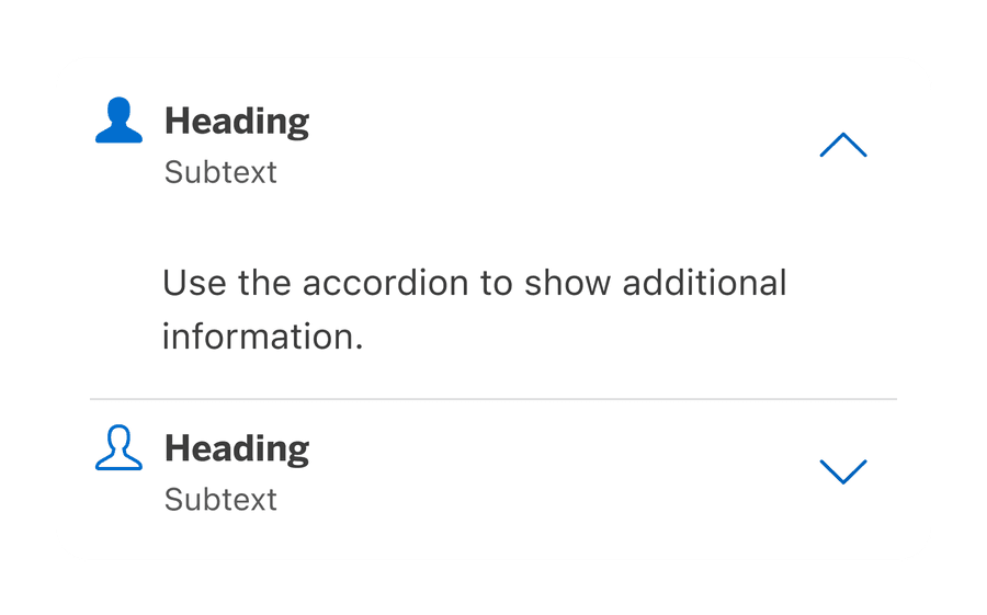
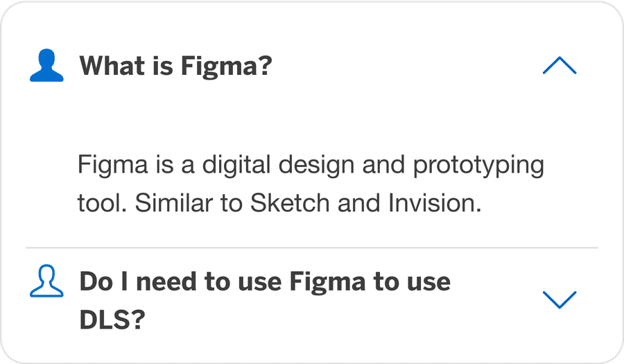
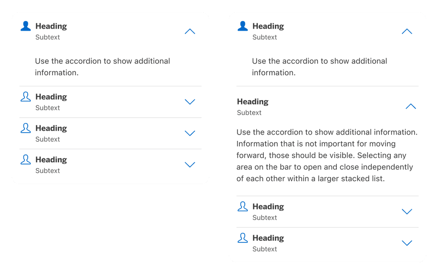
| Panel | Panel Accordion allows the user to select any area of the panel to expand additional details and selecting it again, collapses it. Panel could consist of text panel or custom panel where user can use their local components. Panels can be grouped with related information. Panels have an optional border and may have the chevron on the left or the right side of the heading. |
| Text | Text Accordion allows the user to press the ‘Show more’ button to show additional details. |
Recommendations
Header Panel
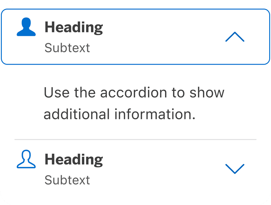
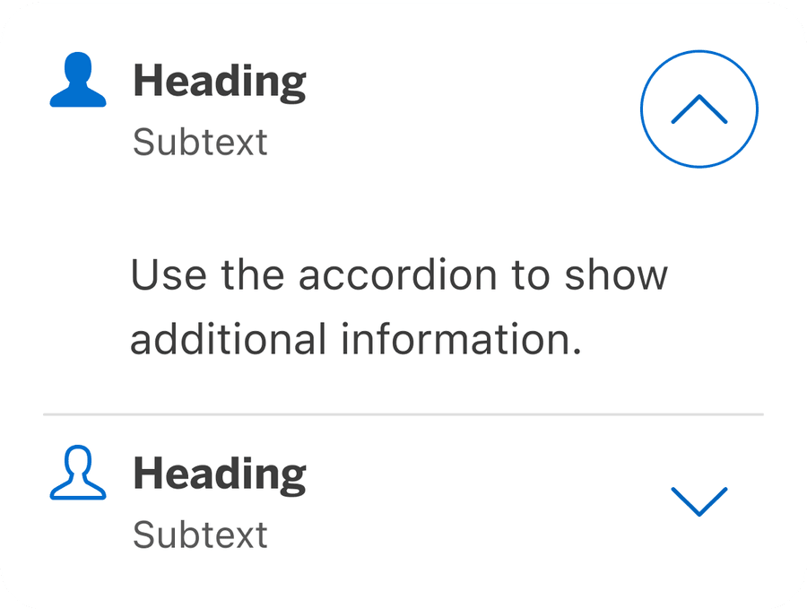
Make the entire header container selectable to trigger expansion. Allow users to select anywhere in the header area to expand or collapse the content; a larger target is easier to manipulate.
Custom Panel
When using custom panel, select the replace me component from the layers to swap instances into one of the local components that user may have created. Custom panel allows users to add in content without detaching the symbol from the library. Read below why its important not to detach.
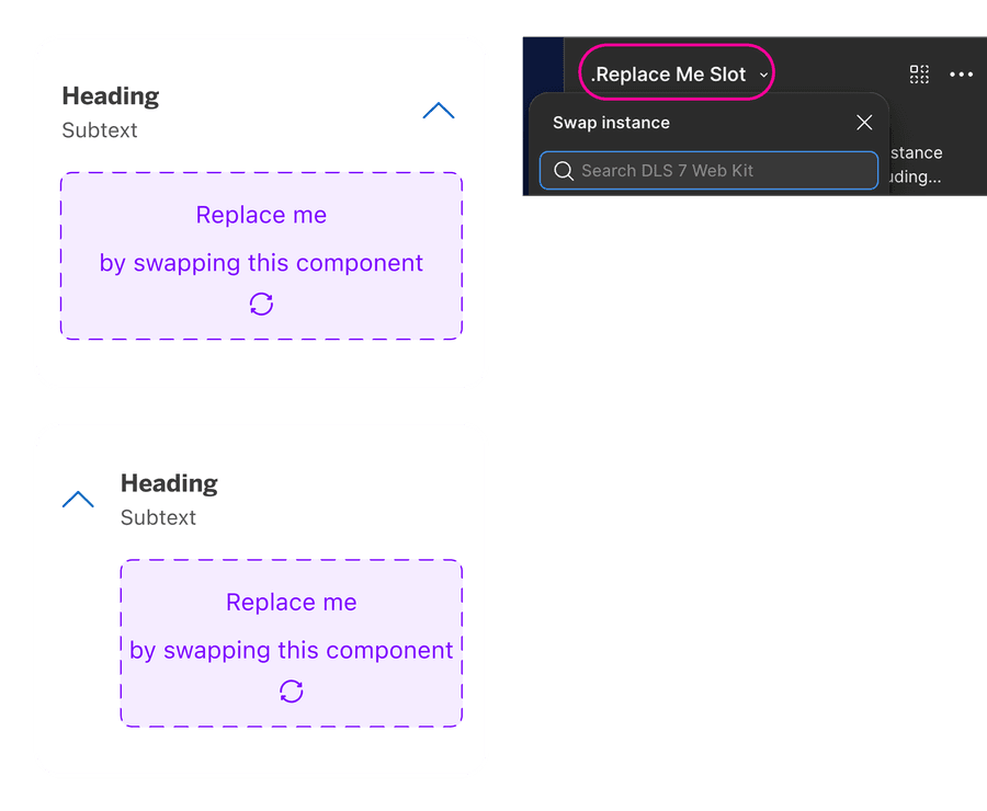
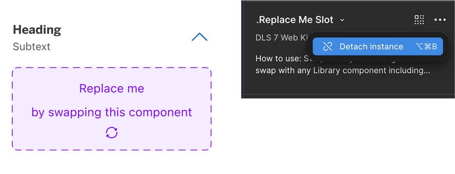
It is recommended that users do not detach components when using our system. If you detach a component, any updates made in the system by our team will not reflect in your designs as it will no longer be connected. Keeping the component connected will allow any updates from our team to reflect in your designs.
Using Icons
Icons used within accordion should be small in size and simple, with well known visual metaphors. It must be placed left of the heading. Collapsed panel will have outline
Guidelines for Icons.
- Use simple well known icons for example account for ‘Account Home’
- Take real world examples for example rewards for Membership Rewards® points
- Be consistent with layout and usage
- Think customer consistency. Follow the icon names available in our icon library for the actions when possible.
- Consider icon meaning and localization
- Don’t use the same icon for different accordion within the related content
- Don’t use complex icons where its hard for user to understand the meaning of icon used
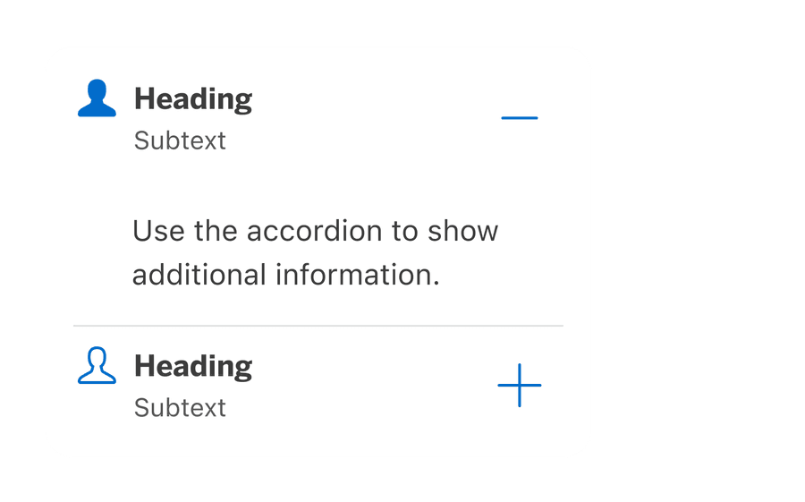
Use up and down chevron to indicate accordion, it should always be positioned to the right of the panel. Avoid rotating, changing icon indicator or using right chevron.
Chevron right and plus and minus could possibly indicate, a different functionality; for example, addition or adding a dependent child to a form. While the arrows seemed more closely related to navigation.
- Icons need to be simple and easy to understand.
- For accessibility, we need to make sure we use icons for the same meaning throughout our website. Consistent identification accessibility standards.
- Remember: the more complex the icon, the longer a user spends understanding them.
Content
Panel content should accurately describe what a user will find when action is performed or when interacted with a accordion. This helps to focus the content on a specific user action, as well as set expectations about the results or a landing destination.
Avoid Nesting Content
If content is nested by using accordions, the page appears more organized. However, page is more complex and reduces usability. Users may miss vital information or be unable to proceed in a user journey.
If content is nested, it should not be an essential part of the user journey. The operability of the journey must not suffer. Otherwise it can be confusing for the users, because they cannot find important functions.
Behavior
Open one or multiple at a time
The accordion may be configured to force the user allowing for only one panel to be expanded or opened at any given time. When a second accordion control is engaged, the previous accordion panel automatically collapses or closes.
If the configuration is set to multiple open panels, the user can open or expand multiple accordion panels at the same time. To close the opened panels, the user must re-engage individual accordion.
Responsive
Accordion is flexible to be minimum of 288px to max 1440px.

All pages must be responsive and reflow to a minimum of 320px. Accordion will reflow to a minimum of 288px, to allow users to use margins in minimum breakpoint. Reflow accessibility standard
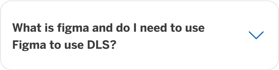
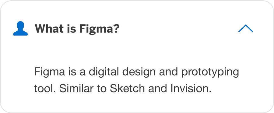
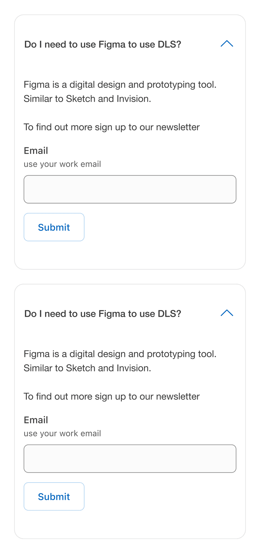
Questions?
Connect with the DLS Team on Slack or by email.
Resources
Check out additional resources.