Carousel
Carousels are comprised of a rotating set of slides, primarily used to highlight content that is prominent but not essential to completing a task. They usually contain between two to five slides, slide number indicator, and navigational arrows that allow the customer to rotate the slide manually. Carousels may also be known as a slider, a slideshow, or a gallery.
Best Practices
- To showcase content such as images or article previews
- Instead of a hero banner to show more than one piece of content in the same piece of prime real estate on a page
- For content that is not critical to the user’s task
- With a collection of two to five slides that are related and make sense on their own
- With high quality images with separate optional heading text and call to actions per slide
- If a slide is misleading without the context of other slides
- For content or functionality that is essential to completing a task
- With more than five slides, as it’s unlikely users will engage with more than that
- With full width slides if user needs to compare content and view it at the same time
- Nested within another carousel or similar interactive element such as tabs
- With slides using text as images
- For critical calls-to-action (CTA) that must not be missed
Variations
Manual Control
Auto-rotate
| Variant | Description |
|---|---|
| Manual Control | Manual control carousels allow the customer to discover the content of a carousel by using the controls provided. Manual control may have full width slides or show more than one slide at a time as cards. Use this carousel when some content is more important or prominent than others. |
| Auto-rotate | Auto-rotate carousels automatically display slides on rotation, based on a specified delay. Users can manually rotate and pause slides if needed. Use when the rotating slides are equal in importance or prominence. |
Recommendations
Slide Content
- Some users will only see the first slide or skip past them all as they can be misunderstood as advertisements. Consider manual vs auto-rotate depending variations on your content type.
- If the slide content is important to a user journey, use an alternative to carousel such as cards or repeat the content elsewhere in your journey.
When choosing content for your slides consider:
Context
- Where is this content going?
- Will the content fit in with the surrounding hierarchy?
- How long will the content stay on screen?
- Where are the slide picker controls? Are they hidden by the fold? Will they cover the content?
- What will the content look like at smaller or larger breakpoints?
Actions
- What can the user do? Will there be call to actions per slide?
- If there are call to actions, are they in a consistent location?
- Is there a more important action? Does the content need to rotate?
- Follow recommendations for Call to action links
Using Headings
- Always have text separate to images, this allows for assistive technologies to read and resize text
- Check for contrast between text and background, learn more about color accessibility
- For copy, follow our ux writing best practices
Using Images
- Provide alt text when appropriate
- How will the images resize?
Slide Types
Slides may be both full width of the carousel or contained in cards. When using cards you may choose standard or actionable variations of cards.
Full width carousel.
Or contained with cards.
Slide 1 of 3
Title
Subtitle
Lorem ipsum dolor sit amet, consectetur adipiscing elit, sed do eiusmod tempor incididunt ut labore et dolore magna aliqua.
Choosing The Slide Picker Control
There are two types of slide picker controls:
1. Off slide (Recommended default)
- Positioned outside the slide area, typically below the carousel
- Advantage: Preserves the full slide space for content, preventing overlays or visual clutter
- Use this option whenever possible for optimal readability and design clarity
2. On slide
- Overlays directly on the slide
- Choose between light or dark background picker depending on your images
- Advantage: Saves vertical space, making it useful in tight layouts
- Trade-off: May obstruct important content—plan layout accordingly
Off Slide (default)
On Slide
Slider Indicator Styles
You can choose from two styles to indicate slide progression:
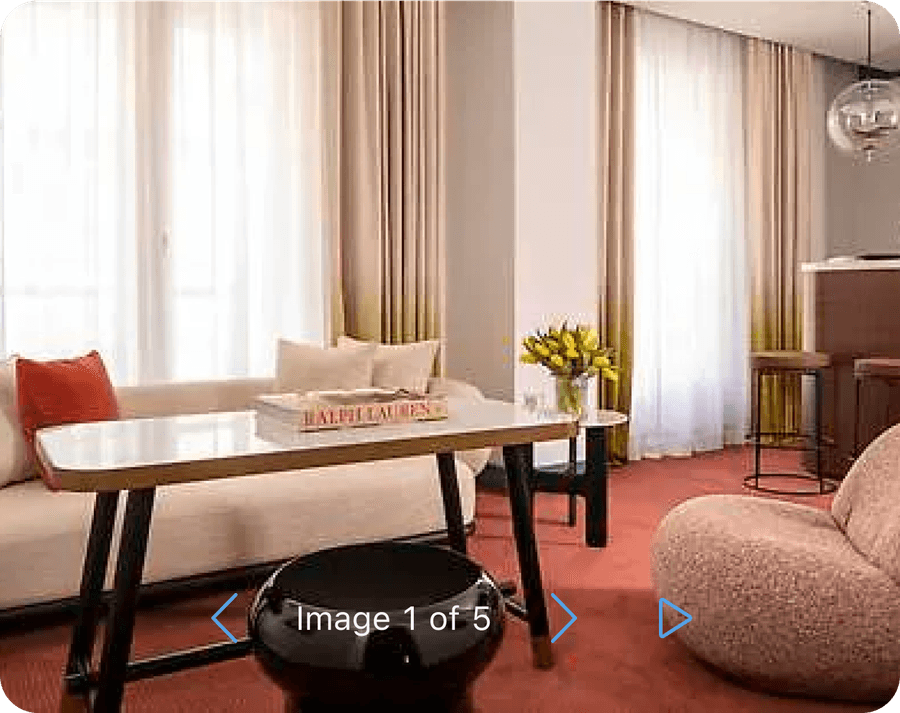
1. Text-based: Example: Slide 1 of 5 or Image 1 of 5
- Use when clarity or accessibility is a priority
- Can be customized or localized
2. Dot-based:
- A row of dots, where the active slide is highlighted
- Minimalist and common for mobile or visual-first designs
Tip: Slide naming (For example, “Image 1 of 5”) it may be change or be removed depending on the context. For example ‘image 1 of 5’ or ‘1 of 5’.
Off Slide (default)
Slide 1 of 3
On Slide
Using Light and Dark Mode On Slides
When using on slide you may choose between light or dark mode depending on your images.
Choose between high or low contrast of the controls and image. Note: that text must always have a background for accessibility.
Light Mode
Slide 1 of 3
Dark Mode
Slide 1 of 3
Don’t remove backgrounds


Layout
Carousel may be used as a stand alone component or used inside cards. Note that you shouldn’t put a carousel inside a card that is already in a carousel.
Title
Subtitle
Lorem ipsum dolor sit amet, consectetur adipiscing elit, sed do eiusmod tempor incididunt ut labore et dolore magna aliqua.
Title
Subtitle
Lorem ipsum dolor sit amet, consectetur adipiscing elit, sed do eiusmod tempor incididunt ut labore et dolore magna aliqua.
Slide 1 of 3
Title
Subtitle
Lorem ipsum dolor sit amet, consectetur adipiscing elit, sed do eiusmod tempor incididunt ut labore et dolore magna aliqua.
- Use slides with different heights
- Nest carousels
If content is nested by using a carousel, the page may appear more organized and structured. However, the complexity of the page and how to use it increases. This is doubled if you nest carousel in a carousel slide.
Nesting may cause:
- Users may overlook content
- Nesting important functions reduces the usability for all users
- The site becomes more complicated to use with screen reader and keyboard navigation
- Higher engineering effort to create responsive designs
Reflow
Carousel works at all break points. Follow the carousel slide content guidelines and grid guidelines to make sure your slide content reflows.
Questions?
Connect with the DLS Team on Slack or by email.
Resources
Check out additional resources.


