Carousel
Carousels are comprised of a rotating set of slides, primarily used to highlight content that is prominent but not essential to completing a task. They usually contain between two to five slides, slide number indicator, and navigational arrows that allow the customer to rotate the slide manually. Carousels may also be known as a slider, a slideshow, or a gallery.
On this page
Anatomy
| Name | Description | Required |
|---|---|---|
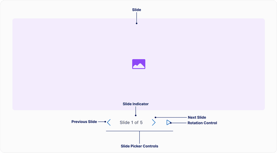
| Slide | A single content container within a set of content containers that hold the content to be presented in sequence by the carousel. | Yes |
| Slide picker controls | Group of elements that allow users pick which slide they want to see. Elements include previous and next slide buttons and slide indicator. When using either the previous or next button the slides will loop back to the beginning. Slide picker controls may be below or on top of the slides. | Yes |
| Slide Indicator | Maybe either text ‘Slide 1 of 5’ or small dots, that enable the user to understand which slide they are on in the sequence. | Yes |
| Rotation control | An interactive element that stops and starts automatic slide rotation. | Required for auto-rotate variant |
| Slide name | An optional naming that may be changed or removed depending on the context. For example ‘image 1 of 5’ or ‘event 1 of 5’. | Optional |
Questions?
Connect with the DLS Team on Slack or by email.
Resources
Check out additional resources.