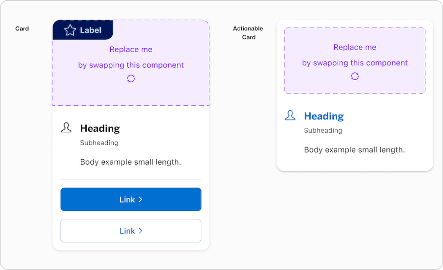
Card
Cards are flexible-size container that display content and actions on a single topic. They can display featured information, related content, or navigational choices.
Best Practices
- To display content and actions on a single topic inside a container
- To visually separate specific parts of content in an application or dashboard view
- To have call to action that’s within the card or have entire card be actionable
- To give user a glimpse of information
- With headings that set clear expectations about card’s purpose
- With a consistent location on the bottom of the card for primary actions or next steps
- To place a card component within a card
- To use when you need to capture user’s attention in a prominent way
- To use to inform user about important changes or conditions in the interface consider notifications
- With image as a background and text over it. It may cause accessibility and readability issues.
Variations
| Variation | Description |
|---|---|
| Card | Card has optional, media, media padding and CTA sections. Cards can stand alone or be grouped together with related content. The card has options for marketing badge, media, media padding and to change between vertical, horizontal or custom layout. |
| Actionable Card | Actionable card allows you to tap anywhere within the card to trigger an action. Let customers know they can take action by using a hover state for this variation. These cards do not contain calls-to-action, as the entire card is actionable. The card has options for marketing badge, media, media padding and to change between vertical, horizontal or custom layout. |
Recommendations
Multiple Cards
A common use case for card is to have a related content of cards displayed in a row. To create multiple cards simply use a singe card and lay them out in the grid.
When using multiple cards ensure that auto layout is set to wrap so when screen get smaller the cards will wrap to the second row automatically.
By default the cards are built to grow when content is added and the card with the most height will set height for other cards when frame is set to fill height. Avoid displaying related content with different aligned text and call to action footer. It should have consistent properties.
Title
Subtitle
This card has the most amount of body copy compared to the surrounding card. The cards with less copy will match the height of this card.
Title
Subtitle
The height is set to fill to match the longest card in the group.
Title
SubtitleBody example small length
Title
Subtitle
Body example small length
Horizontal Card
Avoid using horizontal card on smaller screen size. Minimum width is set to 568px. Consider using vertical card for smaller screen size.

Title
SubtitleBody example small length
Vertical Card
Vertical card is ideal for breakpoints min and x-small screen size, however, can be used in all breakpoints. Minimum width is set to 288px. Consider using horizontal card for larger screen size.
Title
SubtitleBody example small length
All pages must be responsive and reflow to a minimum of 320px. Cards will reflow to a minimum of 288px, to allow users to use margins in minimum breakpoint. Reflow accessibility standard
Custom Card
When using custom card, click on the replace me component to swap instances into one of the local components that user may have created. Custom card allows users to add in content without detaching the symbol from the library.
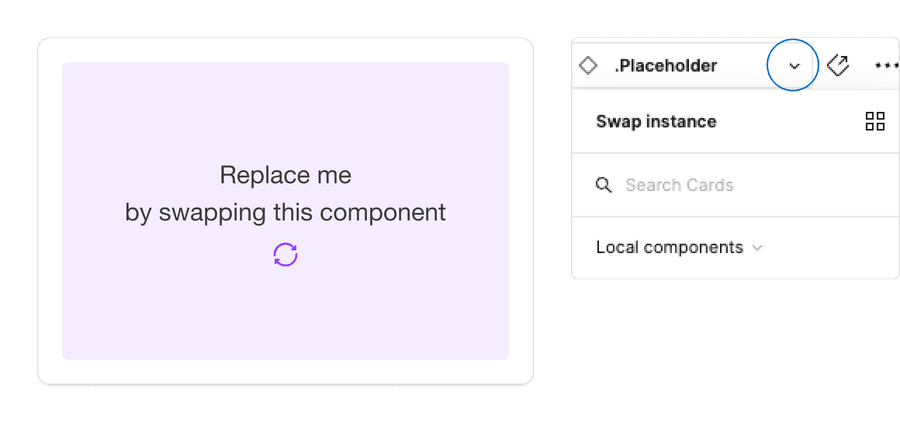
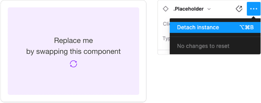
It is recommended that users do not detach components when using our system. If you detach a component, any updates made in the system by our team will not reflect in your designs as it will no longer be connected. Keeping the component connected will allow any updates from our team to reflect in your designs.
Actionable Card
Avoid using a call to action footer when card is actionable as the entire card allows users to click. The indicator of actionable is hover effect and a pointer change.
Using Call to Action Footer
Call to action can be applied to the cards if the card is not actionable. Actionable cards allow the entire card to be a link. If not actionable then you can apply links, buttons, or icon buttons.
Guidelines for Links | Buttons | Icon Buttons | CTA Links
Review Your Account
Review your loan balances, recent transaction, or make a payment today.
Avoid using multiple primary actions in a card, consider using secondary button if necessary.
Title
SubtitleBody example small length
Title
SubtitleBody example small length
Card Content
Card content should accurately describe what a user will find when action is performed or when interacted with a card. This helps to focus the card content on a specific user action, as well as set expectations about the results or a landing destination.
Review Your Account
Review your loan balances, recent transaction, or make a payment today.
Review Your Account
Review your loan balances, recent transaction, or make a payment today.
Using Marketing Badge
Marketing badges are for marketing messages and insights. Marketing badge consists of a ribbon with a text label, and optional icon. The badge can be laid out in three different ways, and has a sutble and emphasis colors, for more details on marketing badge including badges on images read the marketing badge documentation.
Aim to have a high contrast between the marketing badge and its background.
Corner marketing badge on card
Special Offer
Don't live life without itEarn 90,000 Membership Rewards® Points
after you spend $6,000 on eligible purchases on your new Card in your first 6 months of Card Membership. Offer ends 11/6/2024.†
Subtle corner marketing badge on card
Special Offer
Don't live life without itEarn 90,000 Membership Rewards® Points
after you spend $6,000 on eligible purchases on your new Card in your first 6 months of Card Membership. Offer ends 11/6/2024.†
Side Marketing Badge on Card with subtle color to create high contrast
Membership Experiences

Card Members get access to presales and dedicated tickets to some of the most talked about events in sports, music, theater, and more.‡

Standalone marketing badge added as part of the card media. This was creating using the replace me Slot in Figma.

Membership Experiences
Card Members get access to presales and dedicated tickets to some of the most talked about events in sports, music, theater, and more.‡
Using icons
Icons used within cards should be simple, with well known visual metaphors. Icons can be placed left of the Heading or top centered with variations of alignment with content. Icons can be unfilled or filled.
Guidelines for Icons.
- Use simple well known icons for example account for ‘Account Home’
- Take real world examples for example rewards for Membership Rewards® points
- Be consistent with layout and usage
- Consider when to use fill for emphasis
- Think customer consistency. Follow the icon names available in our icon library for the actions when possible.
- Consider icon meaning and localization
- Don’t use the same icon for different cards within the related content
- Don’t use complex icons where it’s hard for user to understand the meaning of icon used
- Icons need to be simple and easy to understand.
- For accessibility, we need to make sure we use icons for the same meaning throughout our website. Consistent identification accessibility standards.
- Remember: the more complex the icon, the longer a user spends understanding them.
Layout
Cards can be organized in several ways. It can be supported in all breakpoints including minimum breakpoint size. Be sure to follow guidelines on minimum width of the cards when laid out. Guidance for grid and layout for reference.
| Breakpoint | Description |
|---|---|
| Medium+ | Supports (4) 3 column cards, (3) 4 column cards, (2) 6 column cards, or (1) full width. |
| X-Small+ | Supports (3) 4 column cards, or (2) 6 column cards. Applies to both vertical and horizontal orientations. |
| Minimum | Single column, full width. |
Reflow
Both horizontal and vertical cards are flexible to be full width, however, horizontal card has a min width of 568px and will reflow to vertical layout.

Questions?
Connect with the DLS Team on Slack or by email.
Resources
Check out additional resources.