Badges
Badges are small, visual indicators used to provide brief supporting information at a glance about an element’s status or number count. Badge itself is not interactive. Also known as: Ribbon, tag, flag
Best Practices
- As a non-interactive element attached to something that is interactive to provide additional information
- To indicate the system status of a feature or service
- In accordance with the status color palette
- As a tag, use tags instead
- On its own, for example, without context of other related content
Variation
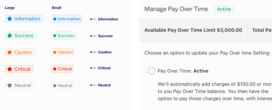
Text Badge
Text badge includes an optional icon and text label. Text badge can be contained within a component or layout to give user additional feature context, for example, a status.
| Name | Description |
|---|---|
| Information | Provides additional helpful information, for example, ‘New’, ‘Offer’, ‘Promotion’. |
| Success | Indicates a successful state, for example, ‘Added’, ‘Approved’, ‘Submitted’, ‘Saved’. |
| Caution | Indicates cautionary information to the user, for example, ‘Limited’, ‘Warning’. |
| Critical | Indicates something is failed, may require potential action, for example, ‘Failed’, ‘Cancelled’. |
| Neutral | Provides general, non-critical status update, for example, ‘Pending’ or ‘Processing’. |
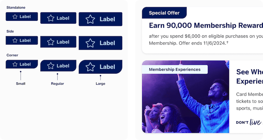
Marketing Badge
Marketing badges are for marketing messages and insights. Marketing badge consists of a ribbon with a text label, and optional icon. The badge has three different sizes, small, regular and large, as well as three different shapes depending on location on a card or page usage. The badge has three different shapes, large radii for corners, two subtle radii for side and subtle radii for Standalone.
Marketing badge can be either emphasis (for high-contrast) or subtle color options. When images remain consistent across light and dark modes, consider using Marketing Badge Color = “persistent”. The badge will maintain the same color in light and dark mode maintaining contrast with the image.
For details on how to use marketing badges in cards see our cards documentation.
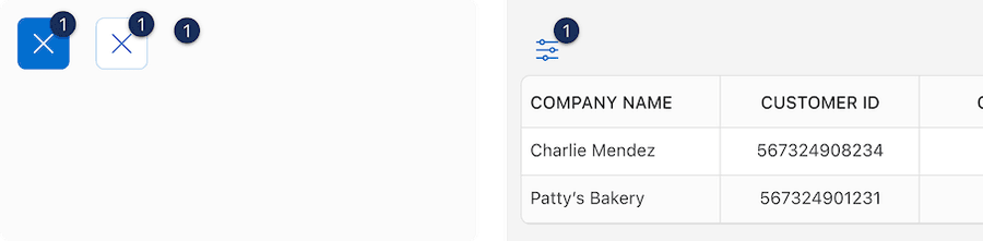
Number Badge
Number badge is used to indicate the number of actionable items.
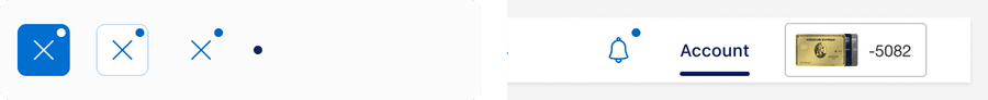
Dot Badge
Dot badge is used to indicate that something is actionable, without telling user the exact number of the actionable items.
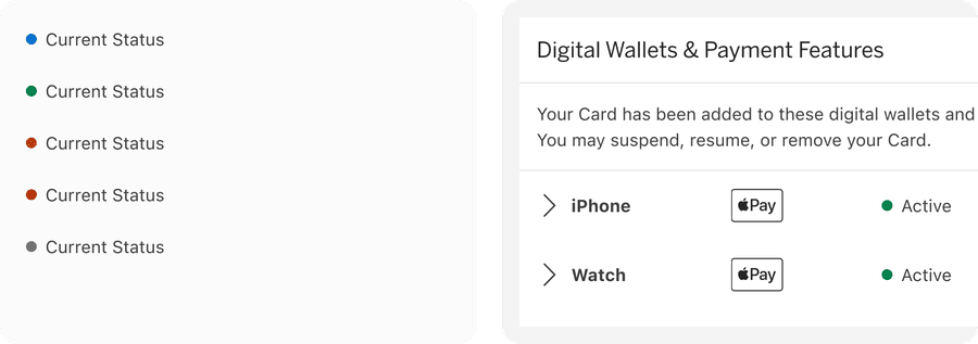
Status Badge
Status badge consists of a colored dot and text label. When there are two or more colors required to differentiate, text label is required. When only one colored dot is used, Label is optional.
Which Badge Should I Use?
Badges have been designed with different use cases in mind. This table will help you choose the best badge for your journey.
We have considered the attributes:
Content: Expected content within the component.
Layout: Where the component is used with in a page design.
Trigger: What triggered the badge to appear? This could be a user event, system event, or marketing event.
Location: Where will the badge be found in a experience/journey? Contextual or global? A Global example would be a dot badge in the navigation header would be persistent through a journey. Contextual would be marketing badge will be found on a specific card.
User action: Does the badge require user follow up or action?
Life time: How long will the badge be used in a journey?
Importance: The level of importance the information is to the user
| Attribute | Text Badge | Marketing Badge | Number Badge | Dot Badge | Status Badge |
|---|---|---|---|---|---|
| Content | One to three words that convey notice or status message | One to three words that convey marketing or insight | Indicator dot with numeric value | Indicator dot attached to a button | A short one to three word notice or status message |
| Layout | Standalone or Inline with text | Standalone Attached to a card or inline with text | Standalone or attached to a button | Attached to a button | Inline with text or table cell |
| Trigger | System event | Marketing event | System event or User activated | System event or User activated | System event |
| Location | Contextual | Contextual | Contextual or Global | Contextual or Global | Contextual |
| User action | Passive | Passive | Action needed, recommended or passive | Action needed, recommended or passive | Passive |
| Life time | Persistent | Date range or persistent | Alert | Alert | Persistent |
| Importance | Good to know | Good to know | Should know or Must know | Should know or Must know | Good to know |
Recommendations
Content Guidelines
Badges labels are required and should be short, clear and powerful to draw the user in and convince them to keep reading or want to take an action. This is an opportunity to inject our Brand tone of voice. Keep these guidelines in mind:
- Be concise
- Keep it simple
- Be consistent
- Always ask “was it worth it?” to make users look here first


Status badge labels should be short, clear and descriptive. Approximately 20 characters or less.


Choosing Icons
Icons used in badges should be simple, with well known visual metaphors for example a hand with a thumbs-up for feedback, pencil for edit, or a lock for security. Icons can be unfilled or filled. For more information about icons in general, check out our icons.
- Use simple well known icons
- Take real world examples for example lock for security
- Be consistent. Always use the same icon for the same meaning.
- Consider when to use icon fill for emphasis
- Think customer consistency. Follow the icon names available in our icon library for the actions when possible.
- Consider icon meaning and localization
- Use different icons for a badge with the same meaning
- Use the same icon for different badges with different meanings
- Use complex icons without a label
- Icons need to be simple and easy to understand.
- For accessibility, we need to make sure we use icons for the same meaning throughout our website. Consistent identification accessibility standards
- Remember: the more complex the icon, the longer a user spends understanding them.
Using Badges Figma Components
The badge components are made up of sub-components, using properties and variables.
- Use the properties and variables available in the components
- Use the instance swap property instead of detaching
- Look for property details in the Component configuration Description
- Detach a component unless essential, you will loose the ability to update the component with future updates including style and bugs.
Text Badge
Properties:
- Status: Information, Success, Caution, Critical, and Neutral
- Size: Small or Regular
- Show icon: Hide or Show
- Label: Text
Marketing Badge
Uses a mixture of Properties and Variables
Variables:
Marketing badge color: Inverse or Persistent.
You may not always have a dark mode image available, this variable allows you to choose if a badge will stay the same color on top of an image in dark mode.
Properties:
- Size: Small, Regular, or Large
- Color: Emphasis or Subtle
- Show icon: Hide or Show
- Icon filled or unfilled
- Label: Text
- Icon: Swap instance
Number Badge
Has two components to choose from: a Wrapper that helps you add a badge to an existing button or the badge on its own.
Wrapper Properties:
- Wrapped Component: Primary icon button, secondary icon button, or tertiary icon button
- Number: number
Badge Properties:
- Wrapped Component: Primary icon button, secondary icon button, or tertiary icon button
- Number: number
Dot Badge
Dot badge component is a Wrapper that helps you add a badge to an existing button.
Wrapper Properties:
- Hierarchy: Primary, Secondary, or Tertiary
Status Badge
Properties:
- Status: Information, Success, Caution, Critical, and Neutral
- Label: Text
Questions?
Connect with the DLS Team on Slack or by email.
Resources
Check out additional resources.