Card
Cards are flexible-size container that display content and actions on a single topic. They can display featured information, related content, or navigational choices.
On this page
Anatomy
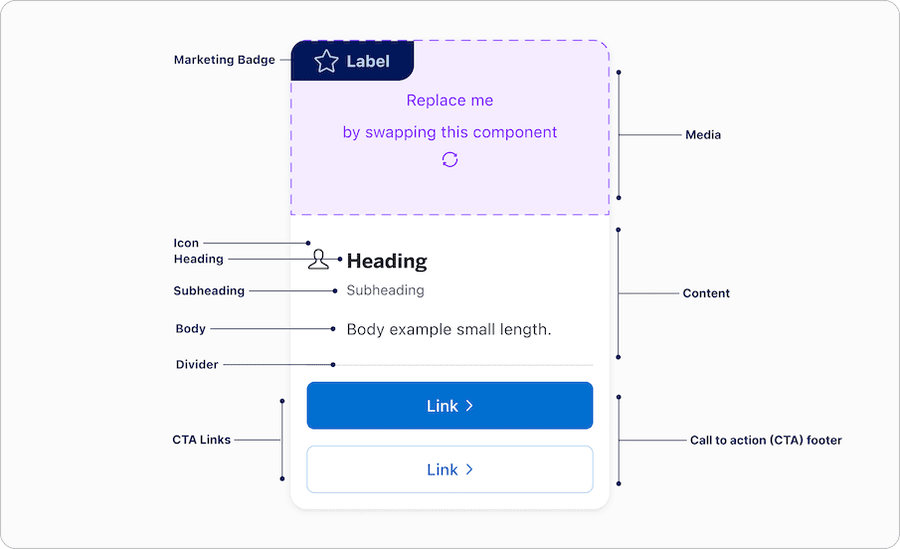
| Name | Description | Required |
|---|---|---|
| Media | Media container can easily be replaced with an image or video. - If image is used add alt text for non decorative image. Recommended 16:9 aspect ratio for images. - If video is used it needs captions and if there is text that appears in the video it must be represented as a transcript. | Optional |
| Content | Content block allows users the ability to utilize heading, subheading and body with left or center alignment. Between the heading, subheading, and body one must be used at all time. | Yes |
| CTA Footer | Footer is pinned to the bottom of the card often used to display a link, buttons, or icon buttons depending on the use case. Note that when card is actionable no CTA footer option is available. | Optional |
| Divider | Label divider provides users the visually separation between content and call to actions footer. | Required if using CTA Footer |
| Marketing Badge | Available in two positions Corner and side, see badge documentation for details. | Optional |
Actionable Card States
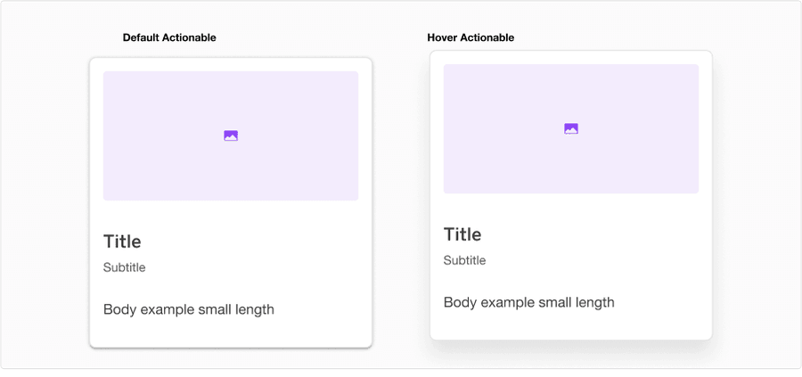
| State | Description |
|---|---|
| Default | Shadow Medium to indicate users that the option is actionable, compared to Shadow Low in default card |
| Hover | Shadow High, move 8px up, and hand pointer to indicate users that the option is clickable |
Questions?
Connect with the DLS Team on Slack or by email.
Resources
Check out additional resources.