Tooltip
Non-actionable, brief informative message or tip. Tooltips are user-triggered to give extra information that is contextual but not critical to a user’s journey. Tooltips are initiated in one of three ways: hover, focus or press.
On this page
Best Practices
Use tooltips for providing contextual user triggered information that provide additional information for journeys. Tooltips are user-triggered and initiated in one of three ways: hover, focus or press.
- To give non critical contextual information or help to users
- To give additional guidance for users
- In a predictable location
- For information that is needed to complete a task
- On buttons that trigger an action other than opening a tooltip
- Consider using hint text on inputs before using a tooltip
American Express web experiences, should work with a keyboard, mouse, touch screen, assistive technologies or any input available to the device, this is taken from Concurrent Input Mechanisms (Level AAA). This means that tooltips cannot be triggered by hovering alone, as hovering is not available on touch devices. Tooltips should be triggered by buttons that are only used for the actions of opening and closing a tooltip.
For buttons that trigger an action in addition to triggering a tooltip, like “delete all” on an icon button, touch screen users will not be able to perceive the tooltip content without also triggering the “delete all” action, and failing the accessibility Concurrent Input Mechanisms (Level AAA) requirement. A better solution than a tooltip would be to provide a dialogue for friction or a button with a label.
Variations

| Variation | Description |
|---|---|
| Tooltip | Pair tooltip with any button in the system to give users extra information that is contextual but not critical to a user’s journey. |
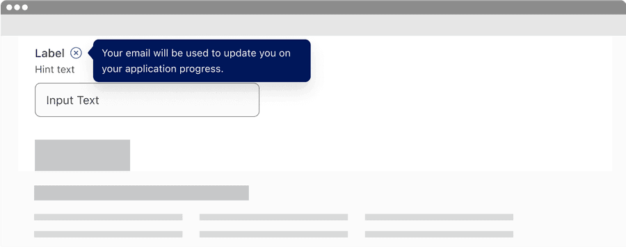
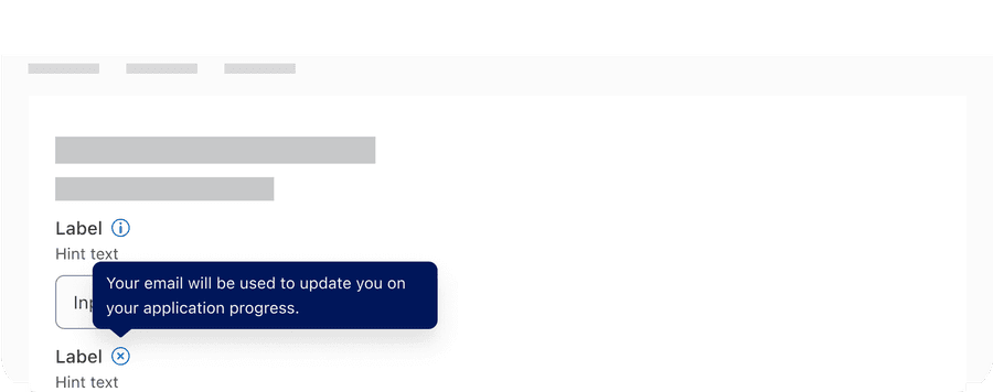
| Info Tooltip | Info tooltip is triggered by Icon button with the info icon. Info tooltip can only be used inline. Use info tooltip to give users extra information that is contextual but not critical to a user’s journey. |
Most interactive components need to be at least 44 by 44px to pass the minimum target size accessibility standard. Tooltip is an exception when it’s inline with a sentence or block of text, for example input label or a page title. Any tooltips not inline still need to be at least 44 by 44px to pass the minimum target size. Understanding Target Size (level AAA)
Recommendations
Labels
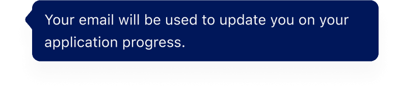
Use short and descriptive labels that give users additional information. If information is necessary for user comprehension, then accessing it should not require a click/tap. That content should be displayed prominently on the screen.
- Tooltips provide supplemental information that’s not essential to the user’s understanding.
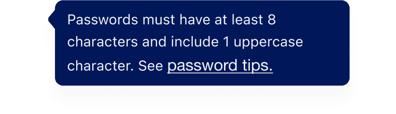
- Try not to exceed three lines.
- Use sentence case, for example “Only the first word and proper nouns like American Express have capitals.”
- Don’t add links or buttons
- Don’t include journey critical information
Because the tooltip itself never receives focus and is not in the tabbing order, a tooltip can not contain any interactive elements such as links, inputs, or buttons.
Layout
Here are examples of where to layout tooltips. When adding a tooltip to a page think about what it will cover when it’s open. Note that inline tooltip can only be use when inline with a sentence or text block.
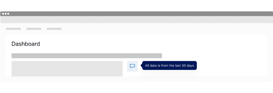
Info tooltip
Tooltip with Button
Responsive
Tooltip has a recommended max width of 3 columns when the label is too long for horizontal space, label wraps to a new line.
All pages must be responsive and reflow to a minimum width of 320px or height of 256px without two scroll bars. 320css px supports people with low vision who need to enlarge text and read it in a single column. When the browser zoom is used to scale content to 400%, it reflows - i.e., it is presented in one column so that scrolling in more than one direction is not necessary. Reflow accessibility standard

Tooltip Positioning
Tooltip may move above, bellow before or after the trigger button, and will move depending on the trigger buttons location on screen at the time.
Tooltip at the Top of the page
Tooltip at the bottom of the page
Questions?
Connect with the DLS Team on Slack or by email.
Resources
Check out additional resources.