Tooltip
Non-actionable, brief informative message or tip. Tooltips are user-triggered to give extra information that is contextual but not critical to a user’s journey. Tooltips are initiated in one of three ways: hover, focus or press.
On this page
Anatomy
Tooltip

| Variation | Description | Required |
|---|---|---|
| Tip | A signifier that is added to a popover container to help show the relationship between the tooltip and where it was triggered | Yes |
| Label | A short and descriptive text that give users additional information. | Yes |
| Background | High contrast background that allows tooltip to stand out from the content behind | Yes |
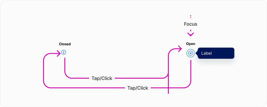
Info Tooltip

| Variation | Description | Required |
|---|---|---|
| Tooltip | Non-actionable, brief informative message or tip. | Yes |
| Info Tooltip | Triggered by Icon button with the info icon signifier. | Yes |
States
Tooltip
Tooltip uses a buttons default, hover, pressed, and disabled states along with it’s open and closed state. In this example we have used the secondary brand button.
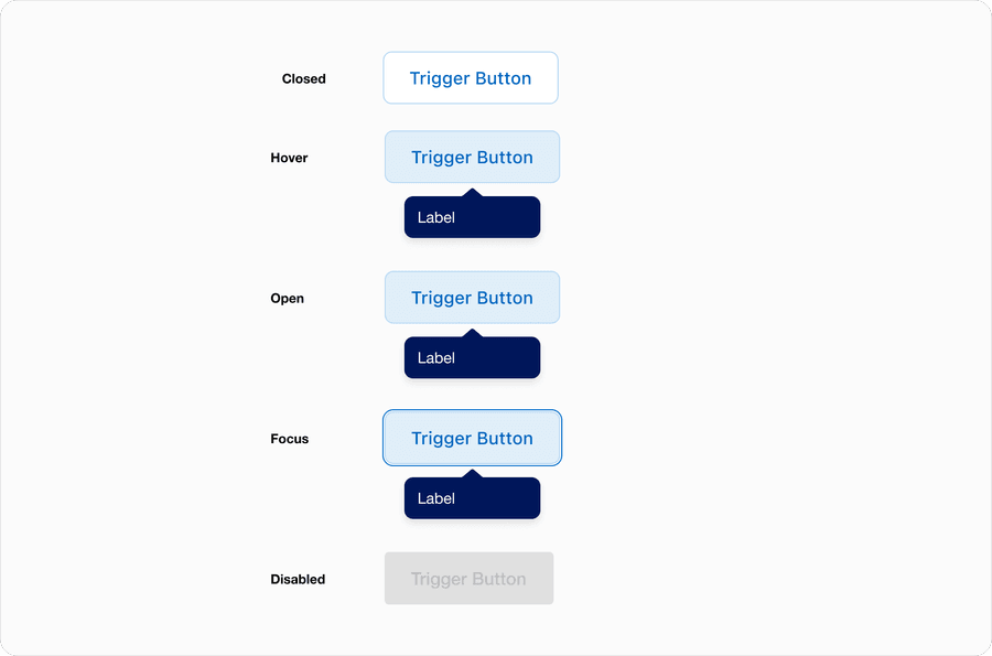
| State | Description |
|---|---|
| Closed | No tooltip is shown and the tooltip trigger button is in default state. |
| Hover | While cursor hovers over the trigger button the tooltip is shown and the trigger moved to hover state. |
| Open | Triggered by tap, click or focus. Tooltip shown and trigger button has focus state. |
| Focused | Triggered by tap or click on the trigger button. Tooltip shown, to give user extra context that is not essential to the user’s journey. |
| Disabled | Trigger in disabled state and no tooltip shown. |
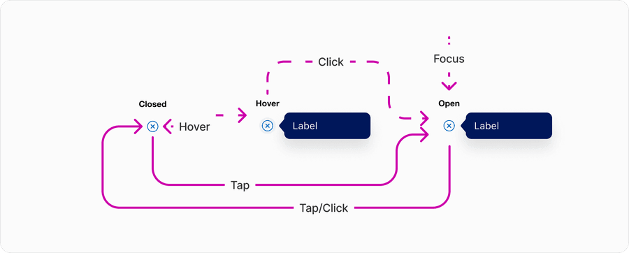
Icon and Info Tooltip
States for both default and inline info tooltip use the Icon buttons default, hover, pressed, and disabled states along with open open and closed state.

| State | Description |
|---|---|
| Closed | No tooltip is shown and the tooltip icon button is in default state. |
| Hover | While cursor hovers over the icon button the tooltip is shown and the trigger moved to hover state. |
| Open | Triggered by tap or click on the icon button. Tooltip shown, to give user extra context that is not essential to the users journey. |
| Focused | Triggered by tap or click on the icon button. Tooltip shown, to give user extra context that is not essential to the users journey. |
Interactions
Info tooltip can be triggered by either hover, tap, and focus or just tap, and focus.
American express experiences, must work with a keyboard, using a cursor or pointer, and also touch screen. This means that the tooltip may only be used on button, that is only triggering the actions of opening and closing a tooltip.
Questions?
Connect with the DLS Team on Slack or by email.
Resources
Check out additional resources.