Progress Tracker
Progress trackers visually guide users toward completion and gives them a sense of achievement. These components are typically used in scenarios where users need to track their progress toward a set goal, such as task completion, milestones, or performance targets.
Continuous Linear Tracker
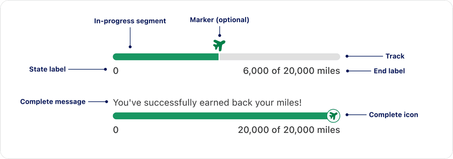
Anatomy
| Name | Description | Required |
|---|---|---|
| Progress Bar Container | This determines the length of the bar within the available screen space. | Yes |
| Progress line | Progress is visually represented by a filled line. It can reflect a: * Known percentage (partially filled)* A complete state (fully filled) | Yes |
| Label | The text describes the process that the progress bar refers to. The label cannot be visually hidden. Turning off the label violates WCAG 2.1 Guideline 1.3.1: Info and Relationships and WCAG 2.1 Guideline 1.4.1: Use of Color. Relying on color or shape alone excludes users with visual impairments or color blindness cannot perceive color or subtle changes in shape effectively. | Yes |
| Marker | An optional visual indicator that shows the current in-progress value along the in-progress track. It provides a focal point for users to quickly identify their exact position within the tracker. | No |
| Complete icon | Text | No |
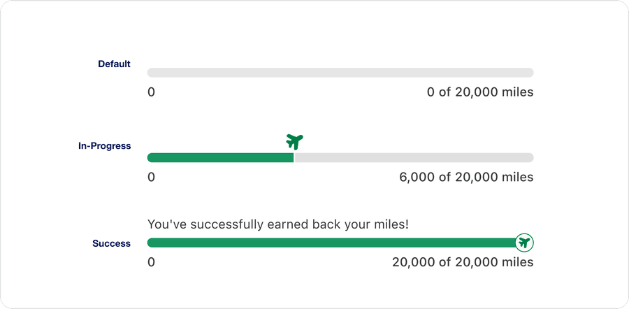
State
| State | Description |
|---|---|
| Default | Represents the initial, inactive state before any progress begins |
| In-Progress | Shows that the process is actively advancing toward completion |
| Success | Indicates that the process has been completed successfully |
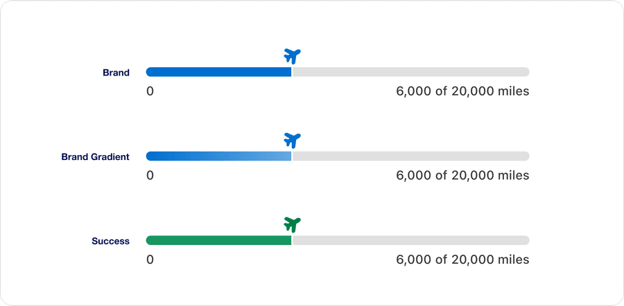
Color
| Color | Description |
|---|---|
| Brand | Primary identity color used to reinforce our brand recognition and consistency. Seamlessly blends into the UI for a cohesive branded experience. |
| Brand gradient | Applies a gradient version of the brand for a more expressive, dynamic and premium feel. Seamlessly blends into the UI for a cohesive branded experience. Slightly more vibrant than Brand.state. |
| Success | Use when you want to highlight progress in a universally positive sentiment. Used when contrast or clarity is prioritized. |
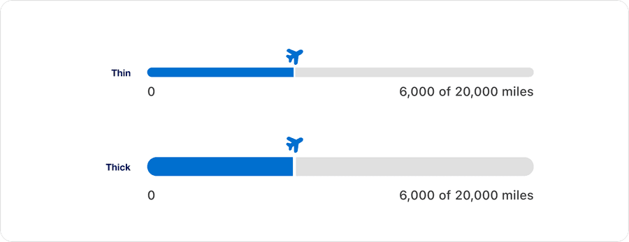
Size
| Size | Description |
|---|---|
| Thin | Used for more subtle visual prominence or in a more space-efficient way. Can also be used if supplementary to another main action. |
| Thick | Used for more visual prominence to provide a strong visual emphasis. Can assist in being readily scannable and aid in orientation. |
Segmented Linear Tracker
Anatomy
| Name | Description | Required |
|---|---|---|
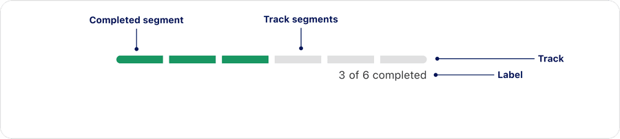
| Track | This determines the length of the bar within the available screen space | Yes |
| Completed segment | The current step in the progress that indicates completed steps and the step the user is currently on | Yes |
| Incomplete segment | Shows steps that haven’t been completed yet | Yes |
| Label | The text describes the process that the progress bar refers to. Optional, but not recommended, label can be visually hidden, but must be defined in order to be accessible. | Yes |
State
| State | Description |
|---|---|
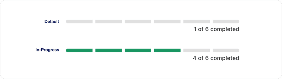
| Default | Represents the initial, inactive state before any progress begins |
| In-Progress | Shows that the process is actively advancing toward completion |
Color
| Color | Description |
|---|---|
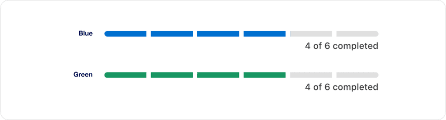
| Blue | Primary identity color used to reinforce our brand recognition and consistency. Seamlessly blends into the UI for a cohesive branded experience. |
| Green | Use when you want to highlight progress in a universally positive sentiment. Used when contrast or clarity is prioritized. |
Progress Circular Determinate
Anatomy

| Name | Description | Required |
|---|---|---|
| Progress track | Circular track for progress completion | Yes |
| Progress line | Progress is visually represented by a filled line. It overlays the progress track indicating current completion | Yes |
| Label | Percentage completion of progress | Yes |
State

| State | Description |
|---|---|
| 0% | No progress has been made, the progress track is unfilled |
| 1%-99% | The task is in progress |
| 100% | The task is fully complete |
Questions?
Connect with the DLS Team on Slack or by email.
Resources
Check out additional resources.