Buttons
Buttons are used as triggers for actions. Buttons can contain a label and/or an icon and come in a variety of styles and sizes.
Primary
Anatomy

| Name | Description | Required |
|---|---|---|
| Background | Background color conveys states default, hover, or pressed. | Yes |
| Label | Used to inform the user of the expected button action. | Yes |
| Icon | Graphic element to enhance the visual appeal and tell the user more about buttons action. Can be used before or after the label. Choose the appropriate Icon based on the buttons action. Icons are for use with a label, if you would like an icon on its own use Icon Button. See choosing icons | Optional |
States
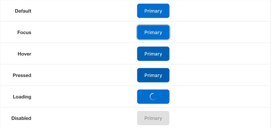
| State | Description |
|---|---|
| Default | Users can tap or click the button to activate an action. |
| Hover | When a cursor hovers over the button, the background color changes to indicate that the button is clickable. |
| Pressed | Background color change indicates to a user that the button is active. |
| Disabled | Avoid disabled buttons when possible. The disabled state is for if you are still showing the button, but the actions it completes are disabled. The background and text color changes to indicate to a user that the button is inactive. Read more about disabled buttons. |
| Loading | A loading animation indicate the button is active and loading. |
| Focus | A focus outline appears around visual element to help users identify current selected component. This is used when a user navigates using keyboard controls or uses a cursor. |
Secondary
Anatomy
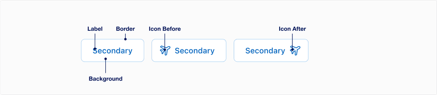
| Name | Description | Required |
|---|---|---|
| Background | Background color conveys states default, hover, or pressed. | Yes |
| Label | Used to inform the user of the expected button action. Label best practice | Yes |
| Border | Outlines button target to and matches primary button height. | Yes |
| Icon | Graphic element to enhance the visual appeal and tell the user more about buttons action. Can be used before or after the label. Choose the appropriate Icon based on the buttons action. Icons are for use with a label, if you would like an icon on its own use Icon Button. See choosing icons | Optional |
States
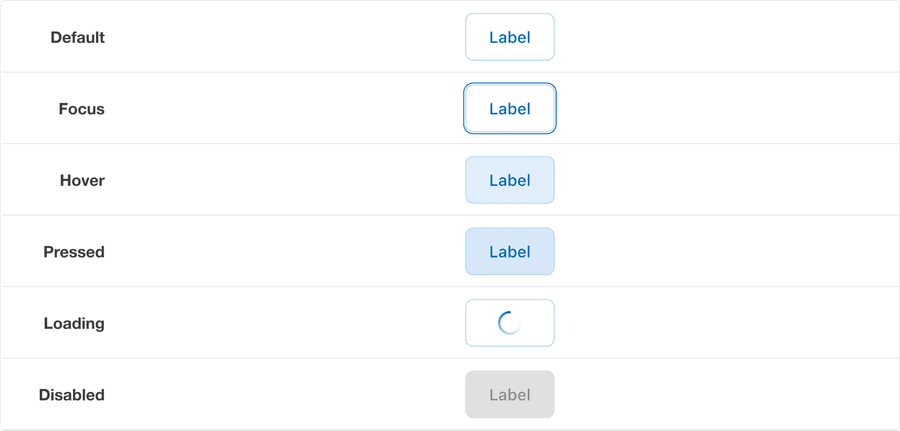
| State | Description |
|---|---|
| Default | Users can select the button to activate an action. |
| Hover | When a cursor hovers over the button, the background color changes to indicate that the button is clickable. |
| Pressed | Background and text color changes indicates to a user that the button is active. |
| Disabled | Avoid disabled buttons when possible. The disabled state is for if you are still showing the button, but the actions it completes are disabled. The background and text color changes to indicate to a user that the button is inactive. Read more about disabled buttons. |
| Loading | A loading animation indicate the button is active and loading. |
| Focus | A focus outline appears around visual element to help users identify current selected component. This is used when a user navigates using keyboard controls or uses a cursor. |
Tertiary
Anatomy

| Name | Description | Required |
|---|---|---|
| Label | Used to inform the user of the expected button action. Label best practice | Yes |
| Icon | Graphic element to enhance the visual appeal and tell the user more about buttons action. Can be used before or after the label. Choose the appropriate Icon based on the buttons action. Icons are for use with a label, if you would like an icon on its own use Icon Button. See choosing icons | Optional |
States
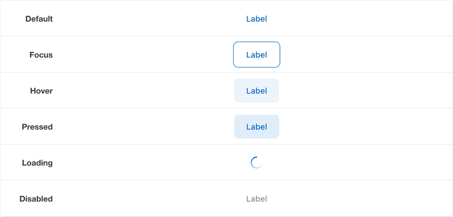
| State | Description |
|---|---|
| Default | Users can tap or click the button to activate an action. |
| Focus | A focus outline appears around visual element to help users identify current selected component. This is used when a user navigates using keyboard controls or uses a cursor. |
| Hover | When a cursor hovers over the button, the background color changes to indicate that the button is clickable. |
| Pressed | Background color change indicates to a user that the button is active. |
| Disabled | Avoid disabled buttons when possible. The disabled state is for if you are still showing the button, but the actions it completes are disabled. The background and text color changes to indicate to a user that the button is inactive. Read more about disabled buttons. |
| Loading | A loading animation indicate the button is active and loading. |
Questions?
Connect with the DLS Team on Slack or by email.
Resources
Check out additional resources.