Toggle Switch
Toggle Switch allows users to toggle a boolean selection between states instantly. There is always a default selection for switches.
On this page
Best Practices
- To turn an option on or off for a mode, feature, or function without any submission
- When the change takes immediate effect
- For binary options
- With label for user to understand the action
- To select an option from the list, consider radio component
- To select several options from the list, consider multiple select component
- That requires a submit button before it takes effect, consider checkbox component
- For alternate view, consider segmented control instead
Recommendations
Labels
Toggle switch labels are required and should be short, clear and descriptive. It should be easy for the users to understand what they are activating.
Avoid ending labels in punctuation, colons or commas.
Label is positioned left of the toggle control because its necessary for the user to read first then take an action of activating or deactivating.
Enroll your mobile number to receive account alerts.
- Labels need to be simple and easy to understand
- For accessibility generic text, like “Light/Dark”, is not recommended, as it does not inform a user of what the switch will change.
- Remember that Text Indicator should be brief one word, like on/off or show/hide
Other Selection Controls
| Radio | Checkbox | Segmented Control | Switch | |
|---|---|---|---|---|
| How many choices does the user have? | At least two | At least one | At least two (this or that) | Only two (on or off) |
| Can there only be one option selected? | Yes | No | Yes | Yes |
| Is it possible for a user to leave the choice unselected? | Yes, but this is typically not ideal | Yes | No—one option is always selected | No—a switch has default state on or off |
| Does the choice require submission in order to take effect? | Typically yes | Typically yes, for Terms and Conditions | No | No |
Switches are best used for communicating activation such as on/off states, while checkboxes are best used for communicating selection and may require a submission to save selection. Toggle Switch should never require users to press a button to apply the settings. Toggle switches can’t have an error state compared to checkbox.
Note that the toggle switch is used mostly commonly with system settings and preferences and not used in forms where checkboxes and radios are commonly found.
Toggle switches are binary options, not opposing ones. A binary option represents a single state that is either on or off.
Opposing options are two separate states that are opposite but related to different user tasks. Segmented Control offers alternate view of related content.
Using Indicators
To make understanding the state of the switch easier for users with visual or cognitive disabilities, a text equivalent of the state (on or off) and icon on the control is displayed in toggle switch as a state indicator.
NOTE: To prevent redundant announcement of the state by screen readers, the text indicators of state are hidden from assistive technologies with aria-hidden.
Text Indicator is optional and it is used within toggle control. Text used should be short, simple, and easy to understand the action being made such as on/off, active/inactive, or show/hide. Text indicator can be changed based on the user and context around the toggle switch.
Icon Indicator is optional and it is used within toggle control to visually emphasize the selected state. Icon used should be simple, with well known visual metaphors, such as check for active/on, close for inactive/off. Icons can be changed but be mindful on what that icon signifies and it should represent with the toggle switch label.
- Use simple well known icons for example check/close that represents on/off or active/inactive
- Take real world examples for example padlock for security
- Think customer consistency. Follow the icon names available in our icon library for the actions when possible.
- Consider icon meaning and localization
- Don’t use the same icon for different text indicator
- Don’t use complex icons
- Don’t use same text indicators for both states
- Icons need to be simple and easy to understand.
- For accessibility, we need to make sure we use icons for the same meaning throughout our website. Consistent identification accessibility standards.
- Remember: the more complex the icon, the longer a user spends understanding them.
Disabled Toggle Switch
Try to avoid using disabled state when possible, opting for enabled toggle switch or no toggle switch and an informative alternative on why its disabled. If you do choose to use a disable toggle switch, use aria-disabled=true instead of disabled, so it’s announced to screen reader users.
Disabled elementsare visible, but not always focusable. They are not announced to screen readers using tab, and can only be found if your users go looking for them.
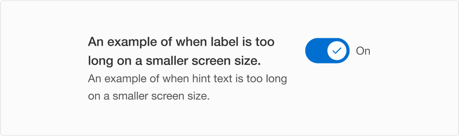
Reflow
When the label is too long for the horizontal space available, it wraps to form another line.
Layout
When it is stacked as a list with shot or long length of label and hint text, toggle control is always aligned top.

Questions?
Connect with the DLS Team on Slack or by email.
Resources
Check out additional resources.