Toggle Switch
Toggle Switch allows users to toggle a boolean selection between states instantly. There is always a default selection for switches.
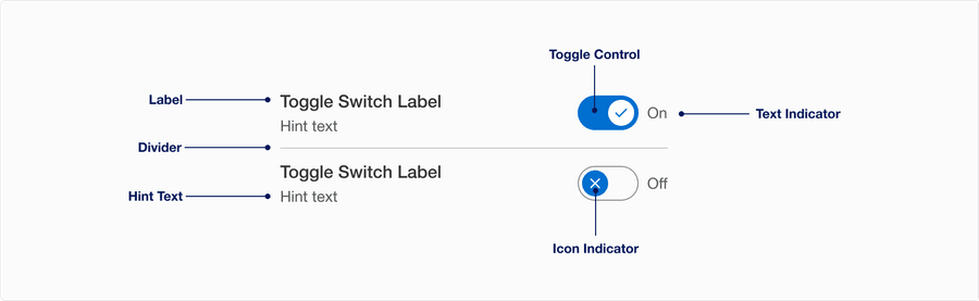
Anatomy
| State | Description | Required |
|---|---|---|
| Label | Used to inform the user what they are switching on and off. Labels are required and need to be simple and easy to understand. Aria-label is also required for consistent identification, the same information is presented to all users. Learn more about label best practice. | Yes |
| Toggle Control | A visual signifier to show the user whether the control is currently on or off by the background color. Wether the control is on or off its always visible. | Yes |
| Hint Text | Can be used to give more specific detail to support the label | Optional |
| Text Indicator | “On” and “Off” text dynamically updates to state the intended behavior of the switch. User can change the text indicator. Remember that Text Indicator should be brief one word, like “on/off or show/hide”. | Optional |
| Icon Indicator | Used as a visual signifier to show active or inactive. User can change the icons. | Optional |
| Divider | Used for making a list of toggle switches. Divider allows users to separates the individual toggle switch. | Yes if used in a list |
States
| State | Description |
|---|---|
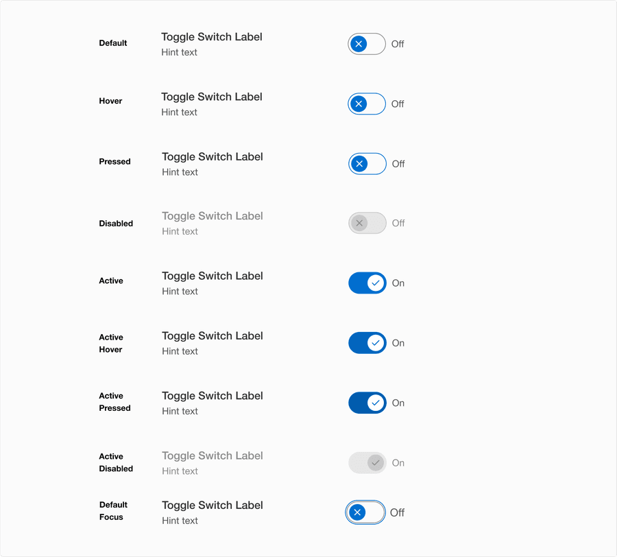
| Default | Toggle Switch has a default state of either on or off. Recommendation is to have it turned off. |
| Hover | Control elevation and border color change indicates to a user that the option is clickable. |
| Pressed | Control elevation and border color change indicates to a user that the option is being pressed. |
| Active | The active state indicates the switch is turned on. |
| Active Hover | Background color change indicates to a user that the option is clickable. |
| Active Pressed | Background color change indicates to a user that the control is being pressed. |
| Disabled | The toggle switch isn’t interactive. Avoid using disabled, its best not to show it or an informative alternative on why its disabled. If you do choose to use a disable toggle switch, use aria-disabled=true instead of disabled, so it’s announced to screen reader users. |
| Focus | A focus outline appears around visual element to help users identify current selected component. This is used when a user navigates using keyboard controls or uses a cursor. Focus will appear on all states, for more details review our focus state guidelines. |
Questions?
Connect with the DLS Team on Slack or by email.
Resources
Check out additional resources.