Tags
Tags show categories for a piece of content. Tags are always interactive. If you need a component that is not interactive, use badge instead.
On this page
Best Practices
- When users need to select multiple categories
- For filtering when users need to remove a category
- As quick-access shortcuts to categorized content
Recommendations
The tag component is used to display categories for pieces of content. Tags are always interactive. If a non-interactive label is needed, use the badge component instead.
There are two variations of the tag component:
- Toggle Tag - Used for selection, allowing users to toggle between active and inactive states.
- Dismissible Tag - Used for filtering, allowing users to remove a category from a selection.
- If multiple categories can be selected simultaneously, allow users to select more than one tag at a time.
- When a tag is dismissed, the content should dynamically update to reflect the change.
- Maintain consistent padding and spacing to avoid crowding
- Avoid mixing exclusive and multi-select behaviors within the same group of tags.
- Avoid using too many tags at once, which can clutter the interface and hinder usability. Aim for one to seven tags in a group.
Labels
Tag labels should be short, clear and descriptive. Approximately 20 characters or less. Avoid having long tag titles wrap to multiple lines within the tag container.
When writing labels, use sentence case, not title case or all caps (unless you have a proper noun).
Icons
Icons cannot be changed or removed for dismiss or active indicator.
Reflow
Tags are designed to be fluid and responsive, adjusting dynamically based on available space.
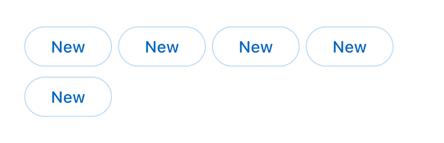
Wrapping and reflow: If tags do not fit within a single line, they should wrap onto the next line rather than being truncated. Consider using one to seven tags max within a group. This helps in maintaining clarity and avoiding overwhelming the user with too many options.

- Spacing Considerations: Maintain consistent spacing between tags to ensure readability and accessibility.
- Dynamic Changes: When a tag is removed (in dismissible tags) or selected/deselected (in toggle tags), ensure smooth reflow so that adjacent tags shift naturally without breaking layout integrity.
- Mobile Considerations: On smaller screens, tags should adjust to fit within the viewport while maintaining tap-friendly spacing.
Questions?
Connect with the DLS Team on Slack or by email.
Resources
Check out additional resources.