Tags
Tags show categories for a piece of content. Tags are always interactive. If you need a component that is not interactive, use badge instead.
On this page
Toggle Tag
Anatomy

| Name | Description | Required |
|---|---|---|
| Label | Label should be short and descriptive, no more than 25 characters. | Yes |
| Container | A pill-shaped background that holds all elements. | Yes |
| Active Icon | Includes a checkmark icon to show user that the tag is active. | Yes |
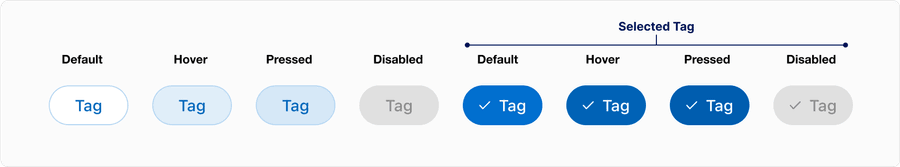
States
| State | Description |
|---|---|
| Default | The tag is visible. |
| Hover | Background slightly changes to indicate interactivity. |
| Pressed | Briefly changes state when clicked. |
| Focus | A focus outline appears around visual element to help users identify current selected option. This is used when a user navigates using keyboard controls or uses a cursor. |
| Disabled | The tag isn’t interactive and no options are selected. Avoid using disabled, it’s best not to show it or provide an informative alternative. If you do use a disabled tag, use aria-disabled=true instead. |
| Selected | When the tag is selected, an active indicator icon is visible and the color changes. |
Dismissible Tag
Anatomy

| Name | Description | Required |
|---|---|---|
| Label | Label should be short and descriptive, no more than 25 characters. | Yes |
| Container | A pill-shaped background that holds all elements. | Yes |
| Dismissible Icon | Includes a close (“X”) icon to remove the tag. | Yes |
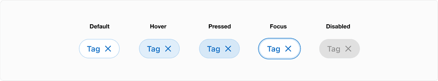
States
| State | Description |
|---|---|
| Default | The tag is visible with a dismiss icon. |
| Hover | Background slightly changes to indicate interactivity. |
| Pressed | Briefly changes state when clicked. |
| Focus | A focus outline appears around visual element to help users identify current selected option. This is used when a user navigates using keyboard controls or uses a cursor. |
| Disabled | The tag isn’t interactive and no options are selected. Avoid using disabled, its best not to show it or an informative alternative on why its disabled. If you do choose to use a disable tag, use aria-disabled=true instead of disabled, so it’s announced to screen reader users. |
Questions?
Connect with the DLS Team on Slack or by email.
Resources
Check out additional resources.