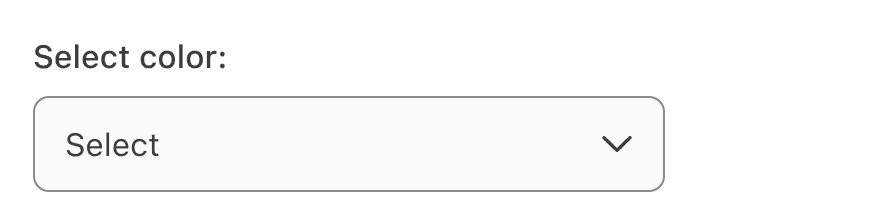
Select
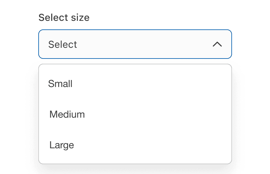
Single select allows users to make a single selection from a dropdown list of six or more items. Consider using radio buttons for fewer items.
On this page
Best Practices
- To let a user choose one option from a dropdown list.
- For sorting existing content on the page
- When you have list of six or more options to choose from
- If the list is sourced from a external data and unaware of how many options will be populated in the list
- Use optional hint text to provide additional instructions
- To reduce vertical space
- If there are five or less options, consider using radio for single selection
- Country flag dropdown to select a language, many languages are spoken within a country
Variations
| Variation | Description |
|---|---|
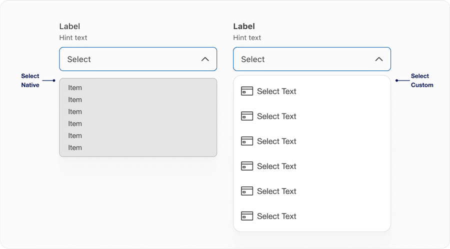
| Select Native | Use system native list for when a user is allowed to select only one option from the options listed. Highly recommend using system native because its browser default and will be adaptable on the device user is using. |
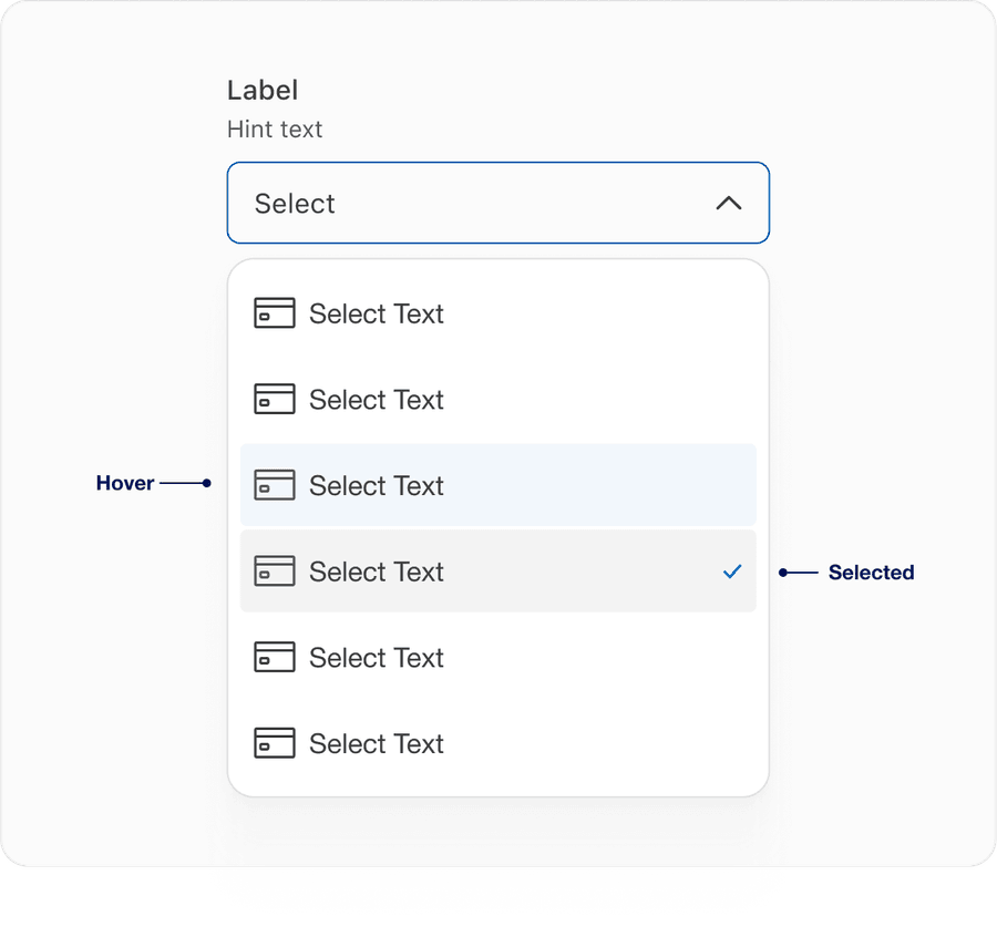
| Select Custom | Use DLS icons or graphics such as card art that are max 24px in height. The use of graphic adds additional information with context. Note, only use graphic if system native doesn’t fit your solution. |
Recommendations
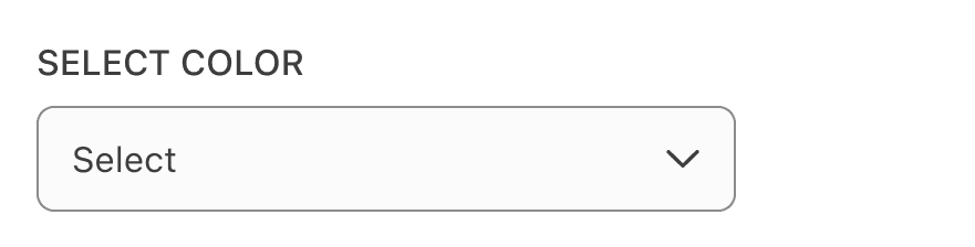
Select labels are required and should be short, clear and descriptive. It should be easy for the users to understand what they are selecting.
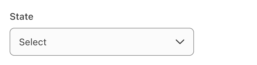
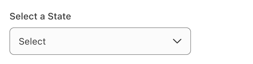
When writing labels, use sentence case, not title case or all caps (unless a proper noun).

Avoid ending labels in colons.

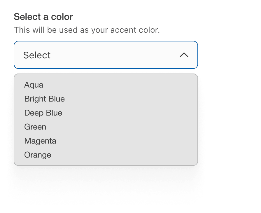
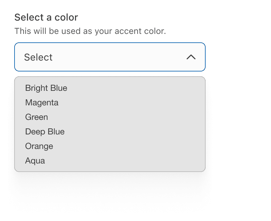
List the options in alphabetical order or any other order which makes sense for the list.
Avoid long dropdowns that require scrolling because they make it difficult to view all items immediately. If you have too many items to include, consider using an autocomplete field that customers can type in to filter results, such as search input with typeahead.

If there are five or less options, consider using a radio button for single selection. Avoid using single select to reduce vertical height.

Avoid adding error within the dropdown, display it below the input field.


Behavior
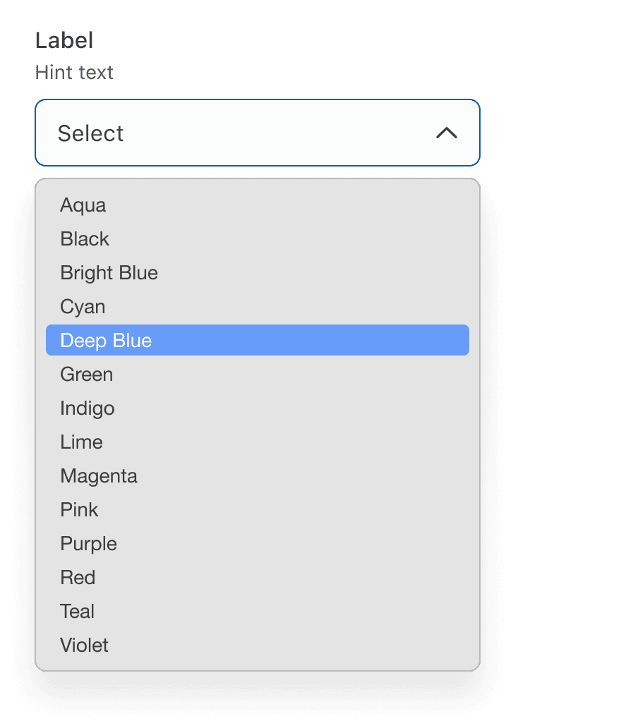
- On hover we have introduced a blue so a user can identify easily between hover and selected. With elements right next to each other the focus ring will be inside 4px of the visual element.
- elected item will now have check icon to the right indicating the selected item from the list provided.
Questions?
Connect with the DLS Team on Slack or by email.
Resources
Check out additional resources.