Select
Single select allows users to make a single selection from a dropdown list of six or more items. Consider using radio buttons for fewer items.
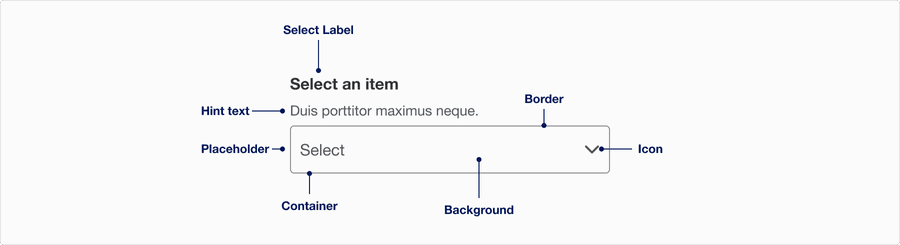
Anatomy
| Name | Description | Required |
|---|---|---|
| Select label | A short, clear and descriptive way to help users understand what they are selecting. | Yes |
| Hint text | Additional information to help the user what it is they are selecting or instruction to help them decide. | Optional |
| Border | Adds sufficient contrast to pass accessibility in unselected and error state. | Yes |
| Container | Container 316 x 48 px. | Yes |
| Background | Background color can convey tone of active or disabled. | Yes |
| Icon | The icon helps reinforce if the dropdown is expanded or not. | Yes |
| Placeholder | Similar to hint text its a way to provide additional information to help user with selecting, note that placeholder text disappears once selected. Try using hint text first. | Optional |
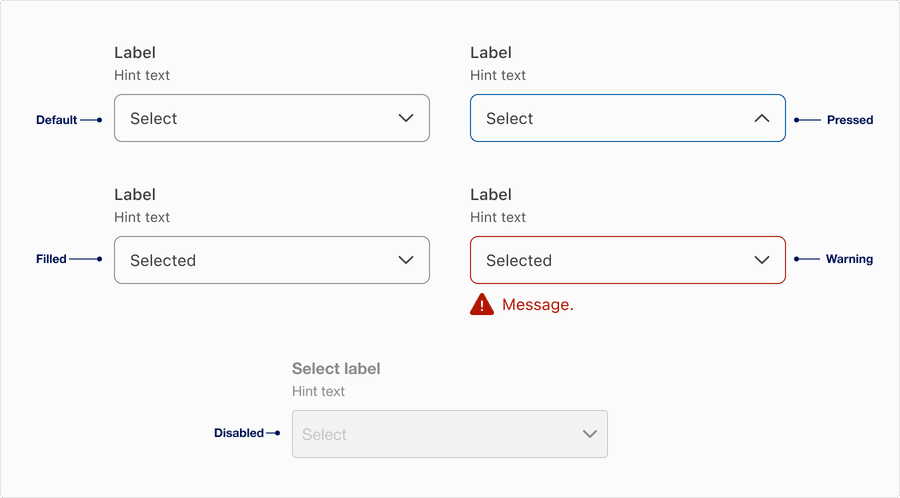
States
| State | Description |
|---|---|
| Default | Users can tap or click the text field to select an option from the dropdown. |
| Pressed | A change in border color to indicate its pressed and dropdown appears for users to select from list of options. |
| Filled | A selection appears once a user selects from one of the lists of options. This could be a variety of selections, plain text, and could include an icon, such as flag of a country. |
| Warning | Helps user understand that there is an error if a selection is needed to move forward. Providing a clear message to the user is important for them to know how to correct the error. |
| Disabled | Limit the use of disabled elements as they are not interactive and cannot be focused by keyboard. Disabled elements provide visual indicator, but they don’t need to meet color contrast standards. If an element is disabled, please follow accessibility guidelines to support assisted technology. |
Questions?
Connect with the DLS Team on Slack or by email.
Resources
Check out additional resources.