Radio
Radio buttons give customers the ability to make a single selection from a group of two or more mutually exclusive options.
Best practices
- When you want a user to select only one option from a list
- With positive and active labels
- With clear error messaging in case of validation errors
- In vertical layout as its easier to read
- If you require customers to select more than one option, consider using checkbox instead
- If you require an interactive content inside label, such as links
- If there are more than five options, consider using the select dropdown
- For accepting terms and conditions and similar functionality, consider using checkbox instead
Variations
| # | Variation | Usage |
|---|---|---|
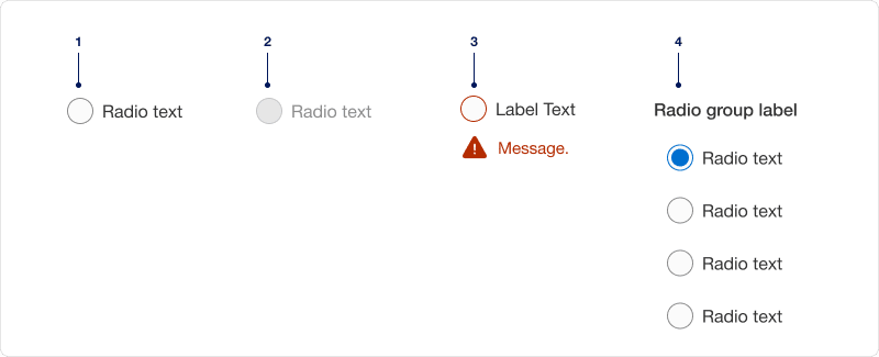
| 1 | With label | Radio should always have a short, clear and descriptive label that explains its purpose. |
| 2 | Disabled | Limit the use of disabled elements as they are not interactive and cannot be focused by keyboard. Disabled elements provide a visual indicator, but they do not need to meet color contrast standards. |
| 3 | With error message | Radio shows an error message if a selection is needed to move forward. Providing a clear messaging to the user is very important for them to know how to correct the error. |
| 4 | Grouped | Radio groups should always have a label that clearly describes what the list of options represents. Give each radio within a group a unique value. |
Recommendations
A group of radio buttons should have one option selected by default. Select the safest, most secure and positive option. If you are unsure, leave it blank.
Radio button labels should be short, clear and descriptive. It should be easy for the user to understand what they are selecting.
Avoiding ending labels in punctuation, commas, or semicolons.
Limit labels fewer than four words. If you do go over the recommended four word maximum, do not truncate radio button labels with an ellipsis. Instead, reword the label or wrap it to the second line.
If there are only two possible options that can be expressed clearly as a single binary choice such as on/off or yes no combine into single checkbox or toggle switch control.
Choose radio if you want the ability to select only one option. If a user is required to make more than one selection use a checkboxes.
Radio listed vertically is easier to consume than those listed horizontally. If you use horizontal layout, limit the number of options to three across.
For vertical layout, limit the options to five. Consider using select dropdown when there are more than five options to select from.
Once an option is selected in a radio group, a user cannot deselect from the group. If you need an unselected group state, add “none” as an option in the group.
Avoid adding error per item, instead add it to the group.
Responsive
When the label is too long for horizontal space, it wraps to another line below the text. Leaving the radio aligned top.
On smaller breakpoint the horizontal list will reflow into vertical list to fit the viewport. Minimum screen size to design for is 320px.
Questions?
Connect with the DLS Team on Slack or by email.
Resources
Check out additional resources.