Radio
Radio buttons give customers the ability to make a single selection from a group of two or more mutually exclusive options.
Anatomy

| State | Description | Required |
|---|---|---|
| Border | Adds sufficient contrast to pass accessibility in unselected and error state | Yes |
| Container | Container is 24 x 24px | Yes |
| Background | Background color can convey tone of default, selected or indeterminate | Yes |
| Selection | It can allow the user to understand the state of the radio | Yes |
| Target Size | Tap target is 48 x 48px to meet the minimum accessibility requirements and to be able to fit 8x system. WCAG 2.1 success criterion 2.5.5 | Yes |
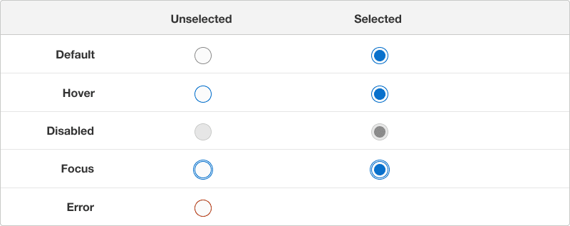
States
| State | Description |
|---|---|
| Default | Users can tap or click the text label or the radio to select an option. Once selected, user is not able to unselect. |
| Hover | A change in color indicates to a user its clickable when the cursor hovers over a selection |
| Disabled | It’s an option where it’s visible but not interactive. Our recommendation is not to display if its not needed. If displayed indicate to a user why its disabled. |
| Focus | A focus outline appears around visual element when a user navigates using (keyboard controls)[/components/selection-controls/radio/accessibility#keyboard-navigation]. |
| Error | Use error state if a selection is needed to move forward and include an error message on why its invalid to avoid accessibility issue, (color as info)[]. |
Questions?
Connect with the DLS Team on Slack or by email.
Resources
Check out additional resources.