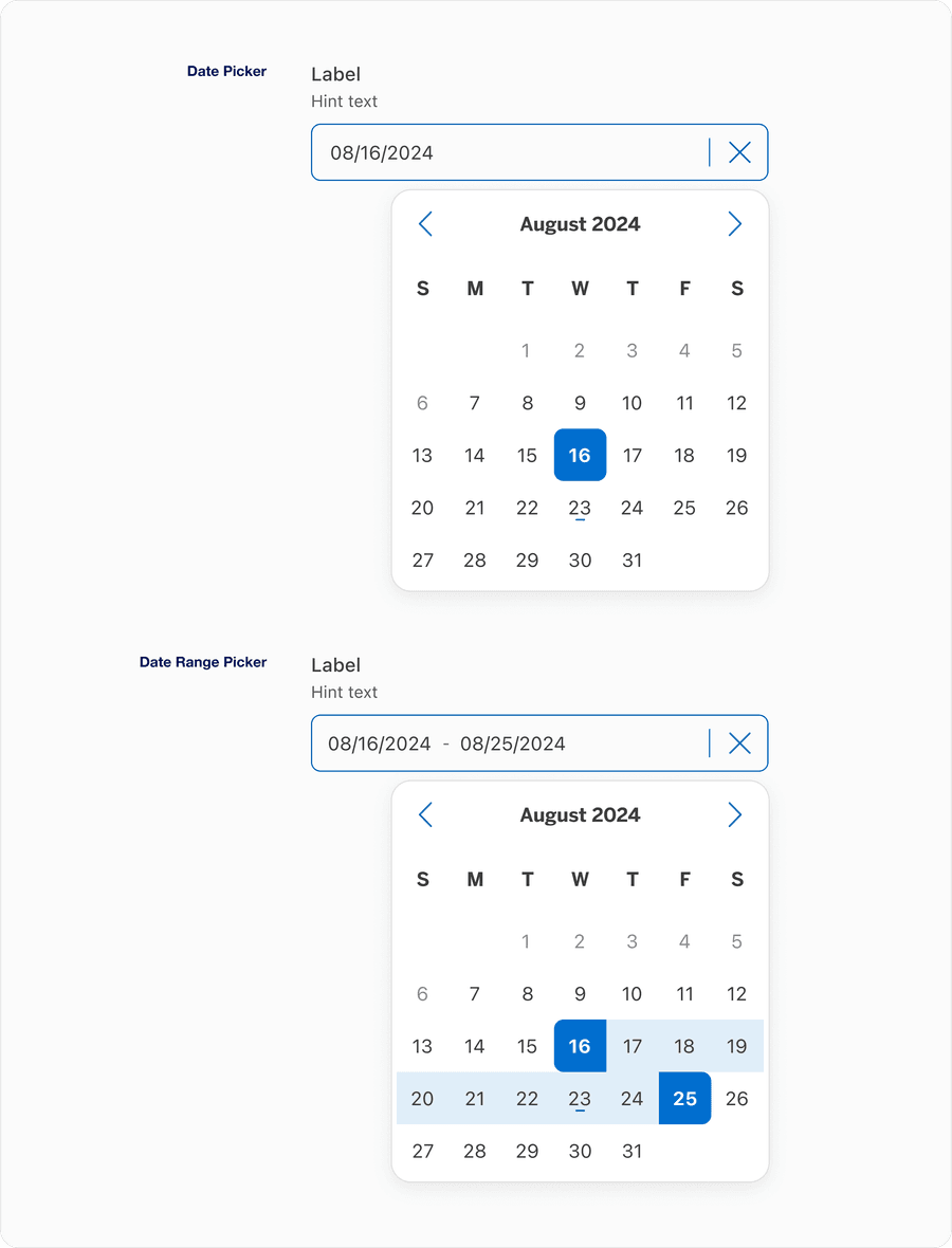
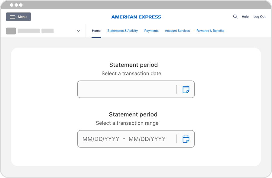
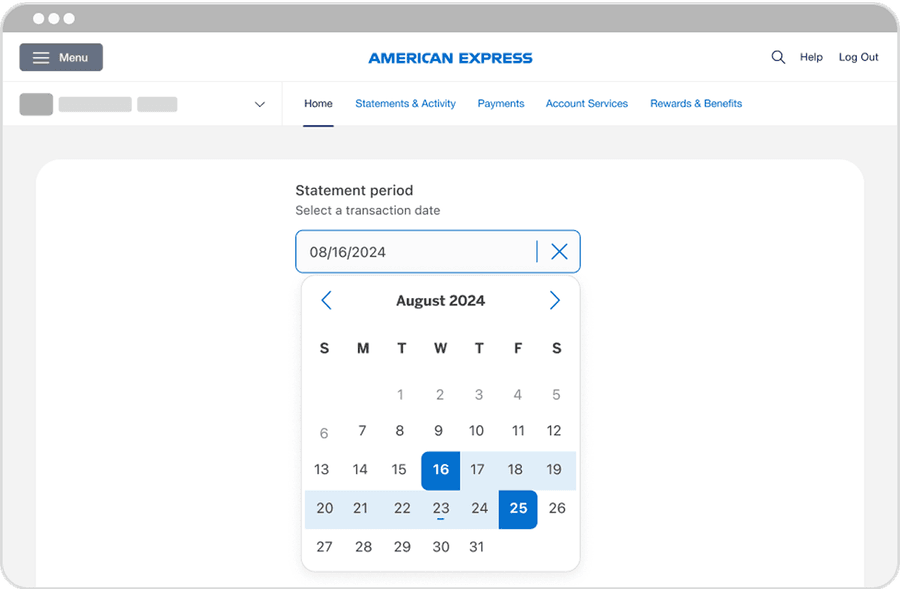
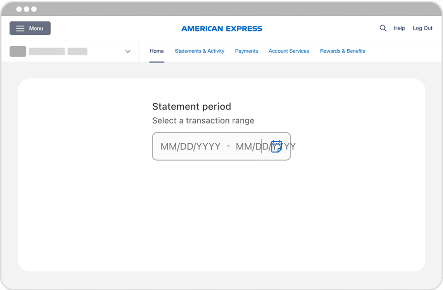
Date Picker
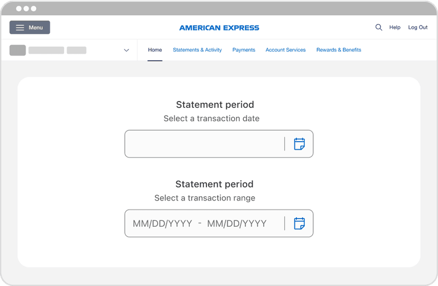
Date pickers enable a customer to select a single date or a date range, such as a payment date or a statement period requiring start and end dates. Date pickers are used to display past, present, or future dates. Use date pickers when you are asking the user for a date, a date range, or for scheduling tasks.
On this page
Best Practices
- When users need to select a specific date
- To define a custom time range, such as filtering transactions or generating a statement
- When the UI benefits from visual scheduling or availability (for example a promotional period)
- To support localized formats and want to reduce input errors by using guided selection
- The selection for a date or range directly impacts what the user sees next (for example updating transaction results)
- When users are selecting predefined options, use a Dropdown instead
- The date is non-editable or static, such as a statement issue data - just display text
- You are asking users to type a date manually without validation or format guidance - this increases error rates
- You’re trying to fit a complex calendar UI into mobile-first or space-constrained experience without proper adaptation
Variations
| Variations | Description |
|---|---|
| Date Picker | Allows users to select a single date using either the text input or calendar popover. Best for one off selections like setting a payment date, birthdate or filtering by a specific transaction date. |
| Date Range Picker | Let’s users choose a start and end date in a single interaction, using an input field paired with the Calendar Popover. It’s ideal for tasks like filtering statements, reviewing spending overtime, or setting a travel period. |
Recommendations
Labels
- Provide clear, descriptive labels
- Use concise labels, one to three words and avoid long phrases
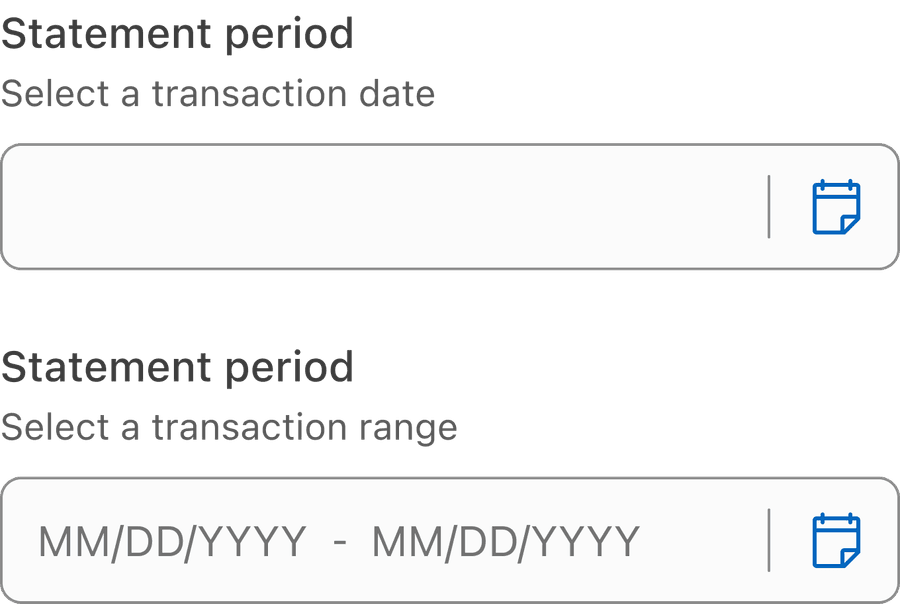
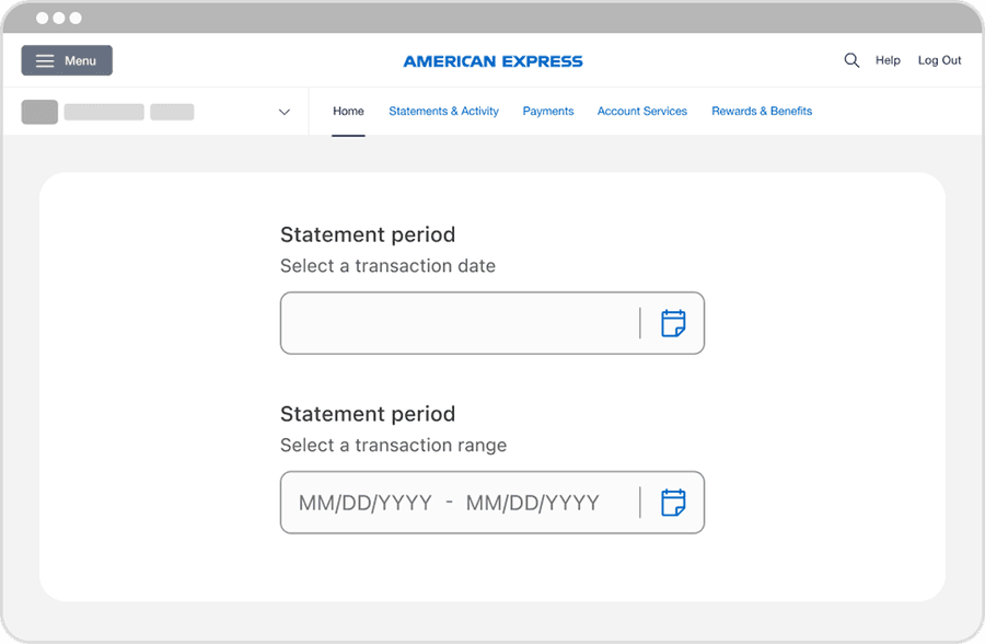
- Use sentence case for readability, such as “Statement period”
- Ensure the label describes the purpose of the date selection
- Use additional hint or helper text if the date format or expected behavior needs clarification
- Remove labels in favor of placeholder inputs, this harms accessibility
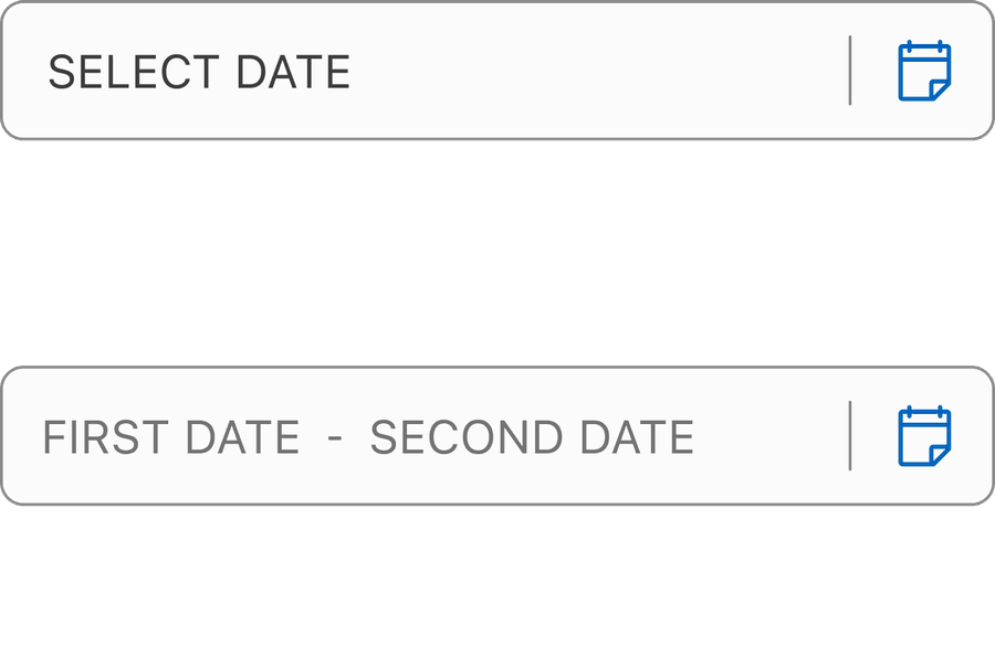
- Use ambiguous terms like “Select date” if there’s more specific context
- Use ALL CAPS, it reduces readability (especially for screen readers)
- Rely on visual placement alone to convey what the field is for - always provide a label
Removing the label from the Date Picker violates WCAG 1.3.1 - Info and Relationships and WCAG 4.1.2 - Name, Role, Value, resulting in inaccessible experiences for assistive tech users. Never rely on visual design or color alone to convey purpose or progress.
If a label is removed, screen readers announce a progress bar but with no context. They will not know what is progressing: Is it a form, a task?
Layout
Align labels according to the reading direction (left for LTR, right for RTL) to support readability and screen reader consistency
Center texts in fields, it hurts readability and breaks visual scanning patterns
Make fields wide enough for full date input and calendar icon
Truncate the date or crowd the calendar icon - avoid input fields that are too narrow to display the full value clearly
Icon
Align labels according to the reading direction (left for LTR, right for RTL) to support readability and screen reader consistency
Center texts in fields, it hurts readability and breaks visual scanning patterns
All non-text content (for example the calendar icon) must have a text alternative. Please utilize the Icon Button Tertiary Component Properties to provide Alt Text.
Removing or not providing text alternatives violates WCAG 1.1.1 - Non-text Content, resulting in inaccessible experiences for screen reader users.
If no accessible name is provided, screen readers may ignore the icon entirely as they will not know it exists, the control may be announced generically with no indication of purpose, users may be unable to interact with the date picker or understand how to open it. Provide descriptive text to convey intent.
Questions?
Connect with the DLS Team on Slack or by email.
Resources
Check out additional resources.