| Name | Description | Required |
|---|
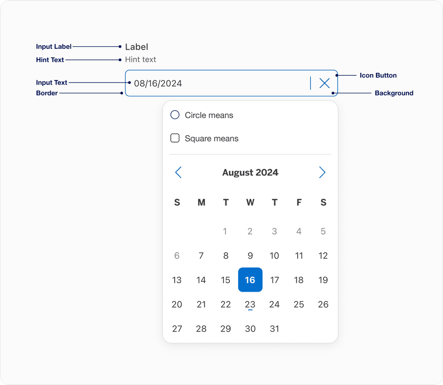
| Input Label | A concise descriptive text that informs the users of the text fields intent. | Yes |
| Hint Text | It helps the user understand additional details about the text input requirements. | Optional |
| Border | Adds sufficient contrast to pass accessibility in pressed, success and error states. | Yes |
| Background | Background color can convey active or disabled. | Yes |
| Input Text | Allows users to view, enter, or edit a date manually in addition to selecting it from a calendar popover. It supports both typed input and visual confirmation of the selected date format, adapting to local and validation rules. Placeholder text provides lightweight guidance about expected date format before a user enters or selects a date. It disappears once a user begins typing or a date is selected from the calendar. Displays a formatted date based on locale, while allowing the user to type a date in manually. In code, the displayed date format will differ from the actual value — the displayed date is formatted based on the locale of the user’s browser, but the parsed value is always formatted yyyy-mm-dd. | Yes |
| Input Button | Calendar button icon opens the calendar popover for date selection | Yes |
| State | Description |
|---|
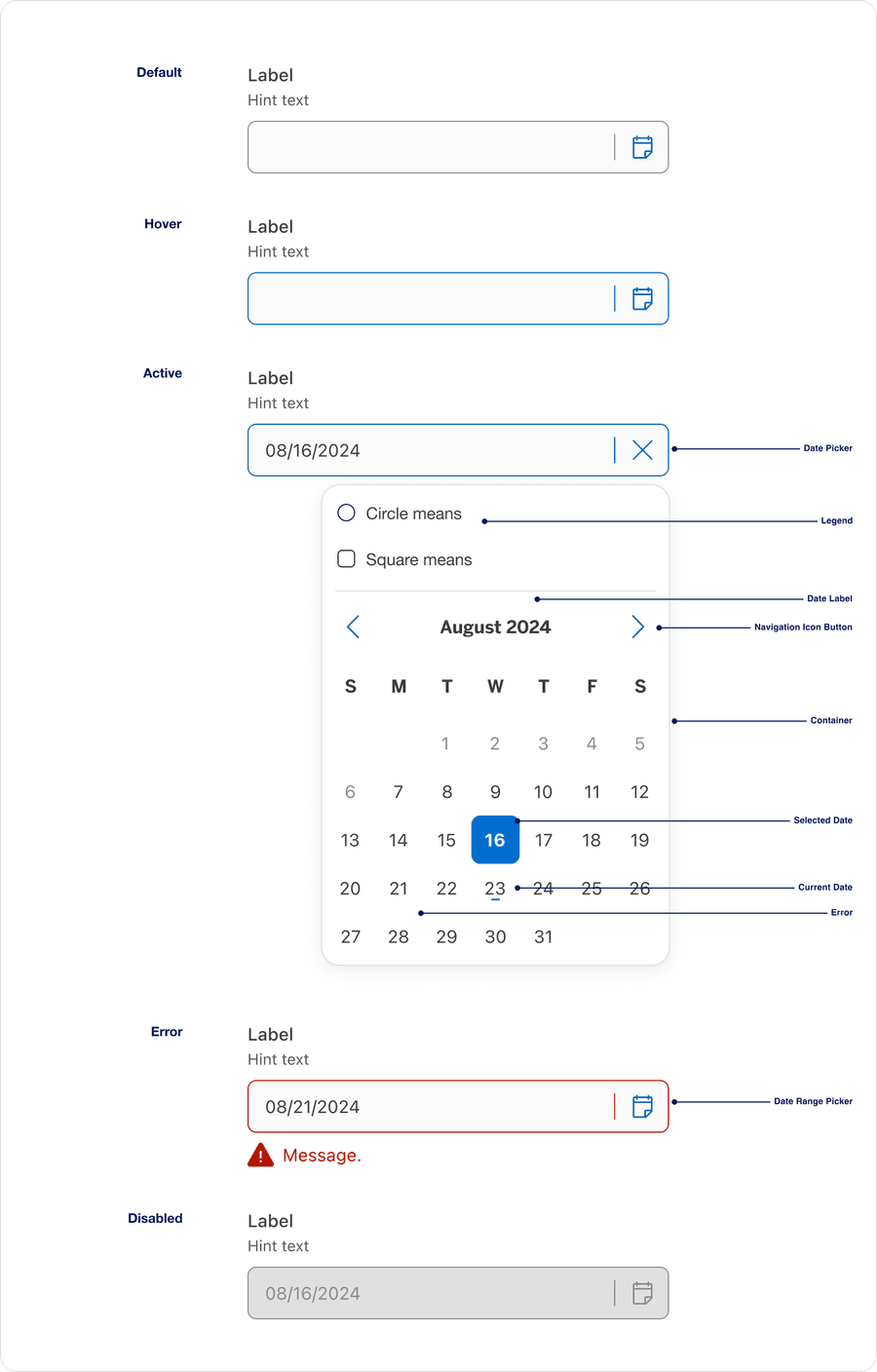
| Default | Represents the initial, inactive state before a user taps or clicks the input |
| Hover | It helps the user understand additional details about the text input requirements. |
| Error | Help users understand that there is an error if a field is not validated in a particular format or left blank. Providing a clear message to the user is important for them to know how to correct the error. |
| Active | Indicates represents the moment when a user is currently interacting with the field, sometimes referred as the focused field |
| Disabled | Limit the use of disabled elements as they are not interactive and cannot be focused by keyboard. Disabled elements provide visual indicator, but they don’t need to meet color contrast standards. If an element is disabled, please follow accessibility guidelines to support assistive technology. |
| Name | Description | Required |
|---|
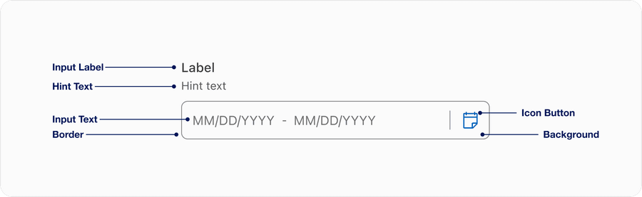
| Input Label | A concise descriptive text that informs the users of the text fields intent. | Yes |
| Hint Text | It helps the user understand additional details about the text input requirements. | Optional |
| Border | Adds sufficient contrast to pass accessibility in pressed, success and error states. | Yes |
| Background | Background color can convey active or disabled. | Yes |
| Input Text | Allows users to view, enter, or edit a date manually in addition to selecting it from a calendar popover. It supports both typed input and visual confirmation of the selected date format, adapting to local and validation rules. Placeholder text provides lightweight guidance about expected date format before a user enters or selects a date. It disappears once a user begins typing or a date is selected from the calendar. Displays a formatted date based on locale, while allowing the user to type a date in manually. In code, the displayed date format will differ from the actual value — the displayed date is formatted based on the locale of the user’s browser, but the parsed value is always formatted yyyy-mm-dd. | Yes |
| Input Button | Calendar button icon opens the calendar popover for date selection | Yes |
| State | Description |
|---|
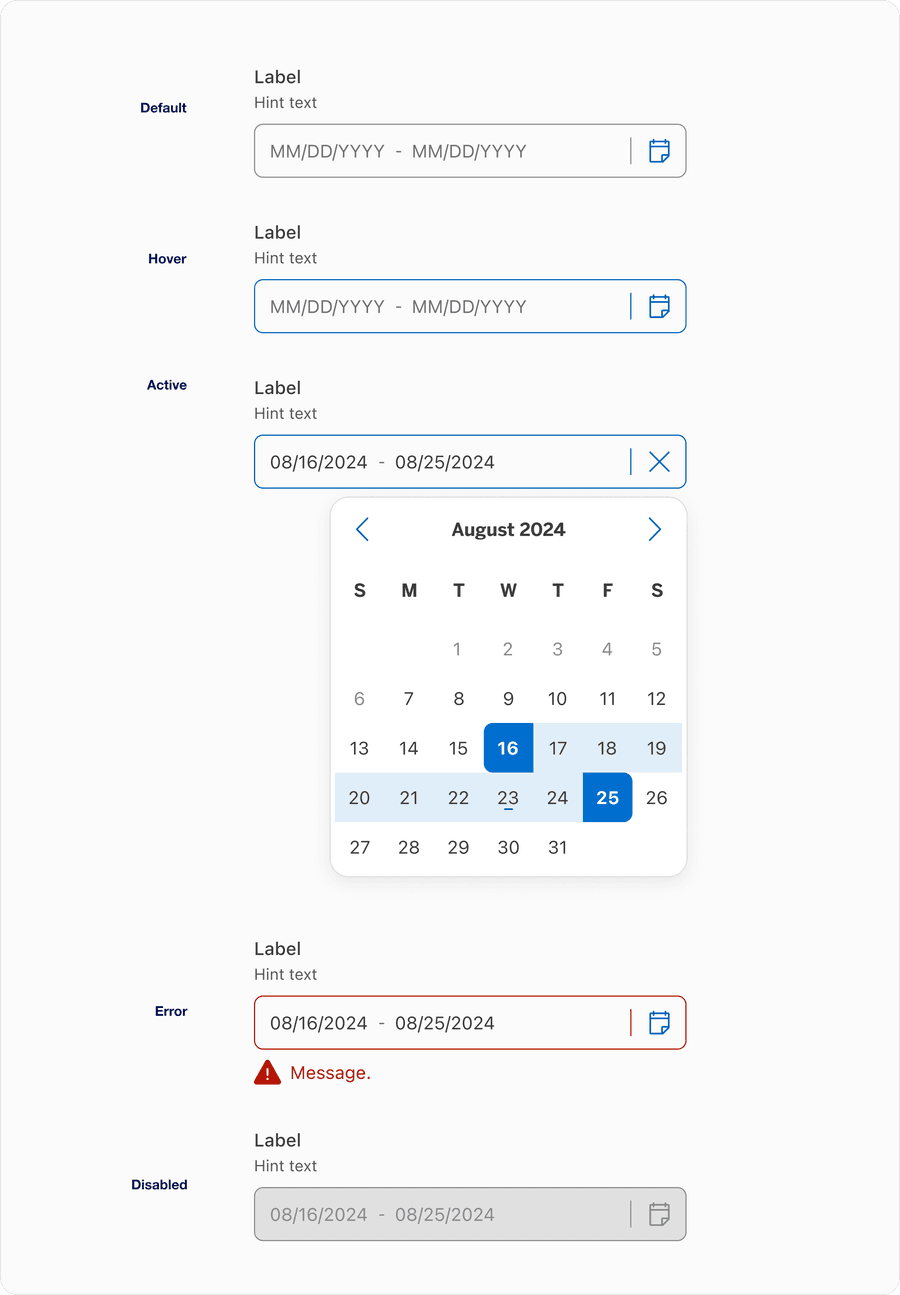
| Default | Represents the initial, inactive state before a user taps or clicks the input |
| Hover | It helps the user understand additional details about the text input requirements. |
| Error | Help users understand that there is an error if a field is not validated in a particular format or left blank. Providing a clear message to the user is important for them to know how to correct the error. |
| Active | Indicates represents the moment when a user is currently interacting with the field, sometimes referred as the focused field |
| Disabled | Limit the use of disabled elements as they are not interactive and cannot be focused by keyboard. Disabled elements provide visual indicator, but they don’t need to meet color contrast standards. If an element is disabled, please follow accessibility guidelines to support assistive technology. |

| State | Description |
|---|
| Default | The initial, inactive state of the input field before the user interfaces with it. Displays the placeholder text as guidance. |
| Selected | Indicates that the input has been clicked or tapped and is ready to receive input. Typically shows with a change in border color or visual emphasis to signal interactivity. |
| Placeholder (Off) | Represents the state where the user has entered a value into the field, replacing the placeholder text. The field may remain focused or unfocused, but the placeholder is not longer visible. |
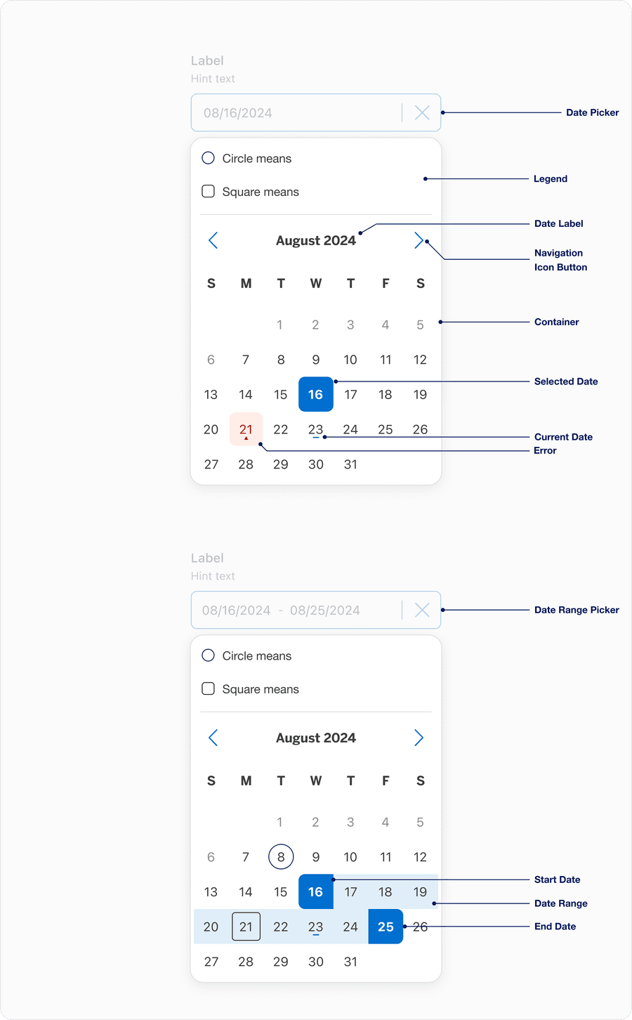
The Calendar popover is a shared UI element used in both the Date Picker and Date Range Picker components.
This visual interaction creates consistency across components and reduces redundancy.
| Name | Description | Required |
|---|
| Legend | Clarifies the meaning of any non-standard shapes or styles within the calendar view. | No |
| Current Date | The current date (today) is visually indicated but not automatically selected. It helps orient users. | No |
| Date Label | Displays the currently selected date or date range. | Yes |
| Container | The outer wrapper that holds all of the calendar’s content (such as Date Label, Legend, and any supporting UI). The Calendar has a min-width of 316 px to ensure adequate spacing for Date Tile touch-targets to maintain accessibility. | Yes |
| Navigation Icon Button | Allows users to navigate forward or backward by month (sometimes by year). Can be disabled if calendar is constrained by a minimum or maximum date. | Yes |
| Date Tile | Each tile within the calendar grid represents a single date. These tiles respond to interaction states and optional modifiers that provide additional meaning and visual clues. | Yes |
| Start Date | Used within the Date Range Picker, the first date selected by the user | Yes |
| Date Range | Used within the Date Range Picker, if a user is selecting a range or viewing data tied to a range (like availability, promotions, or multi-day events), you must highlight the selected or active date range visually within the calendar. | Yes |
| End Date | Used within the Date Range Picker, the final date selected to complete the range | Yes |
| Selected Date | Used within the Date Picker, captures a single selected date, which is both visible in the input field and reflected within the calendar pop over | Yes |
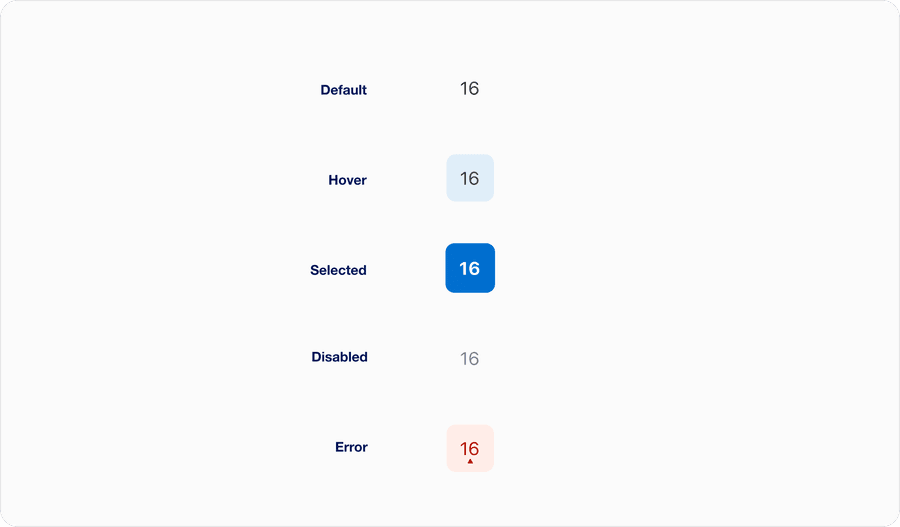
| State | Description |
|---|
| Default | The date is selectable and has no current selection or special meaning |
| Hover | Provides a visual queue that a date tile is interactive and currently under the users cursor |
| Selected | The user has chosen this date or it may be a predefined selection |
| Disabled | The date is outside the selectable range or not applicable (for instance, in the past or a cut-off date) |
| Error | The date input is invalid, conflicting or not permitted based on business logic |